 Despite the attention consumer-level mobile apps, websites, and software get, much of the world depends on business software. Business software supports core functions for organizations, such as productivity management, communication, accounting, and sales.
Several products also have a fair amount of crossover between business and consumer usage.
Along with their features and capabilities, the user experience of software is a key determinant of how likely users are to adopt new technology and recommend the product.
Benchmarking is an essential step in a UX measurement plan, which aids in making systematic improvements in a product’s user experience. We’ve found that usability accounts for between 30% and 60% of the variation in Net Promoter Scores. A positive experience leads customers to recommend a product. A negative experience, predictably, causes customers to actively discourage others from buying a product.
From April through July of 2022, we collected data from 732 participants to learn about their attitudes towards the functionality and usability of common business-related software. Measuring user attitudes toward the experience is an important step in benchmarking and improving a product.
This analysis is an update to research we conducted on a similar set of products in 2017 and 2020 using a similar methodology. We increased the number of products benchmarked and, as we did in 2020, separately reported business-focused software (this article) and consumer-focused software (coming in a future article).
The 21 business products include a mix of productivity and communications software (both web and desktop):
- AutoCAD
- Blackboard
- Box
- Canvas
- GitHub
- GoToMeeting
- QuickBooks
- MailChimp
- Oracle
- Salesforce
- Shopify
- Slack
- Squarespace
- SurveyMonkey
- Tableau
- VMware
- WebEx
- WordPress
- Zendesk
- ZipRecruiter
- Zoom
Participants came from the United States. A bit over half of the participants (55%) were male and tended to be younger, with 56% under 35. Participants were asked to reflect on their most recent experiences with the software and answer a number of items, including the System Usability Scale (SUS), the UX-Lite™, the standard likelihood-to-recommend (LTR) question used to compute the Net Promoter Score (NPS), and the Product-Market Fit (PMF) item. The full details are available in the report. Here are some highlights.
Methodological Note: Some products in our analysis contain disparate functionality and users, notably Oracle and Salesforce. Our analysis asked participants only about their overall experience with each product and included a mix of users from across functional areas. It’s likely many functional areas will have substantially different scores (e.g., sales versus HR).
Loyalty/Net Promoter Scores
The most popular method to measure loyalty is the Net Promoter Score (NPS). It’s calculated using an eleven-point (0 to 10) likelihood-to-recommend question, with the NPS computed by subtracting the percent of detractors (those choosing 0–6) from the percent of promoters (those choosing 9 and 10).
Across the 21 products, the average Net Promoter Score was −12%, ranging from −58% to 23%. This average is reasonably consistent with the previous averages of the business NPS from 2017 (−11%) and 2020 (−3%).
We have collected data from five business software products for multiple years (QuickBooks and AutoCAD since 2011; Salesforce, GoToMeeting, and WebEx since 2014). The NPS for these products generally declined. The exception is QuickBooks, which is also the only product whose NPS has been positive since 2011.
The biggest drop we observed was for Salesforce. It scored an NPS of 0%, down from 25% in 2020. Respondents reported that the major issues with Salesforce were the complex user interface (19% of verbatim comments), unsatisfactory pricing (13%), and being unattractive (9%).
Figure 1 shows the historical NPS profiles for QuickBooks and Salesforce.

System Usability Scale (SUS) Scores
We used the popular System Usability Scale (SUS) to compute the perceived ease of use of the 21 products. The SUS is a ten-item questionnaire with possible scores ranging from 0 to 100. The average SUS score from over 500 products (including websites and business software) is 68. The average SUS score from this group was 70, with a low score of 59 and a high score of 77.
Raw SUS scores were converted to percentile ranks, which translated the average raw score into 56%—meaning this group of products score just over the historical average in perceived usability.
The product with the lowest SUS score in this dataset was the educational software Blackboard, with a SUS score of 59 (at the 27th percentile). The two most common complaints regarding Blackboard were its poor navigation (13% of verbatim comments) and its steep learning curve (10%).
The SUS scores for the five products from previous years were reasonably stable, with two products dropping two points from 2020 to 2022 and three improving from two to three points.
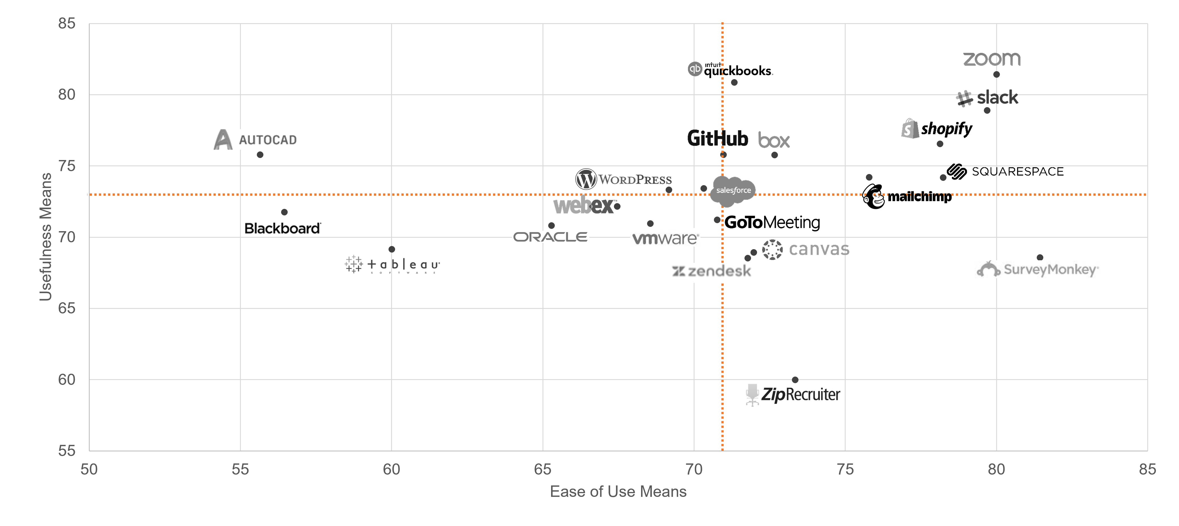
Usefulness and Ease
In the report, we present findings for the UX-Lite (based on the UMUX-Lite reported in previous studies) as it’s become an important benchmark for many organizations as part of using a single (succinct) score to quantify software acceptance and satisfaction. It’s based on earlier work hearkening back to the Technology Acceptance Model (TAM) but includes only one item each for ease (how easy is the software to use) and usefulness (how well do the functions meet the users’ needs). In aggregate, it provides a measure of acceptance (a mini-TAM) or, even more broadly, satisfaction or quality of the product.
Figure 2 shows a scatterplot of the two components of the UX-Lite scores. The dotted red lines indicate the component means from this study (71 for ease; 73 for usefulness). Zoom and QuickBooks received the highest usefulness ratings, while Zoom and SurveyMonkey received the highest ease ratings.
Perceived Usability Affects Loyalty
Figure 3 shows the SUS scores for detractors, passives, and promoters (computed at the individual level for all responses; all differences significant with p < .05).
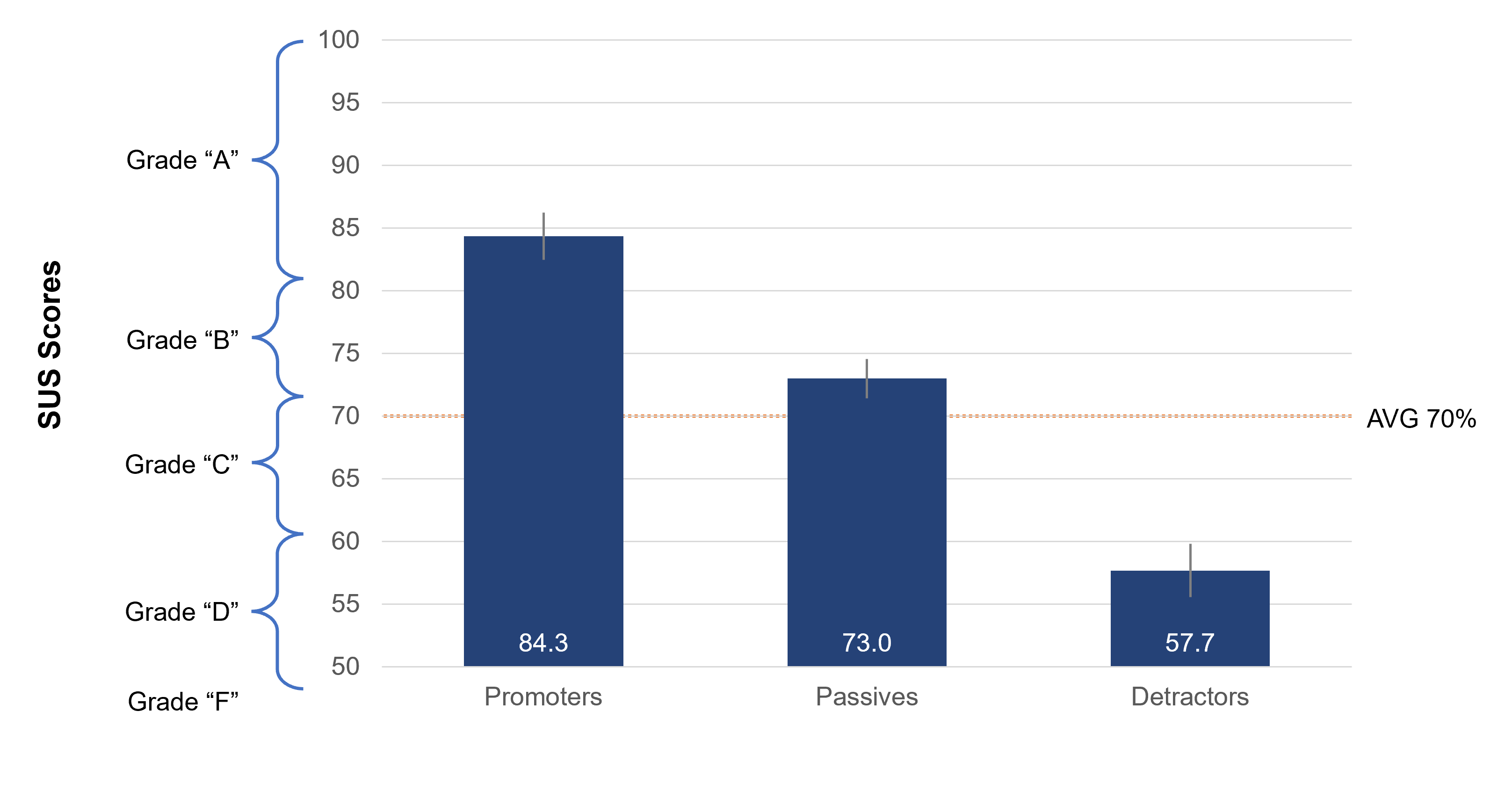
This figure shows that, on average, promoters had SUS scores of just over 84 (an A+ on the Sauro-Lewis curved grading scale). This pattern is consistent with our previous research that found that SUS scores above 80 have a good chance of indicating promoters. The mean SUS for passives was 73 (a B− on the Sauro-Lewis curved grading scale) and, for detractors, was 58 (the 25th percentile, a D grade).
Product-Market Fit
In this report, we included a new section on the assessment of the Product-Market Fit (PMF) item, which has the following four response options to the question, “How would you feel if you could no longer use this product?”
- Very disappointed
- Somewhat disappointed
- Not disappointed (it isn’t really that useful)
- N/A – I no longer use this product
The most common way to report results for the PMF item is the top-box score (percentage of “Very disappointed” ratings), with a rule of thumb that the top-box benchmark for successful startups is 40%. (For least-squares modeling, assigning a number to each response is possible; for example, 0 = no longer used, 1 = not really that useful, 2 = somewhat disappointed, and 3 = very disappointed.)
The products with the highest PMF top-box scores were AutoCAD and Oracle (both 26%). The products with the lowest PMF top-box scores were GoToMeeting and Tableau (both 0%). Even the best of these scores were lower than 40%, but this could be due to numerous factors (e.g., mature rather than startup companies, business rather than consumer products, presence of successful competitors).
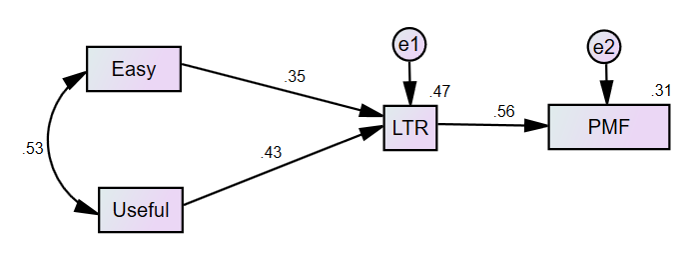
Useful + Usable = Market Fit through Recommendations
One way to better understand the relationship between the multiple metrics collected is through a path diagram using structural equation modeling (SEM). SEM can provide insights into hypothesized causal relationships between variables.
Figure 4 shows a structural equation model using the data across all the products in this study. It has good fit statistics (χ2(2) = 4.8, p = .09; CFI = 1.00; RMSEA = .04; BIC = 57.6), which means the model does a good job of explaining the data. It supports a hypothesized causal chain from the UX-Lite components (Easy, Useful) to likelihood-to-recommend (LTR) to Product-Market Fit.
Variation in the UX-Lite items accounts for about half (47%) of the variation in LTR, and the variation in LTR accounts for almost a third (31%) of variation in mean PMF (using the 0–3-point scaling of its response options). In other words, improving the ease and usefulness of products will likely increase the recommendation intention of users, which in turn will improve ratings of product-market fit.
Summary
Benchmarking is an important step in improving the user experience of software and should include measures of usability and loyalty. Third-party benchmarks such as the ones described here complement internal benchmarking programs by providing more context. It’s a lot easier to know how well your product is doing when you know where it stands relative to the competition or the industry average.
The full list of benchmarks and analysis of verbatim responses are available for purchase in the 2022 Net Promoter & UX Benchmark Report for Business Software.
")

