 Survey response options come in all sorts of shapes, sizes, and now, colors.
The number of points, the addition of labels, the use of numbers, and the use of positive or negative tone are all factors that can be manipulated. These changes can also affect responses, sometimes modestly, sometimes a lot.
There is some concern that long response scales (more than three points) are hard for people to respond to. And in our earlier research, we did find some support that short scales are perceived as easier than long scales (when participants were forced to choose). However, we found no difference in the response time between 3-point and 11-point scales. Participants actually preferred having more points to appropriately capture their feelings toward a question in a survey. We also found good evidence that just using 3-point scales loses too much information as there’s no way to differentiate between tepid and extreme responders. So there’s good reason to use scales with more points.
One alternative some survey designers use to help make longer multi-point scales easier is to break up them into colors. An example from an auto-dealership survey is shown in Figure 1 (provided online by Adam Ramshaw).
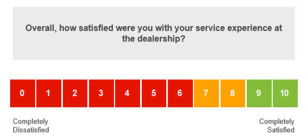
Figure 1: Example of an 11-point scale colored, which corresponds likely to “net” scoring.
Figure 1 shows an 11-point satisfaction item, but based on the colors, it’s likely the raw responses get scored using the same “net” scoring scheme as used in the Net Promoter Score and similar to that used in the Microsoft NSAT. Under this scheme, the top two boxes are considered satisfied (similar to promoters), the 7s and 8s are neutral, and anything 6 and below are dissatisfied (akin to a detractor).
The colors used here also signal to the respondent which responses are considered good (green), which are bad (red), and which are somewhere in the middle (yellow).
This may help respondents more easily respond to the scale, but what does it do to their responses?
Research on Scale Colors
Some online articles recommend against using colored scales. For example, Joe Hopper recommends you not color your scales, such as those used in the Net Promoter Score item, because it will bias the answers. He didn’t provide data on this recommendation, however. An article by Insightrix suggests respondents may perceive colored scales as more severe and give more moderate ratings.
In the academic literature, a study I found by Tourangeau et al. (2009) offers some guidance. The authors argue that respondents use a number of heuristics (mental shortcuts) when responding to scales. To see how changing the color and hue of colors (dark to light) affects responses, they conducted two experiments.
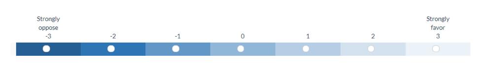
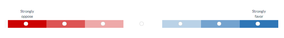
Figure 2: Adaptations of two color scale variations participants responded to in Tourangeau et al. (2009).
Across two studies, the authors randomly assigned around 2,500 U.S.-based online panel participants to one of eight scale conditions that varied the color, hue, labels, and numbers. Two of the conditions of the scales are shown in Figure 2 (we re-created these in our MUIQ platform.) This setup allowed the authors to investigate interaction effects between color and other scale factors. Participants answered questions about general attitudes and lifestyles using items with favor/oppose and frequency label anchors.
They found the shading of the response options had a small but statistically significant effect. When the endpoints of the scale were shaded in different hues, the responses tended to shift toward the high end of the scale (usually between .1 and .2 points on a seven-point scale).
Interestingly, they found this small effect disappeared when the points were fully labeled and generally only detectable when the items were aggregated across items (the differences were not statistically significant at the individual item level), and they found no difference in response times from changes in hue and color. In short, they found a small effect, but it was obfuscated by the larger effects of labeling.
To better understand how color may affect the more commonly used 11-point Likelihood to Recommend and satisfaction scales, we conducted two of our own studies.
Study 1: Three Scale Types and Between Subjects
In September 2019, 229 participants were asked the 11-point Likelihood to Recommend item and an 11-point satisfaction item for a selected list of nine retailers and airlines they reported having recently purchased from (Amazon, Target, Walmart, Home Depot, Lowes, United Airlines, Southwest, Delta, IKEA).
Participants were randomly assigned to one of three scale variants as shown in Figures 3a, 3b, and 3c. Eighty responded to the standard no-color variant (3a); 70 to a gradient version (3b), and 79 to a three-color version (3c).
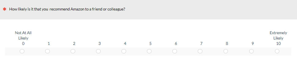
Figure 3a: A standard no-color variant of the Likelihood to Recommend item.
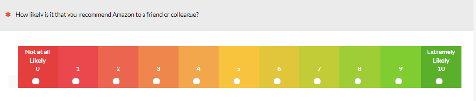
Figure 3b: A gradient variant of the Likelihood to Recommend item.
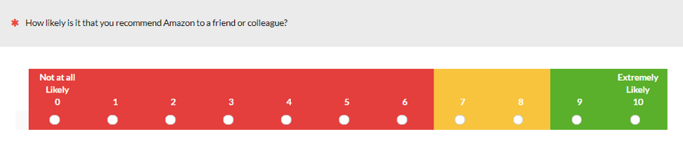
Figure 3c: A three-color variant of the Likelihood to Recommend item.
Study 1 Results
Based on the findings of the Tourangeau et al. (2009) study, we first aggregated all responses (so if one person reflected on five brands, their scores are included five times). The aggregated results across participants and brands is shown in Figure 4. Both color variants had a slightly lower number of detractors compared to the standard no-color group (26% and 24% vs. 32% respectively).
Note: Because the data from the same people are used multiple times within each category, it violated the independence assumption used in most statistical tests, so we conducted the statistical tests only on the brand-level analysis.
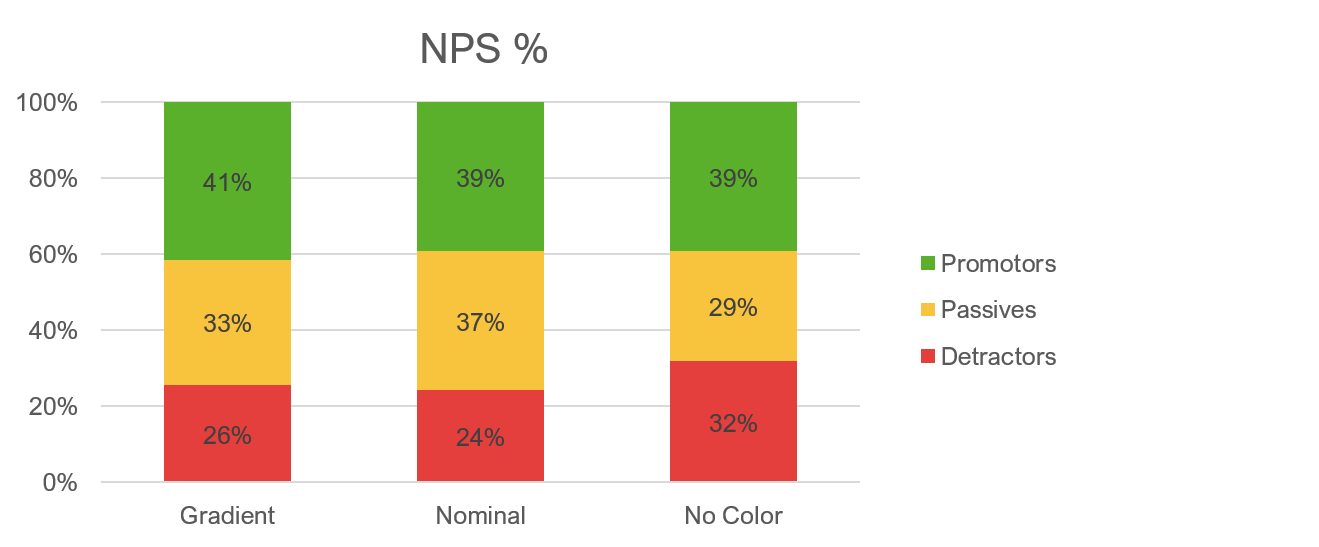
Figure 4: Difference in response patterns for aggregated responses for the gradient, three-color, and no-color variations of the Likelihood to Recommend item.
For the satisfaction item, we see a similar pattern to the NPS item (Figure 5). The percent of those selecting the least favorable responses (0 to 6) decreased slightly when both color variations were shown (21% and 20% vs 25%).

Figure 5: Difference in response patterns for each of the nine brands for the gradient, three-color, and no-color variations of the satisfaction item.
In looking at the differences within the nine brands (Figure 6), there’s less of a pattern. The no-color variation tended to have lower scores for some brands (e.g., Amazon, Walmart) but not all (for Southwest, the gradient was lowest).
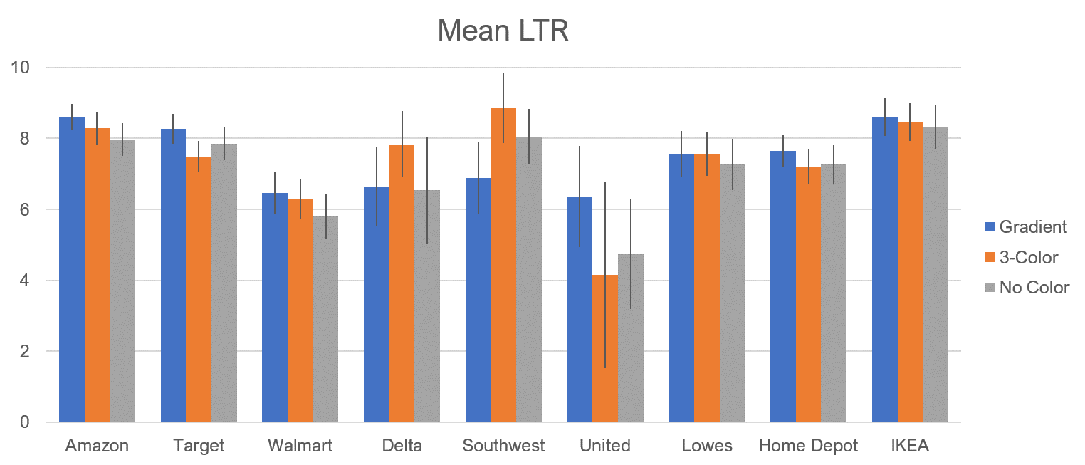
Figure 6: Difference in response patterns for each of the nine brands for the gradient, three-color, and no-color variations of the Likelihood to Recommend item. Error bars are 90% confidence intervals.
There is less of a pattern with the satisfaction item. The no-color version tends to be lower one or both the colored versions for some, but not all, brands; in two cases (Southwest and Home Depot) it’s nominally the highest.
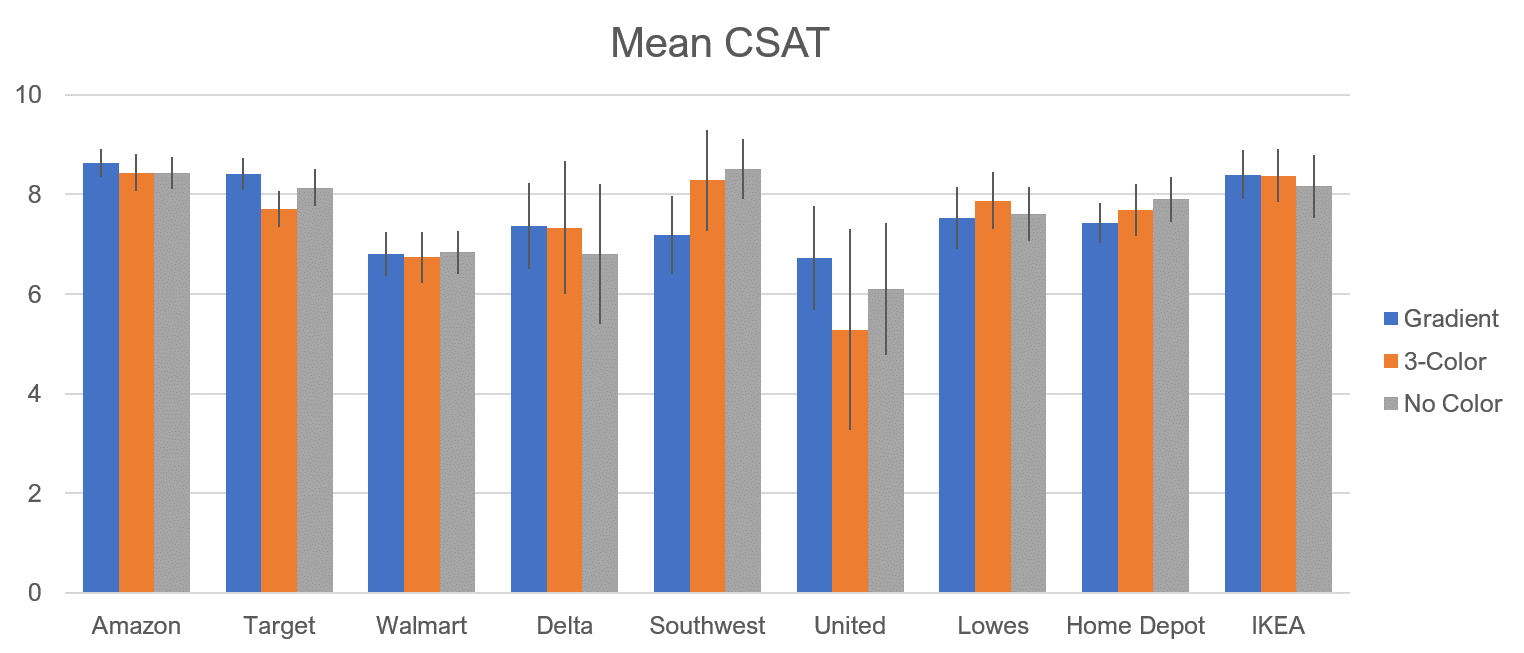
Figure 7: Difference in response patterns for each of the nine brands for the gradient, three-color, and no-color variations of the satisfaction item. Error bars are 90% confidence intervals.
The results of Study 1 suggested that adding color may have a small effect of reducing detractor responses, but only when the results are aggregated across participants and across brands. However, the sample sizes in the between-subjects setup were relatively modest and only large enough to detect medium-size differences.
Study 2: Three-Color vs. No Color: Within Subjects
In the second study to control for the variability between participants, we used a within-subjects approach. We also focused on just two variants—the three-color and no-color versions—as the gradient and three-color showed similar results in study 1.
In September 2019, we asked 184 participants to reflect on a subset of the brands from the first study (Target, Lowes, Home Depot, and IKEA) and again asked the 11-point Likelihood to Recommend (LTR) item and an 11-point satisfaction item. Participants were again only shown companies that they reported having made a purchase from in the last year.
Because this was a within-subjects study, participants saw both versions of the LTR item and both versions of the satisfaction item in the same study. These questions were part of a larger survey and the two variants were randomized to be shown either in the beginning of the survey or at the end.
Study 2 Results
The aggregated results across participants and brands are shown in Figure 8 for the Net Promoter Score. As was seen in Study 1, the three-color response scale has the effect of slightly reducing the number of detractors compared to the standard no-color group (21% vss 18%) and, in this case, increasing the number of promoters (51% of the three-color and 47% for the no-color).
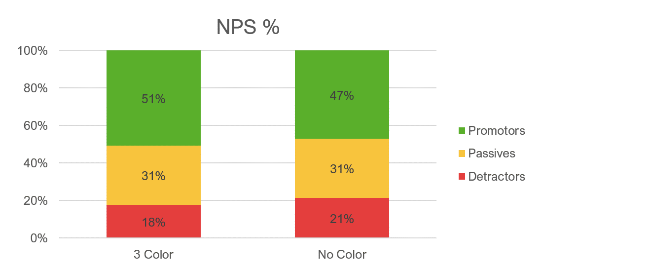
Figure 8: Difference in response patterns for aggregated responses for the three-color and no-color variations of the Likelihood to Recommend item.
A similar pattern is also seen with the satisfaction item. The percentage of least satisfied is reduced in the three-color group (15% vs. 11%) and those reporting the highest satisfaction increased (47% for the three-color and 45% for the no-color).
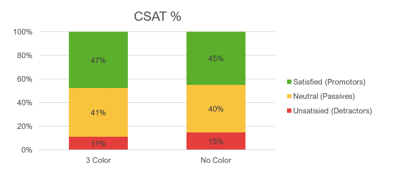
Figure 9: Difference in response patterns for aggregated responses for the three-color and no-color variations of the satisfaction item.
Figure 10 shows the differences between brands for the Likelihood to Recommend item. In general, the three-color version had slightly higher means (between 1% and 3%) and the difference (using a paired t-test) was statistically significant for Target (p = .04) and Home Depot (p < .01).

Figure 10: Differences in mean Likelihood to Recommend scores between the three-color and no-color versions. Target and Home Depot differences were statistically significant (p < .05).
Figure 11 shows the differences between brands for the 11-point satisfaction item. Again, the three-color version had slightly higher means (between 1% and 2%). The difference (using a paired t-test) was only statistically significant for Target (p = .03).
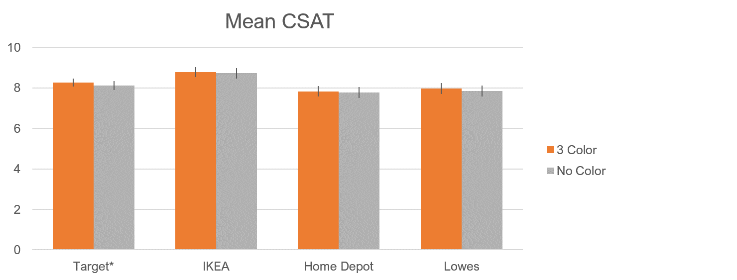
Figure 11: Differences in mean satisfaction scores between the three-color and no-color versions. The Target differences was statistically significant (p < .05).
Slight Positive Shift
To better understand what is causing the shift in mean scores, we looked at the number of participants who moved categories when the three-color scale was used for the Likelihood to Recommend item. In total we had 518 responses from the 184 participants across the four brands and two scale variants. Table 1 shows that there is shifting between all categories (we’d expect some movement just from chance), but the largest movement is from negative to positive: detractors to passives (17) and from passives to promoters (15). This is offset with around half as many moving from passive to detractor, but it’s still enough to see a modest shift in scores upward. A similar pattern was seen with the satisfaction scale as well.
| From | To | NPS Number | NPS % | CSAT Number | CSAT % |
|---|---|---|---|---|---|
| Detractor | Passive | 17 | 3.3% | 13 | 2.5% |
| Passive | Promoter | 15 | 2.9% | 13 | 2.5% |
| Promoter | Passive | 8 | 1.5% | 6 | 1.2% |
| Passive | Detractor | 9 | 1.7% | 3 | 0.6% |
Table 1: Shift of the 518 responses across four brands from no-color to the three-color version. In general, there was a slight shift to more positive responses (somewhat offset by some shifts to more negative responses).
Summary and Takeaways
Across two studies with 413 participants manipulating the color of the 11-point response scale we found:
Color increases scores modestly. Adding color to an 11-point scale had a small effect in both studies (but rarely was the difference statistically significant). This was surprising given the visually salient difference of adding color. Even in our within-subjects study that controlled for variation between people, differences in scores were between 1% and 2%. The largest differences were observed when aggregating across people and brands, but even then, the differences were still modest at around 3%. We saw larger differences from showing or not showing the neutral label, corroborating the research by Tourangeau et al. (2009) that found labeling had a larger effect than colors.
Colors may act as a heuristic. Some earlier research suggests that participants look for clues on how to respond to scales (e.g., numbers, labels, and the presentation order) and color acts as another heuristic (a mental shortcut) on what points mean (red is bad, green is good).
The gradient and three color variations had similar patterns. In study 1 we tested two color variations (the three-color and gradient) and found both generated similar results and had slightly higher means than the no-color group. This suggests the gradient of color, which doesn’t necessarily reveal the net-scoring scheme, acts similarly.
There’s not enough to change your approach; just be consistent. Many people are concerned about using the “wrong” scales, and certainly some online articles make the consequences sound dire. Fortunately, our results suggest the effects are quite small. We didn’t ask participants which scale they preferred, nor did we time responses (all can be topics for future work). However, the small differences here are similar to what we observed when changing the LTR from 11 to 5 or 11 to 10 points—less than 5% difference. This suggests that as long as you are consistent and focus on changes over time, using either color or non-color scales will have comparable (although not identical) results. In the absence of external benchmarks to gauge which is the “right” way, it’s hard to conclude that colored scales are “wrong.” Nevertheless, the prudent thing to do is be consistent and not change your scale presentation so you can more effectively compare scores over time.