 In an earlier article, we examined the folk wisdom that three-point scales were superior to those with more, such as five, seven, ten, or eleven response options.
Across twelve published studies we found little to suggest that three-point scales were better than scales with more points and, in fact, found evidence to show that they performed much worse than scales with more points. Almost all authors recommended using more scale points to prevent respondents from being coerced into a response and the subsequent loss in reliability and validity.
But what about using a scale with many points and then converting it into a three-point scale? This is the case with the Net Promoter Score. To compute the Net Promoter Score, you convert the eleven-point Likelihood-to-Recommend item into three points (Promoters, Passives, and Detractors).
Some have argued that if you’re going to convert to a three-point scale, why not just use a three-point scale to start with? Aren’t they easier to respond to (see the tweet below)? It’s an interesting question that we’ll explore in depth in this article.

As we’ve discussed in an earlier article, reducing the eleven points into three points will lose some information (for example 0s and 1s are treated the same as 5s and 6s). However, there’s good evidence that the most extreme responses (most favorable and least favorable) are better predictors of future respondent behavior. In other words, what is lost may be what’s worth losing anyway. And fortunately, the information isn’t really lost because you can easily track both the mean Likelihood-to-Recommend response and convert back to the eleven-point scale even if the business emphasis is on NPS.
Specifically, we found that the most extreme responders to the Likelihood-to-Recommend item (the 10s and 9s) were actually the most likely to have recommended in the subsequent 90 days. We also found that the least favorable respondents accounted for most of the negative comments.
To understand the effects of changing the number of response options, in an earlier study we compared five-, ten-, and eleven-point versions of the Likelihood-to-Recommend item. We generally found comparable results when computing Net Promoter Scores. The average absolute difference when changing scales was only around 4 percentage points. We didn’t test a three-point version, largely because you need at least four points to have some idea about the intensity of agreement, and ideally, five points to have a neutral point too.
We recommend companies not change their scale if they have historical data, as whatever they may gain will most likely be more than offset by the loss of historical comparisons. But five- and ten-point scales have enough points to allow respondents to differentiate between weak and strong agreement. Both five- and ten-point scales were rated as easier to use than three-point scales in one study. So what happens if we just use three-point scales instead?
To find out, we conducted three studies using the Net Promoter Score item to corroborate or clarify earlier research findings that three-point scales would be less valid and reliable. We followed a similar approach described in Preston & Coleman (2000) but focused specifically on the Likelihood-to-Recommend item and used only eleven- and three-point scale variations. Our analysis also used larger and more diverse (non-student) sample sizes.
Study 1: Three- or Eleven-Point LTR in a Larger Survey
In November 2018 we asked 923 participants to rate how likely they would be to recommend the company they already most recently recommended and to rate how likely they would be to recommend a mix of common brands (they may or may not have purchased from). This mix included airlines, retail stores, rental car companies, and mobile service providers. Participants came from a non-probability sample of the general US population who were compensated to take the survey, and included a mix of genders, ages, and occupations from an online panel.
In the survey we randomly presented to each respondent two versions of a Likelihood-to-Recommend item for each product or brand they rated. In one we asked participants if they would recommend the company in the next 30 days using a three-point Yes/No/Maybe scale along with other brands (as shown in Figure 1).
The other was a standard eleven-point scale bounded by 0 (not at all likely) – 10 (extremely likely) presented in a grid along with other brands that were alternated. We did not include the 30-day timeframe to prevent confusion about asking a similar question about the same brand. The order of the questions and brands in the grid were randomized (also shown in Figure 1) and were shown on different pages.
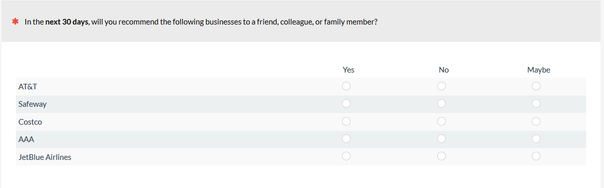
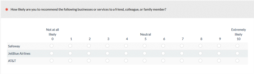
Figure 1: Will you recommend three-point version (Yes/No/Maybe) and a standard eleven-point Likelihood-to-Recommend presented in a grid with multiple brands.
After these questions, we asked participants several questions about their social media usage and to rate a recent website experience using the SUPR-Q. The total survey lasted approximately 12 minutes.
We then reminded participants at the end of the survey about the two scales they were presented with, and similar to Preston & Coleman, we asked them to select which version was:
- easier to use
- quicker to use
- best at allowing them to express their feelings
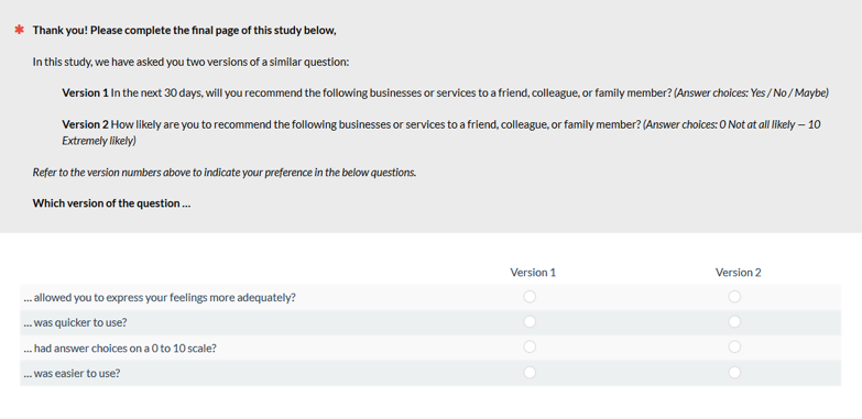
Figure 2: Preference question posed to respondents at the end of the survey after answering both the three-point and eleven-point versions.
To be sure respondents were attentive and understood the question, we asked them to select which version had a 0 to 10 scale and which had a three-point scale. This removed 99 respondents (11%) who either misunderstood the question or were inattentive, leaving a final sample size of 824 (about seven times the Preston & Coleman sample).
The results of the scale preferences are shown in Table 1.
| 3 Point Preference | 11 Point Preference | |
|---|---|---|
| Easier | 63% | 37% |
| Quicker | 72% | 28% |
| Express feelings more adequately | 19% | 81% |
Table 1: Preference for three- vs. eleven-point response options for the Likelihood to Recommend item (n = 824). All differences are statistically significant.
Similar to the Preston and Coleman findings, respondents rated the three-point scales as being easier and quicker to use by around a 2 to 1 ratio. However, also similar to their findings, participants overwhelmingly rated the eleven-point version as allowing them to express their feelings better by more than a 4 to 1 ratio (19% vs. 81%).
To understand how well the three-point scale mapped to the promoters, passives, and detractors, we mapped the Yes/Maybe/No responses onto the NPS designations derived from the eleven-point Likelihood to Recommend item as shown in Table 2.
| Count | Percent | Count | Percent | ||
|---|---|---|---|---|---|
| Yes | 902 | 36% | Promoters | 767 | 30% |
| Maybe | 639 | 25% | Passives | 475 | 19% |
| No | 994 | 39% | Detractors | 1293 | 51% |
| NPS (Yes-No) | 2535 | -4% | NPS | 2535 | -21% |
Table 2: Correspondence of a three-point will recommend scale (yes/maybe/no) to the eleven-point NPS designations. Total sample size is 824 with multiple questions combined across products/brands to generate 2535 total responses for each scale type to compare (cells rounded to whole number).
For example, when given the three-point option, respondents selected Yes (they will recommend) 36% of the time; however, only 30% of respondents were promoters (9s and 10s). That absolute 6 percentage point difference is a relative 18% increase in promoters. The case was similar for maybes and passives (25% vs. 19%). The most dramatic difference was for the detractors where 51% responded 0 to 6 on the eleven-point scale compared to 39% who said “NO” (they would not recommend) on the three-point scale (absolute difference of 12%; 31% relative increase in estimated percent detraction). The consequence is of course the aggregated Net Promoter Scores from the two scales differed by a large amount (17 points — much higher than the 4-point changes seen in our earlier analysis).
This large gap in detractors is mostly because of many respondents who selected the “5” option, the midpoint of the scale, which classifies them not as a maybe, but as a detractor. In an earlier analysis, we’ve found that respondents from 0 to 6 account for 90% of the negative comments, even though they provide a more neutral response. In future analyses we will continue to investigate the validity of the designations.
This first study established that three-point scales don’t naturally map to promoters, detractors, and passives, and respondents found that three-point scales prevented them from expressing their feelings adequately. However, there are possible mitigating effects from other survey items and confounding effects from using a 30-day and indefinite periods for the two recommend items. We conducted another study to address these effects, added the ability to measure the intensity of the preference for each scale type and explored other ways of how Yes/Maybe/No may map better to the eleven-point scale.
Study 2: Preference Intensity for Three- or Eleven-Point LTR
In Study 1 we provided only binary options (preferring three points vs. eleven points) that forced respondents to select one, even if they didn’t have an opinion or strong opinion. To better understand the magnitude of preference, in Study 2 we used a seven-point scale to add intensity in addition to preference. A score of 1 indicated strongly preferring the three-point scale, a score of 4 indicates no preference, and a score of 7 indicates strong preference for the eleven-point scale.
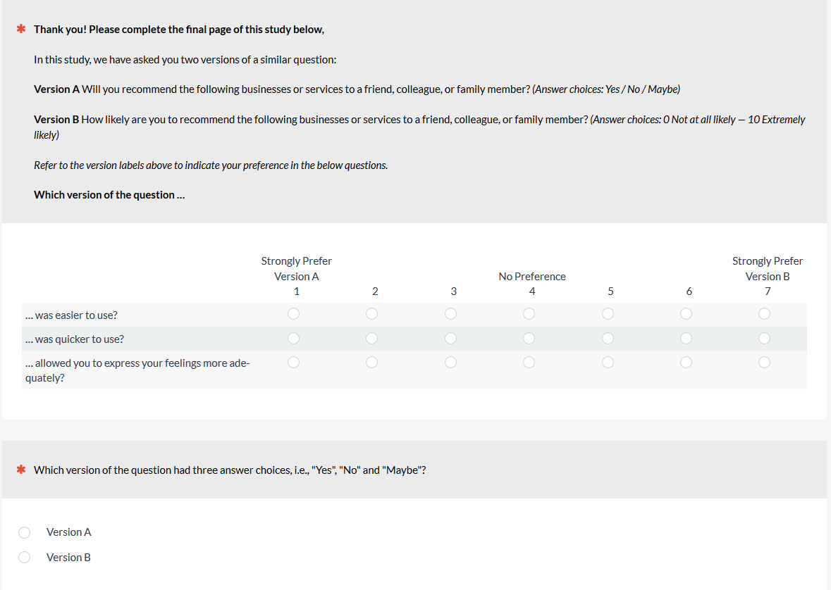
Figure 3: Preferences for the Yes/No/Maybe scale or the eleven-point scale.
In a survey similar to Study 1, we asked 701 participants to rate how likely they would be to recommend a business they recently purchased from to a friend, colleague, or family member.
We presented two versions of the scale to each respondent: A three-point Yes/No/Maybe, or the standard eleven-point scale bounded by 0 (not at all likely) – 10 (extremely likely). The order of the scales was randomized so participants would get the three-point or eleven-point first. Both questions used the same indefinite future time frame (as opposed to one using the 30-day period in Study 1).
We also included the quality/comprehension question and asked respondents to select which version had Yes/No/Maybe. We removed 67 respondents (10%) who answered incorrectly which resulted in a total sample size of 634.
Similar to Study 1, the mean response to each question indicated a preference for three-point scales (by comparing the mean to the midpoint of the scale) for being easier (mean = 3.6; p < .01) and quicker (mean = 3.4; p < .01) but had a stronger preference for the eleven-point scale for expressing feelings adequately (mean = -4.8; p <.01).
Table 3 shows the percentage of respondents that selected each response.
| Easier | Quicker | Express Feelings | |
|---|---|---|---|
| Strongly prefer 3 pt | 27% | 33% | 13% |
| 12% | 13% | 6% | |
| 7% | 7% | 4% | |
| No Preference | 23% | 19% | 18% |
| 7% | 6% | 11% | |
| 10% | 9% | 19% | |
| Strongly prefer 11 pt | 14% | 14% | 29% |
Table 3: Percent of respondents who preferred the three-point or eleven-point version based on ease, quickness, and ability to express feelings.
Around a fifth of respondents indicated no preference for either scale across each question. Using the most intense preferences (top two box) echoes the results of the mean. Respondents were about 50% more likely to prefer the three-point scale for ease (39% vs. 23%) and 60% more likely to prefer it for quickness (46% vs. 23%), but more than 150% as likely to prefer the eleven-point scale for expressing feelings adequately (48% vs. 19%).
We again mapped the Yes/Maybe/No questions to the eleven-point scale to understand how using three points may approximate the eleven points and how similar the Net Promote Score would be (Table 4).
| Aggregated | Count | Percent | Aggregated | Count | Percent |
|---|---|---|---|---|---|
| Yes | 780 | 41% | Promoters | 634 | 33% |
| Maybe | 506 | 27% | Passives | 309 | 16% |
| No | 616 | 32% | Detractors | 959 | 50% |
| NPS (Yes-No) | 1902 | 9% | NPS | 1902 | -17% |
Table 4: Correspondence between Yes/Maybe/No and Promoters/Passives/Detractors, and corresponding “Net” scores, which differed by 26 points (9% vs. -17%).
Table 4 shows a similar pattern to the results of Study 1. When given the three-point option, respondents selected “Yes” 41% of the time compared to there being only 33% of respondents designated as promoters (9s and 10s). That absolute 8 percentage point difference is a relative 23% increase in promoters. The case is similar for “Maybe” and passives (27% vs. 16%) and “No” compared to detractors (32% vs. 50%). This gap in detractors is again because a large number of respondents selected the “5” option, the midpoint of the eleven-point scale, which classifies them not as maybes but as detractors. Again the aggregated NPS that shows the effects of the different scales shows a large difference (+9% vs. -17%, a difference of 26 points), which again was much greater than the average difference observed in our earlier study.
The data is showing that all Yeses, Noes, and Maybes are NOT created equally. To understand the different levels of intensity contained within each Yes/Maybe/No response, Figure 4 shows how respondents expressed their opinions when given the choice.
“Yes” clearly clusters near the top of the scale, but the eleven-point scale is able to differentiate between the extreme “Yes” responders — 53% selected 10, compared to the less extreme 9s (17%) — and more tepid 8s and 7s (11% and 9% respectively). The same is seen with the “No” respondents, who also selected 0 the most (43%), but there were quite a few less intense responses (26% selected between 1 and 4). As we’ve shown earlier, the most extreme responders (especially those 10s), were a better predictor of who actually recommended in the subsequent 90 days. We found between 51% and 77% of recommendations came from the 9s and 10s (promoters).
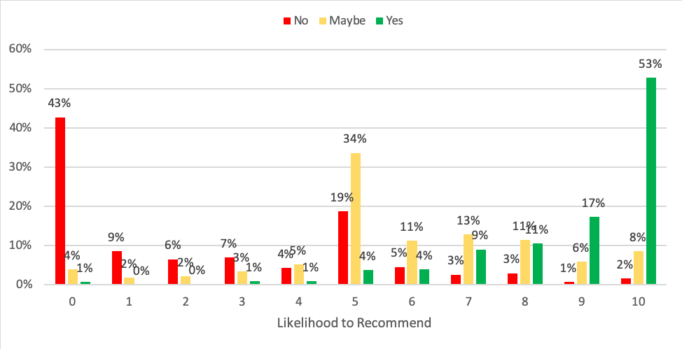
Figure 4: Distribution of how Yeses, Maybes, and Noes map to the eleven-point LTR item, showing not all Yeses are created equal, with more than half selecting 10 and 37% selecting 7, 8, and 9.
Across two studies we see a similar pattern: respondents, when asked, tend to prefer the three-point scale for ease and quickness but even more strongly prefer the eleven-point for allowing them to more adequately express their feelings. In analyzing the distribution of “Yes,” “Maybe,” and “No” against the eleven-point scale, the intensity of response is lost. For example, roughly half the Yeses selected the most extreme response of 10 whereas the other half were mostly spread across less extreme responses (7–9), suggesting less of an inclination to recommend (which we’ve corroborated in an earlier study).
Perception of speed isn’t the same as actual speed and it’s something we can more objectively measure in our final study.
Study 3: Time To Complete, Three vs. Eleven Points
In this study we wanted to see how much faster three-point scales were to answer. In July 2019 we asked 113 U.S. based online panel participants to answer two questions: how likely they are to recommend the most recent restaurant they visited and how likely they are to recommend their mobile service provider. We felt these two questions would generate a more favorable response (for restaurants) and a less favorable response (for mobile carriers).
As in studies 1 and 2, respondents were presented with both a three-point question (Yes/Maybe/No) and the standard eleven-point Likelihood-to-Recommend item. Items were presented in random order to minimize sequence effects. The rating scales were shown alone on the page, which allowed us to collect response time data in MUIQ automatically and isolate it to each question.
After presenting the scales, we again asked preference questions on seven-point scales (preference on easier, quicker, and expression of feelings).
To minimize dropout rates and possibly influences from other questions, we minimized the number of survey questions, including only seven. Demographic data was not collected but participants were U.S. based and represented a mix of ages (21–65) and genders. The median time to complete the survey was 2 minutes and 50 seconds.
As before, we removed respondents who didn’t correctly differentiate between the three- and eleven-point scales, removing 10 respondents and leaving 103 responses to compare times with. The preference for the scales are shown in Table 5.
| Easier | Quicker | Express Feelings | |
|---|---|---|---|
| Prefer/Strongly Prefer 11 | 17% | 12% | 56% |
| Prefer/Strongly Prefer 3 | 48% | 62% | 14% |
Table 5: Top 2 box preference (prefer/strongly prefer) for the three-point vs. eleven-point scale.
As in studies 1 and 2, respondents preferred the three-point scale for perceived ease and quickness but preferred the eleven-point for allowing them to express their feelings adequately. The size of the preference for quickness and ease are larger in this study, however, suggesting the shorter study may allow participants to more readily recall the experience.
Also as in studies 1 and 2, the differences in computed “Net” scores for recommending cellphone carriers (Table 6) and restaurants (Table 7) generates quite different scores if a three-point scale is used versus the eleven-point promoter-minus-detractor computation. The difference was 67 points for cellphone carriers (48% vs. -19%) and 42 points for most recent restaurant (76% vs. 34%).
| Phone Recommend | Percent | Phone LTR | Percent |
|---|---|---|---|
| Yes | 54% | Promoters | 26% |
| Maybe | 39% | Passives | 28% |
| No | 7% | Detractors | 46% |
| NPS (Yes-No) | 48% | NPS | -19% |
Table 6: Difference in responses to cell-phone carrier recommendation intention and computed “Net” score for Yes/Maybe/No and Likelihood to Recommend.
| Restaurant Recommend | Percent | Restaurant LTR | Percent |
|---|---|---|---|
| Yes | 82% | Promoters | 51% |
| Maybe | 13% | Passives | 31% |
| No | 6% | Detractors | 17% |
| NPS (Yes-No) | 76% | NPS | 34% |
Table 7: Difference in responses to restaurant recommendation intention and computed “Net” score for Yes/Maybe/No and Likelihood to Recommend.
The median times to complete the three- vs. eleven-point items are shown in Figure 5. Because these were the same participants, we had higher statistical power in using a paired-t test, and smaller differences can be detected. However, even with this higher power we found no statistical differences in times for either question (using both the raw and log transformed times). Figure 5 shows the median times and 90% confidence intervals.
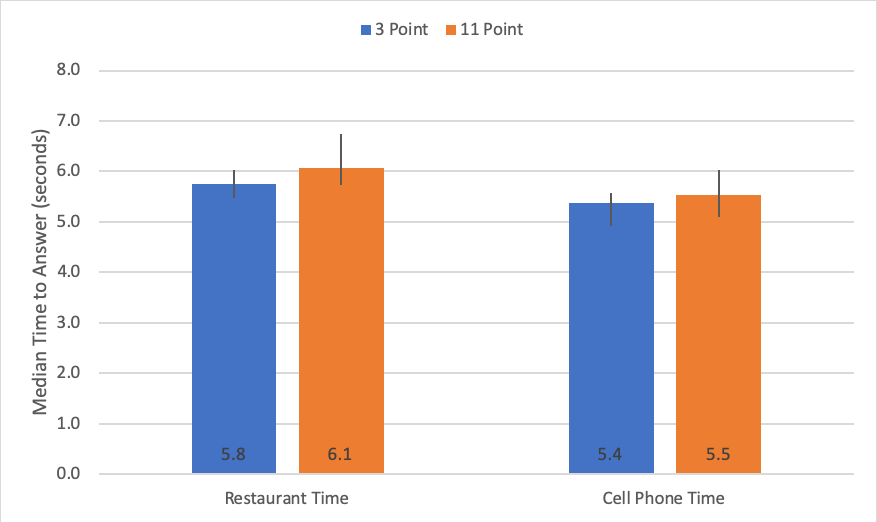
Figure 5: Difference in response time for three- vs. eleven-point scales for two LTR items. Differences are not statistically significant using a paired-t test (p = .10 for restaurant; p = .59 for cell phone carrier time).
It took about five and a half seconds on average for respondents to answer both forms of the questions. The eleven-point scales nominally take longer, but the difference in time is barely perceptible, at an average difference of between one-tenth to three-tenths of a second. That’s about the same amount of time it takes to blink!
Study 3 suggests that while participants may perceive three-point scales as being quicker to respond to, the actual response time was virtually the same. Of course if many dozens of questions are contained in a survey, it’s likely the total survey time will increase. For example, rating ten eleven-point items may add between 1 and 3 seconds compared to ten three-point items. A future study can examine the number of items, more types of questions, and the effect on time.
Summary and Takeaways
Across three studies that compared the differences between three-point and eleven-point Likelihood to Recommend item we found:
Three points are perceived as quicker and easier but stifling. Across three studies participants rated three-point scales as being easier and quicker but rated eleven-point scales as better allowing them to express their feelings adequately. This corroborates the earlier findings of Preston & Coleman, who found similar preferences.
Scores are not interchangeable. Net Promoter Scores derived from three-point scales differ substantially from those derived from eleven-point scales. Our earlier analysis found that five- and ten-point scales tended to generate more comparable results with an average difference of 4 points (and the largest difference was 14 points). Using the aggregated data to create Net Promoter Scores across multiple brands resulted in both different and much higher net scores. In two surveys, the three-point NPS and eleven-point NPS differed by 17 points in Study 1, 26 points in Study 2 (21.5 points on average), and 42 points and 67 points in Study 3.
Not all yeses are created equal. One attractive aspect of the three-point scale is the seemingly universal understanding of the labels applied. After all, doesn’t everyone know what Yes, No, and Maybe mean compared to numbers from 0 to 10? Our analysis shows a lot of ambiguity in those words. One person’s “Yes” might be better read as a “YES!” compared to another person’s more tepid “Yes, I guess.” In contrast, a 10 is greater than a 9, which is greater than an 8 and these quantities are universally understood as being greater. Providing eleven response options on this scale better reflects the underlying attitude continuum that is only coarsely measured with three-point scales. The distribution of responses shows, for example, that on the eleven-point scale roughly half of yeses selected a 10 (YES!!!), 75% selected a 9 or 10 (YES!), but 25% selected less intense responses (Yes, I guess).
Maybe probably means no. One of the main differences between the three-point and eleven-point version was how the maybes were treated. Many respondents who said “Maybe” had corresponding eleven-point scores near the neutral point (5). The NPS computation treats these responses as detractors—that is, people who won’t recommend and are more likely to discourage others from a brand. One criticism of the NPS designations is that while these respondents are less likely to recommend, it doesn’t necessarily mean respondents will discourage others from a company. A future analysis can examine the relationship between actual detracting and lower scores on the LTR item. However, our earlier analysis indicated that MOST people won’t recommend, especially respondents with more tepid responses (between 5 and 7), lending credence to the practice of treating these mediocre responses as people who really won’t recommend.
Gain in speed is offset by loss in validity. This analysis suggests that whatever little is gained in the reduction of time to answer an eleven-point scale is more than lost by both the frustration you are giving respondents in limiting their response options and the subsequent loss of reliability and validity of the scale. Using only three points loses information about the extreme responders, who tend to be better predictors of behavior. As in all research, there are tradeoffs. What’s worse: asking respondents to spend a fraction of a second more to respond or forcing them to pick a response option that doesn’t reflect how they feel? Then is that error made worse by thinking a response of Yes/Maybe/No truly reflects their feelings?
Three-point scales permanently lose information. Why not just have a three-point scale if you are going to collapse eleven points to three points? This analysis shows that eleven points allow you to better differentiate intensities, and therefore likely recommenders, whereas only showing three points puts mediocre responses with the most intense. While converting an eleven-point scale to three points loses information, the loss isn’t permanent as you can still examine the distribution of responses and, if you wish, track the mean Likelihood to Recommend along with the NPS. However, if you start with a three-point question you give up any ability to capture the intensity of response needed to accurately map to standard Net Promoter Scores.
Thanks to Lawton Pybus, PhD, for assisting with the data collection and Jim Lewis, PhD, for providing comments on this article.