 The food delivery market has been growing significantly over the past five years. That growth exploded in the United States from $17 billion in 2018 to $26 billion in 2020 (partly due to COVID-19).
This market is highly competitive and has ultra-thin profit margins. Technologies such as route optimization enable faster and cheaper delivery, but dissatisfied customers can easily switch providers. Service providers that don’t provide outstanding user experiences and customer incentives risk losing business, and in this market, that could mean going out of business.
To better understand this domain, we benchmarked the user experiences of the following top food delivery services to see how people use them and how they might be improved:
We collected SUPR-Q and Net Promoter data, investigated reasons for using the services, measured users’ attitudes regarding their experiences, conducted Kano and key driver analyses, and analyzed reported usability problems.
The food delivery market has been growing significantly over the past five years. That growth exploded in the United States from $17 billion in 2018 to $26 billion in 2020 (partly due to COVID-19).
This market is highly competitive and has ultra-thin profit margins. Technologies such as route optimization enable faster and cheaper delivery, but dissatisfied customers can easily switch providers. Service providers that don’t provide outstanding user experiences and customer incentives risk losing business, and in this market, that could mean going out of business.
To better understand this domain, we benchmarked the user experiences of the following top food delivery services to see how people use them and how they might be improved:
We collected SUPR-Q and Net Promoter data, investigated reasons for using the services, measured users’ attitudes regarding their experiences, conducted Kano and key driver analyses, and analyzed reported usability problems.
Benchmark Study Details
In December 2020 and January 2021, we asked 220 U.S. residents who used at least one food delivery service in the past year to participate in a retrospective study in which they reflected on their experiences. Participants completed the eight-item SUPR-Q (which includes the Net Promoter Score), answered the UMUX-Lite standardized questionnaire, and answered questions about brand attitudes, usage, and their prior experiences.Quality of the Food Delivery Website User Experience: SUPR-Q
The SUPR-Q is a standardized measure of the quality of a website’s user experience and is a good way to gauge users’ attitudes. It’s based on a rolling database of around 200 websites across dozens of industries, including food delivery. SUPR-Q scores are percentile ranks that tell you how a website experience ranks relative to the other websites (so the 50th percentile is average). The SUPR-Q provides an overall score as well as detailed scores for subdimensions of usability, trust, appearance, and loyalty. The four food delivery websites averaged at the 66th percentile. In this study, Grubhub had the lowest SUPR-Q (53rd percentile) and Postmates had the best (84th percentile).Usability Scores and Trust
We asked participants to reflect on how easy they thought it was to use and navigate through the websites. Postmates had the highest score (92nd percentile) and Uber Eats had the lowest (75th percentile). Comments about Uber Eats usability included“I do not like how it is not always immediately clear which places are open for delivery at that time.”
“Takes a lot of time to load.”
Trust scores were generally lower than usability scores, with a high at the 74th percentile for Postmates and a low at the 40th percentile for Grubhub.Loyalty/Net Promoter Scores
The food delivery websites had an average NPS of −4%, so for most websites, there were slightly more detractors than promoters. In general, a good user experience is a good predictor of high loyalty.Use of Food Delivery Sites and Mobile Apps
As a part of this benchmark, we asked participants how they accessed the food delivery services. All participants reported using their desktop/laptop computers, with 75% also using mobile apps and 51% using mobile websites. The typical frequency of use was a few times a year for websites and a few times a month for mobile apps.Components of the Online Food Delivery Experience
Across the websites, using a series of five-point scales (see Key Drivers), we computed the top-two box percentages of items that rate components of the food delivery experience. Overall, 90% of participants agreed that it was easy to pay online; 83% indicated it was easy to request contact-free delivery. At the lower end of the ratings, only 38% thought the service helped them make healthy choices, and only 39% wanted their provider to offer a subscription service.Key Drivers
To better understand what affects SUPR-Q scores and Likelihood-to-Recommend (LTR) ratings, we asked respondents to agree/disagree with the following attributes of the food delivery services on a five-point scale from 1 = strongly disagree to 5 = strongly agree. We conducted key driver analyses (regression modeling) to quantify the extent to which ratings on these items drive (account for) variation in overall SUPR-Q scores and, separately, LTR.- The menus are clear and understandable.
- It’s easy to modify menu items for my order.
- I know how much I’ll be charged for the order, including any delivery fees.
- It’s easy to pay for the order online.
- The website keeps my information secure.
- The process is convenient.
- It’s easy to order exactly what I want.
- Making special requests is no problem.
- The delivery service is a good value for the price.
- There are no hidden fees.
- My order is always correct when it arrives.
- My food comes in the condition I expect.
- The website offers a wide range of restaurants to choose from.
- The delivery service is timely.
- I don’t have to wait too long to get my order.
- It’s easy to communicate with the delivery driver.
- It’s easy to look at my order history.
- The delivery driver keeps my food safe and clean.
- The website helps me discover new restaurants.
- The website helps me make healthy food choices.
- It’s easy to request contact-free delivery.
- I prefer a food delivery service that offers a subscription option that covers or reduces per meal fees.
- I prefer a food delivery service that has discounts for multiple future orders.
Key Drivers Include Information Security, Value, and Convenience
SUPR-Q : The top key driver from the list above was “The website keeps my information secure” (accounting for 19% of SUPR-Q variation). Two services had top-two box scores around 74%, and the other two were around 67%. Other significant key drivers included convenience and getting a good price for the value. LTR : Of the 23 items in the attributes list, five accounted for significant amounts of variation in the ratings of LTR ratings (which is the measure from which NPS scores are derived). “The delivery service is a good value for the price” was the top driver in this analysis. The top-two box scores for this attribute ranged from 39–55%, indicating a significant opportunity for improvement.Kano Analysis
We conducted a Kano analysis on 14 current and proposed features for food delivery services. In a Kano analysis, participants rate features on how much they would like a service with the feature and how much they would dislike a service lacking the feature. Then, the features are placed in a scatterplot with four labeled quadrants. As shown in Figure 1, about half of the features were categorized as Performance (like having and expected), and half were Attractive (like having but not expected—i.e., delightful). For example, one of the top Attractive features was to provide online order modification within a grace period (#9).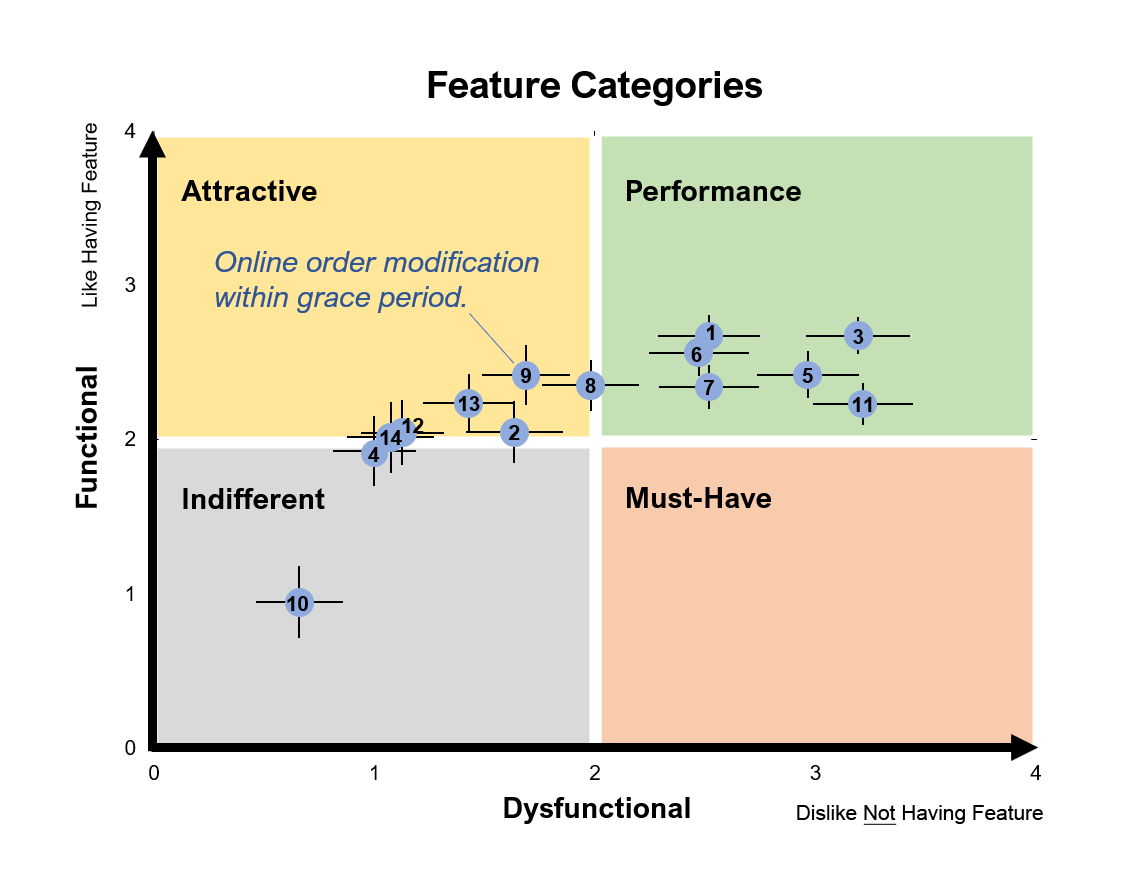
Figure 1: Results of a Kano analysis of 14 current and proposed food delivery features.
What to Improve
Key areas of improvement cited by respondents for each website/app include:- DoorDash: Hidden prices and fees (e.g., “I dislike the amount of fees they add to the order.”)
- Grubhub: Too many pushy pop-ups (e.g., “All the pop-ups pressure to order.”)
- Postmates: Service responsiveness (e.g., “I had an unfavorable experience in the past in which the site glitched and placed the same order twice and I had difficulty getting a refund.”)
- Uber Eats: Difficult to modify orders (e.g., “Not enough customization options in order menus [can’t make substitutions on a burger at McDonalds, for example].”)