 You’ve probably taken a survey or two in your life, maybe even this week.
Which means you’ve probably answered a few types of survey questions, including rating scale questions.
Earlier I outlined 15 common rating scale questions with the linear numeric scale being one of the most used.
Examples of linear numeric scales include the Single Ease Question (SEQ) and the Likelihood to Recommend item (LTR) (the latter is shown in Figure 1).
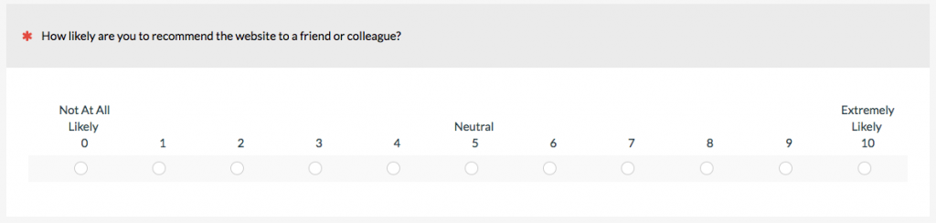 Figure 1: Example of a linear numeric scale: the common Likelihood to Recommend item used to compute the NPS.
When asking respondents a lot of linear numeric questions you can save space by combining them into a multiple rating matrix, or “grid,” such as the one shown in Figure 2.
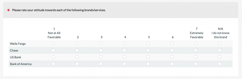
Figure 2: Example of a grid that combines four linear numeric scales.
While using a grid allows for a more compact presentation, does combining the items into a grid of rating scales versus asking them in isolation affect responses?
Research on Grids vs. One at a Time
As is often the case with other questions on survey items and response options (for example, labeling, question order, and number of response options), it can be difficult to find general rules. A good place to start is the published literature to see what’s already been researched.
When it comes to this topic, a lot has already been done. The main focus of research has been on differences in reliability, straightlining (participants answering many questions with the same response options), the response/drop-out rate, and the impact from mobile screens. Here’s a summary of several articles:
Couper, Traugott, and Lamias (2001), in a study of 1,602 students, found increased correlations between items (higher reliability) when placed in a grid versus alone and also found grid responses were completed slightly faster.
Tourangeau, Couper, and Conrad (2004) had 2,568 participants from an online panel answer 8 questions about diet and eating habits with three different presentation styles: all on the same page in a grid, two pages (one grid per page), or presented one at a time on separate pages.
Internal reliability was highest when items were presented altogether in a grid (alpha = .62) and lowest when on separate pages (alpha = .51). However, when presented separately, the items loaded higher on their expected factors. There was also more straightlining in grids. Participants took about 50% longer to complete the questions when presented separately. The authors suspected a “near means related” heuristic (items close to each other ask about similar things) may cause respondents to respond more similarly when items are presented on the same screen.
Yan (2005) [pdf] also found an increase in internal reliability when presenting items in a grid versus on separate pages to 2,587 online panel participants.
Even the U.S. Census Bureau (Chesnut, 2008) tested the old-school paper-and-pencil forms and found that demographic information presented separately versus in a grid resulted in slightly higher (1.5%) response rates.
Toepoel, Das, and Van Soest (2009) measured arousal-seeking tendencies from 2,565 Dutch respondents. They found the reliability was slightly higher when the 40 items were presented on one grid on a screen compared to separately or broken up across ten screens. However, they also found this treatment resulted in higher non-response when placed in a grid.
Thorndike et al. (2009) found 710 Swedish respondents preferred the one-at-a time format over a grid when asking quality of life questions even though it took more time to complete.
Garland (2009), as reported in Callegaro, had U.S. panel participants rate which one of three forms they preferred: grid, multiple items per screen, or one per screen. He found no difference in reported satisfaction between versions, but contrary to other studies, the one-per-page version had the highest reliability, highest variance explained, and the factor structure that best matched the published factor structure of the questionnaire. Differences in means were also reported but the original article is no longer available to discern the pattern.
Bell, Mangione, and Kahn (2001) found no difference in reliabilities for a grid compared to one at a time and slightly faster completion time for the grid, with 4,876 respondents.
Iglesias, Birks, and Torgerson (2001) found older UK respondents (older than age 70) missed or skipped significantly more items (27% vs. 9%) when items were arrayed in a “stem and leaf” grid versus one at a time. They also found slightly better reliability when items were displayed separately.
Callegaro et al. (2009) had 2,500 U.S. panel participants answer nine items (some required reverse scoring) about mental health in one of five randomly assigned conditions ranging from displayed all in one grid to one per page. They found the one-per-page presentation had slightly higher internal reliability compared to the grid but took more than 50% longer to complete.
Grandmont, Goetzinger, Graff, and Dorbecker (2010) also found that 7-point Likert items, when presented in a grid, generated higher drop-out rates. Even though respondents took longer to take the one-at-a-time version compared to a grid (19 vs. 15 minutes), there was no difference in how long respondents thought the surveys took (both 15 minutes). Interestingly, they found straightlining was about the same for both the grid and one per page, but the highest when the grid was split across multiple page. The authors suspected respondents were more consciously attempting not to look like they were straightlining when in a big grid.
Respondents reported disliking long grids the most. This study also asked respondents how they would want to rate 25 product characteristics. Their responses seem to support the idea that “near means related” but also don’t want all items in one grid:
“State up front that there will be 25 questions, then divide them into thematic groups, no more than 3–5 per screen.”
“Don’t just throw a list of 25 characteristics up on the same page.”
Mavletova, Couper, and Lebedev (2017) also reported higher measurement error (e.g. straightlining) and lower concurrent validity from grids when testing on mobile screens from a Russian panel.
Liu and Cernat (2016) examined responses from 5,644 SurveyMonkey panel participants and actually found higher straightlining in grids but similar response times (for a short, <2 min survey). They also found higher non-responses for grid formats with seven or fewer response options compared to one-at-a-time presentations (especially for mobile respondents). They also found that grids with 9 or 11 response options led to substantial differences compared to item-by-item questions and posit that as the number of columns increase in a grid, the data quality may deteriorate.
I’ve summarized the findings across these studies in Table 1 (having to infer some conclusions from some papers):
| Grid | Alone | No Difference | |
|---|---|---|---|
| More Straightlining | 4 | 1 | |
| Increases Reliability/Variance Explained | 4 | 4 | 1 |
| Scores/Distributions Differ | 1 | 3 | |
| Higher Non-Response | 6 | ||
| Loading on Expected Factor/Higher Validity | 3 | ||
| Preference | 4 | 2 | |
| Takes Longer | 5 | 2 |
Table 1: Summary of studies comparing grid vs. standalone displays. Numbers represent the number of studies I uncovered that share a finding (e.g. six studies found grid displays increased non-response rates).
While some results are mixed as other factors moderate the effects, we can conclude that grids seem to increase non-responses and probably increase straightlining in many cases. When items are presented alone they tend to take longer (although participants may not notice as much) and they better match the intended factor structure but there isn’t much difference in scores. Not all grids are created equal as some studies explored, with massive grids (many rows and many columns) being the least preferred and potentially affecting response quality.
NPS Grid Study
To contribute to the extensive literature on grid versus separate page presentation we conducted our own study using an online U.S. panel in February 2019 for the popular Likelihood to Recommend (LTR) item used to compute the Net Promoter Score. We asked participants how likely they would be to recommend the following common brands:
- Amazon
- eBay
- Walmart
- Target
- Best Buy
- Apple
- Enterprise
- Budget
- United
- Southwest
Using our MUIQ platform, 399 participants were randomly assigned to either a grid where all brands were shown together in a fixed order (the order shown above) or they were shown one at a time in a random order (see Figure 3).
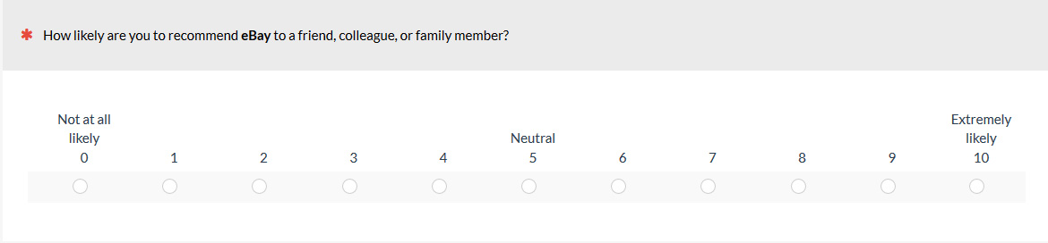
Figure 3: Differences in LTR scale presentations: in a grid (top) or on separate pages (bottom).
After the LTR items we also asked participants how many purchases they made with each of the brands in 2018 to look for differences between customers and non-customers. Respondents were required to answer all LTR items so we didn’t measure non-responses in this study.
LTR Results
We compared the mean LTR scores for each of the 10 brands when presented in the grid or alone for all respondents and then customers only (respondents who reported at least one purchase in the prior year).
For all respondents, the average score tended to be slightly higher when each brand was presented on its own page versus in a grid. The mean difference was .38 (3%) higher when the items were presented separately on their own pages. The difference in mean scores ranged from a low of .16 for eBay to a high of .81 on Target. Only one difference (for Target) was statistically significant (p = .024).
The pattern was attenuated when we examined customers only. In selecting only respondents who had indicated at least one purchase in 2018, we reduced the number of responses per brand modestly for Amazon, Walmart, eBay, and Target (sample size between 81 and 208 per cell) and more substantially for the two rental car and two airline websites (sample size between 10 and 29 per cell). This can be seen in Figure 4.

Figure 4: Difference in mean (likelihood to recommend) LTR scores when brands were presented in a grid versus alone on their own pages (customers only).
Eight out of ten brands had higher mean scores when they were presented on separate pages and two had higher scores when they were presented in a grid (eBay and United). None of the differences were statistically significant. The average difference across websites was .27 or 2% on the 11-point LTR scale. We didn’t measure reliability in this study as we were only examining a single item response per brand.
SUS Grid Studies
To see whether this same result could be replicated and to examine reliability (slightly lower scores when presented in a grid), we conducted two follow-up studies using the popular System Usability Scale (SUS). The SUS is most commonly presented in a grid on both paper variations (from 30+ years ago) and in online surveys.
An important aspect of the SUS is that half of its ten items are positively phrased (e.g. “I thought the system was easy to use”) versus negative (e.g. “I thought there was too much inconsistency in this system”). This alternating tone leads some participants to mistakenly agree to items they intended to disagree to. However, in the scoring of the SUS, items are reverse coded to generate a scaled score from 0 to 100, which allows us to see the effects on reliability and the overall score.
We recruited 612 participants in February 2019 who reported using one of the following six software products or suites frequently:
- Google Docs
- Google GSuite (including Docs, Sheets, Slides)
- Office 365 (which includes Word, Excel and PowerPoint)
- Outlook
- PowerPoint
- OneDrive
Participants were randomly assigned the SUS in a grid or one of the SUS items per page (10 pages).
In a parallel study we recruited 319 separate participants who reported using Facebook in the last six months and randomly assigned them also to a grid versus alone version of the SUS.
SUS Results
On average we found SUS scores were slightly lower when placed within a grid. On average, the scores for the six products were about 1 point (1%) lower. Two products had slightly higher SUS scores (Google Docs and GSuite) while the other four had lower scores—none of the differences were statistically significant. The closest statistical difference was with Outlook that had a mean SUS score 5 points higher when presented alone (p = .08) compared to a grid. Sample sizes were 61 and 62 in each condition.
The reliability of the SUS was also slightly higher when presented in a grid (Cronbach alpha = .86 in a grid vs. .83 alone). However, for two of the products, the reliability was higher when presented alone and for the other four products the opposite was observed. This suggests a small but inconsistent effect of the grid for reliability.
For the Facebook study we found similar results, albeit a bit more pronounced with the larger sample size. The mean SUS score for Facebook was 4.7 (7%) higher (72.1 vs. 67.4) when presented alone versus in a grid (see Figure 5). We also found the reliability to be slightly higher when presented in a grid (Cronbach alpha = .89 in a grid vs. .84 when alone).
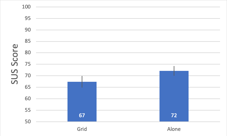
Figure 5: SUS scores were slightly lower for Facebook when presented in a grid (n= 160) compared to questions displayed on separate pages (n = 159).
We suspect the slightly higher reliability seen in both studies is a consequence of respondents being more likely to select the same response option (and therefore increasing the correlation). This likely supports the “near means related” heuristic as suggested by Tourangeau et al. (2004).
However, the reliability is likely offset by the alternating tone of the items. More straightlining will actually decrease the reliability of the overall score as respondents will be agreeing to generally opposite sentiments. To look for some evidence of straightlining, we counted the number of respondents who selected the same response for the five positively worded items in the SUS. We found mixed results. For the software products and suites, we did find respondents tended to pick all the same item slightly more times when in a grid than when presented alone (19% vs. 13%), but the difference was not statistically significant (p = .14). Somewhat puzzling though, for the Facebook data, we actually found the opposite; slightly more respondents selected the same responses when alone (11%) versus in a grid (8%), but again the difference was not statistically significant (p = .33).
Grid Is Much Faster
We also measured the time it took participants to complete the SUS in a grid versus on separate pages. As suspected, participants completed the grid much more quickly. It took an average 41 seconds to complete the ten SUS items in a grid whereas it took more than twice as long to complete the same items when presented on separate pages (92 seconds). The difference was statistically significant, p < .001.
Summary
An analysis of the literature and our own two studies on the effects of displaying questions in a grid versus on separate pages found:
Presenting items in a grid slightly lowers the score. Compared to presenting items separately on a page, we found the mean LTR scores were slightly lower on grids. On average the effect was small, a 2% to 3% difference. Eight out of ten brands had higher mean scores when they were presented on separate pages for the LTR. The effect was even smaller for the SUS with a difference of 1%.
Non-customers were more affected than customers. For respondents who had made a purchase with the brand, the effects were even smaller, dropping the scores by only 2%. The consumer software sample by definition were frequent users and scores were barely different (only 1%), suggesting whatever influence the grid may have (e.g. near means related) is small.
A grid may increases non-responses. If you don’t require all responses, expect more participants to skip or miss an item in a grid (especially grids with more items). The higher amount of non-responses is likely from participants missing lines, especially ones that contain many rows and/or columns.
Grids take less time to complete but often increase straightlining. Participants generally take less time to answer grids than when questions are on separate pages. In our analysis of SUS data, it took more than twice as long to complete the same ten items when presented on separate pages. This is an expected result as generally it takes more time for servers and web browsers to display new pages. But the less time may come also come from non-attentive respondents providing the same response (straightlining).
Reliability is slightly increased in grids (but maybe artificially). In a few studies the internal consistency reliability increased when items were presented in a grid as well as our two studies using the SUS. This may be a consequence of increased straightlining (selecting the same response) and therefore artificially increasing the correlation between items. However, this wasn’t universally seen across studies and even in studies where this was observed, the differences in reliabilities were small.
Near means related. One likely hypothesis for the effects on scores in grids is that participants rely on a heuristic that items placed near each other are related and consequently rate items more similarly. In fact, when asked in one study, respondents seem to prefer items to be grouped but not all placed on the same page (presumably in a grid).
Should you use grids? The published literature and our studies found that large grids seem to be strongly disliked by participants and may increase drop out. Participants actually prefer when items are grouped together in smaller grids. It’s unclear how big is too big (maybe no more than 5 or 10), but these smaller grids may offer a good balance of being faster to complete, easier to display, and not loathed by respondents.