 Air travel was one of the sectors most impacted by the pandemic. The summer of 2022 has seen air travel return to—or, in some cases, exceed—pre-pandemic levels. But the return to the skies has not been without turbulence.
Shortages in staff and planes have resulted in a record number of delayed and canceled flights, making an already hectic experience even more trying.
For many people, a trip starts with looking for and booking flights on an airline website. To understand if the online airline experience is just as bumpy as actually flying, we collected UX benchmark data from several of the leading airline websites.
Similar to our earlier analysis in 2019, we collected data on a variety of attitudes and intentions toward several airline websites. This year we included both U.S. and a few international carriers:
- Air Canada
- Air France
- Alaska Airlines
- American Airlines
- British Airways
- Delta
- Frontier
- JetBlue
- Lufthansa
- Ryanair
- Southwest
- United
We computed SUPR-Q® and Net Promoter scores, investigated reasons for using the websites, measured users’ attitudes regarding their experiences, conducted key driver analyses, collected think-aloud data, and analyzed reported usability problems.
Benchmark Study Details
In May 2022, we asked 600 users of airline websites in the U.S. and international markets to recall their experience and their perceptions of one of the listed airline providers on their desktop and mobile (app and or website) in the past year. An additional 18 users participated in remote MUIQ® think-aloud usability studies of the websites.
Participants completed the eight-item SUPR-Q (which includes the Net Promoter Score) and two-item UX-Lite standardized questionnaires and answered questions about their brand attitudes, usage, and prior experiences.
Quality of the Airline Website UX: SUPR-Q
The SUPR-Q is a standardized questionnaire that is widely used for measuring attitudes toward the quality of a website user experience. Its norms are computed from a rolling database of around 200 websites across dozens of industries.
SUPR-Q scores are percentile ranks that tell you how a website experience ranks relative to the other websites (the 50th percentile is average). The SUPR-Q provides an overall score as well as detailed scores for subdimensions of Usability, Trust, Appearance, and Loyalty.
The airline websites in this study collectively averaged at the 62nd percentile. Southwest received the highest SUPR-Q score, at the 83rd percentile, and Frontier scored the lowest, at the 34th percentile. The SUPR-Q scores were not significantly different when comparing domestic versus international airlines.
Usability Scores and Trust
We asked participants to rate how easy they thought it was to use and navigate the websites. Southwest had the highest usability score (89th percentile), and Frontier had the lowest (40th percentile). Comments about Frontier regarding usability included
- “We had to add an additional piece of luggage after making our reservation. Finding out how to do this and getting the software to let us do this was difficult and in the end impossible and we are digitally astute. We had to call the Frontier help number to get this done. Very frustrating!”
- “I dislike the promo code feature. It is not easy to use due to the countless restrictions involved, and it makes the booking experience quite frustrating. I would rather just see all available fares, rather than needing to enter a code that likely will not work.”
We also asked participants to rate the trust and credibility of the airline websites. Trust scores were generally more positive relative to the usability scores. Southwest had the highest trust score (96th percentile). Ryanair had the lowest trust score (25th percentile). Based on respondents’ feedback, this may be related to inaccurate or unclear information. Comments about Ryanair included
- “There can be big price differences from day to day.”
- “Sometimes it can be unclear as to what is an extra cost and you may accidentally pay for them.”
- “Help centre isn’t direct with contact details.”
More verbatim comments are available in the downloadable report.
Loyalty/Net Promoter Scores
The average NPS for the airline websites was −2% (roughly equivalent numbers of promoters and detractors), ranging from −32% for Frontier to 16% for Alaska Air. In general, a better user experience is a good predictor of customer loyalty.
2019 versus 2022 Comparison
When looking at 2019 versus 2022 scores on the SUPR-Q, most airlines have seen decreases across the board. The overlapping airlines that we studied in these years are American Airlines, Delta, JetBlue, Southwest, and United.
Overall, SUPR-Q scores have fallen by 17 percentage points since 2019, indicating that user experience as a whole has worsened across every airline. Additionally, each airline scored worse on the SUPR-Q subscales of Trust and Loyalty. However, when comparing differences in the SUPR-Q subscale of Usability, Southwest increased its score by 6%, while all other airlines fell.
When looking at the NPS between 2019 and 2022, there was more variation compared to the SUPR-Q. Both American Airlines and United saw increases in users’ likelihood to recommend in 2022. American Airlines saw an increase of 18% while United saw an increase of 8%. However, the remaining airlines, including Delta, JetBlue, and Southwest, all saw decreases. On average, the NPS decreased by 7%.
Websites and Mobile App Usage
As a part of this benchmark, we asked participants how they accessed the online airline services. All participants reported using their desktop/laptop computers (this was a requirement for participation in the survey), with 40% also using mobile apps and 58% using mobile websites.
The typical frequency of use was a few times a month to a few times a year for desktop/mobile websites (on average, about 1% reported daily use). For those who reported mobile app use, the typical frequency of use was a few times a year. Southwest was the most frequently used mobile app (overall usage of 30%).
Usage patterns were roughly equivalent for all airline websites, with 78% of users going to airline websites to look at airfares and 43% purchasing an airline ticket. Other reasons for visiting airline websites include checking a flight status (35%), viewing a reservation (33%), checking in to a flight (31%), checking an account (18%), looking at frequent flyer miles (11%), changing a reservation (10%), getting help/support (7%), signing up for the rewards program (6%), and finding the company’s contact information (4%).
Key Drivers of the Airline Experience
To better understand what affects SUPR-Q scores and likelihood-to-recommend (LTR) ratings, we asked respondents to rate the following attributes of the airline websites on a five-point scale from 1 (Strongly disagree) to 5 (Strongly agree). We conducted key driver analyses (regression modeling) to quantify the extent to which ratings on these items drive (account for) variation in overall SUPR-Q scores and, separately, LTR (the rating from which the NPS is derived).
- I feel comfortable booking a flight on this website
- It’s easy to purchase an airline ticket
- It’s easy to check in to a flight
- It is easy for me to check in on this website
- I know how much I’ll be charged, including fees and taxes
- It’s easy to check the status of a flight
- I can accomplish what I want to do online without calling customer service
- I can easily pay for and manage my checked baggage online
- It is clear how to retrieve my boarding pass
- Interacting with the calendar on this website is simple and intuitive
- It is easy to choose a seat on this website
- This website keeps my information secure
- It is easy for me to filter through flights on this website
- It’s easy to find the ideal departure time for a flight
- It’s easy to find a flight that meets my needs
- I can easily find contact information when I need it
- I’m able to share flight information
- It’s easy to find the cheapest airfare for a flight
- It is easy to get frequent flyer status with this airline
- I can easily change my reservation on this website
- I’m able to save a flight listing
- I can be notified if a price drops on a flight I’m interested in
- I always get the best deals on this website
SUPR-Q Drivers. As shown in Figure 1, the top key drivers from this list were “I feel comfortable booking a flight on this website” and “This website keeps my information secure” (respectively accounting for 15% and 12% of SUPR-Q variation). Another significant key driver was “I can easily find contact information when I need it” (8% of variation).
LTR Drivers. At a high level, the top key driver of likelihood-to-recommend (LTR, the basis of the NPS) was brand attitude (34%). At a lower level, using the same set of predictors as in the SUPR-Q KDA, the top key driver was “I feel comfortable booking a flight on this website” (14%).

Best and Worst: Key Drivers
It’s easy to check the flight status
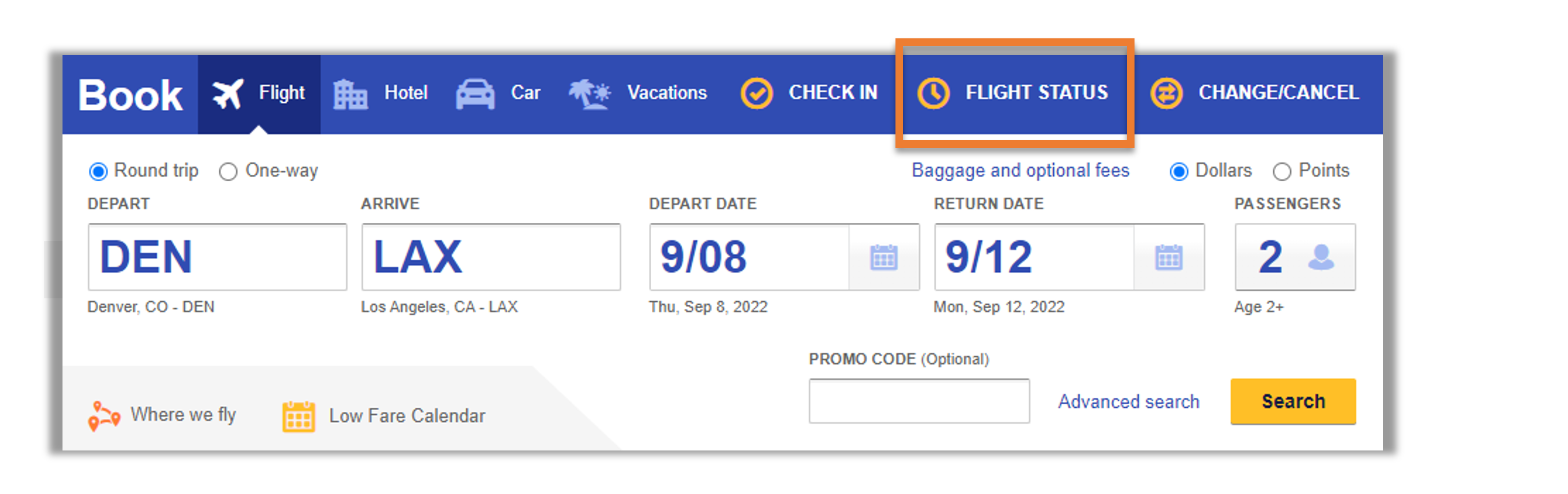
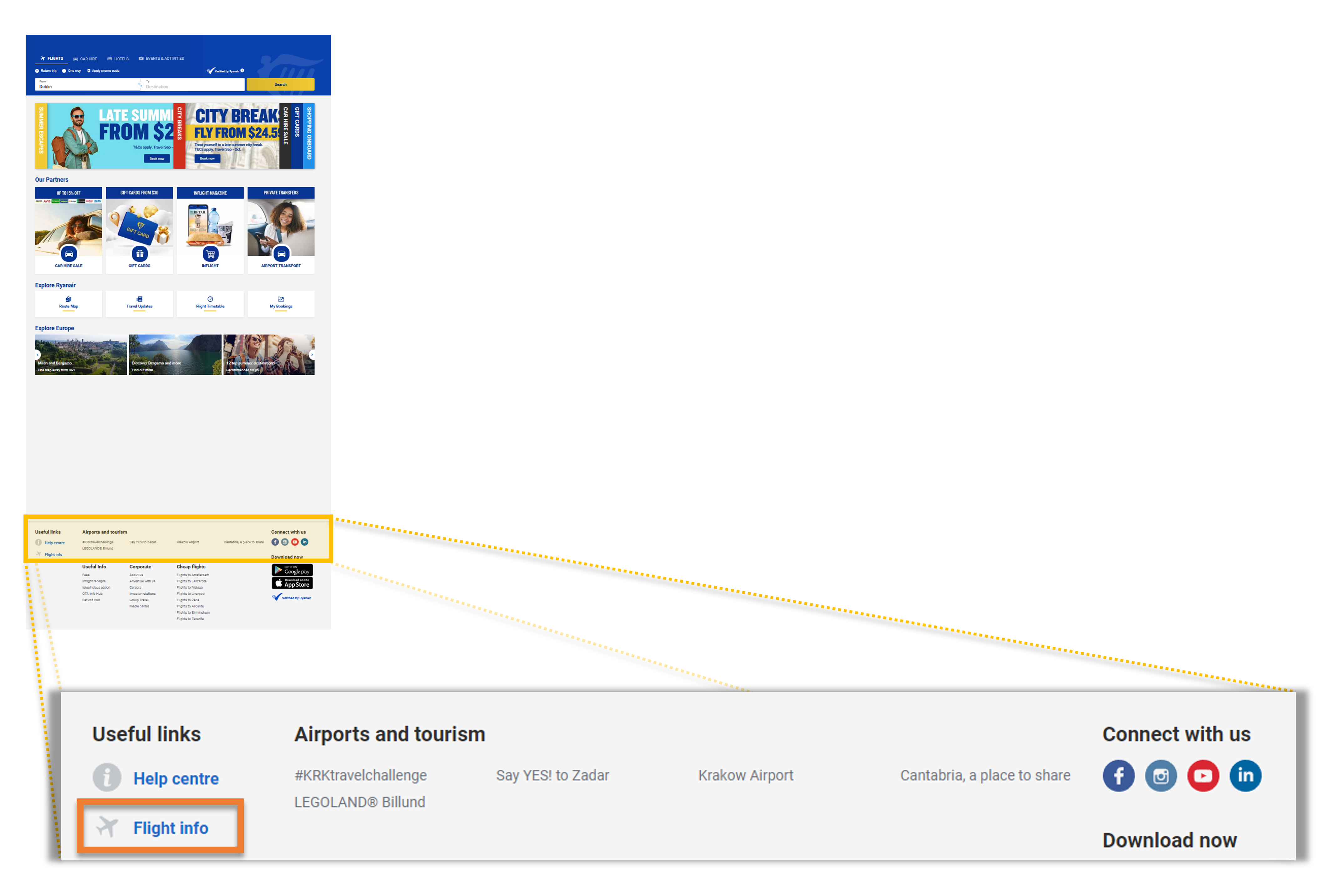
Participants were asked to rate their experience when finding the status of a flight. Southwest received the highest percentage of participants who selected Strongly Agree (top box) at 56%. Ryanair had the lowest percentage, with only 16% of participants strongly agreeing. This difference of 40% can likely be attributed to the location of the flight status selection.
When viewing Southwest’s homepage, the Flight Status button is located within the immediate search box. However, on the Ryanair website, users must scroll to the very bottom of the homepage into the Useful Links section where they can find the “Flight info” link. The ease of discoverability is a key factor in this metric. Figures 2 and 3 show the location of each of these sections.
Choosing Seats
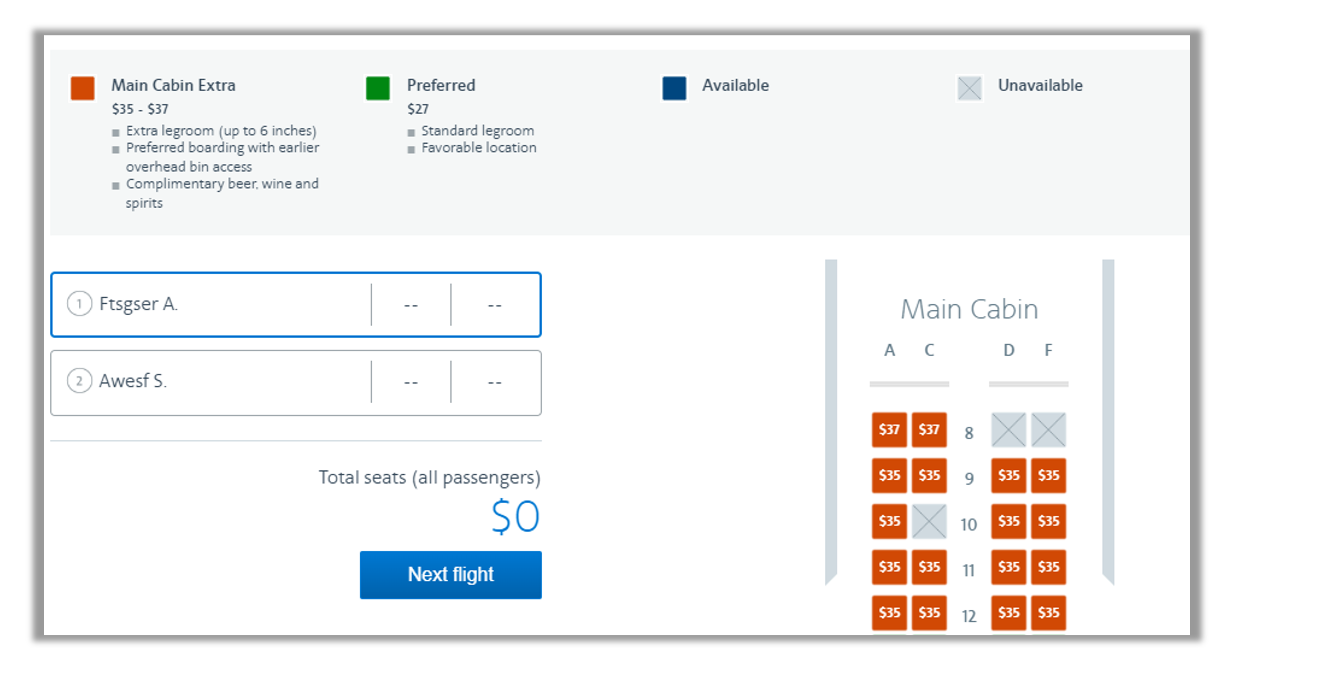
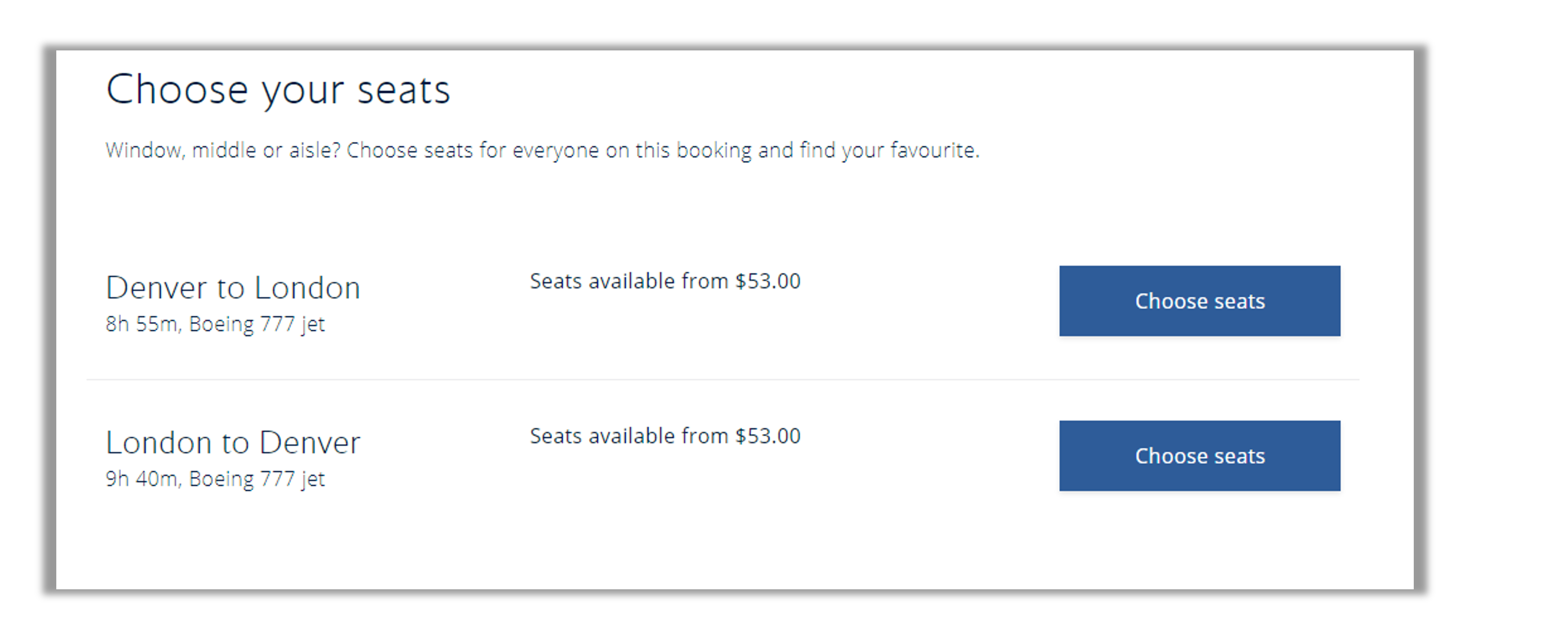
Participants were asked to rate their agreement with the following statement: It is easy to choose a seat on this website. American Airlines performed the best on this metric, with 38% of participants selecting Strongly Agree while British Airways performed the worst with 16% of participants strongly agreeing.
When comparing airlines, each airline has a different order and flow in which the booking process is conducted. This can cause frustration when participants are unsure of where a particular step should fall in the flow. For example, American Airlines has users select their seats on Step 6 of their booking process (Figure 4). This step follows a pattern in which users do not review their selections until all decision points have passed (i.e., all upgrades are selected). However, within the British Airways flow, users select their seats on Step 7 after reviewing their flight information and the cost of the flight (Figure 5). However, adding a seat can incur an extra charge, so users must then re-review the flight and total charges.
What to Improve
Respondents had a few common problems and frustrations across the airline websites, such as 1) difficulty with navigation to find information such as pricing or contact information and 2) difficulty understanding the process of making flight selections or upgrades.
Specific key areas of improvement cited by respondents for each website/app include
- Air Canada: “It can be difficult to compare prices and ensure you are getting the cheapest fare.”
- Air France: “Don’t have the function of seeing price in a grid table with different depart and return dates like other airlines.”
- Alaska Air: “The flights timetable when trying to buy tickets is slow and glitchy and feels very annoying to use especially when you’re switching between dates to compare prices.”
- American Airlines: “I don’t like trying to find the flight status page. It seems to be in a different place all the time. Also, it’s very hard to find pricing for inflight wifi.”
- British Airways: “I can’t always find things I need.”
- Delta: “Difficult to search for flights from the app.”
- Frontier: “When it came time to load my boarding pass, the app was very slow and also it didn’t update the gate change that happened at the airport.”
- JetBlue: “Hard to find the destinations page. Tell me about your destinations!”
- Lufthansa: “There is a lot going on with the pages. It is a bit crowded.”
- Ryanair: “Getting into direct contact with Ryanair is difficult, to me.”
- Southwest: “It’s hard to find some of their general policies. It seems like I have to really search and go through multiple menus to find what I need.”
- United: “I dislike searching for flights within the app; the information isn’t spaced out enough.”
Across all the websites, users experienced issues with various design elements:
- Air Canada: “The layout could use some work. I feel like the boxes on the homepage could be laid out more aesthetically than it currently is. Just feels like a bunch of boxes put together right now.”
- Air France: “I think the overall look of the website could be a bit more crisp and modern looking.”
- Alaska Air: “Right now there’s a big background ad for the Buzz Lightyear movie, which is a little weird and I find it off-putting.”
- American Airlines: “The different sizes of the font makes it difficult to read. They are too small and too confusing (the different sizes). The colors are pretty, but they need to be a little bit darker in order to see them (and I have pretty good eyesight!).”
- British Airways: “I hate how the app goes down more often and you occasionally can’t use certain features like looking at your upcoming holidays.”
- Delta: “The visual of the website is a little bit busy for my taste. Could be a little sleeker and simpler.”
- Frontier: I think the stock photography on this website makes the website and the brand look cheaper.”
- JetBlue: “The one thing I dislike about the JetBlue website is the amount of information on each page. The web pages are a bit too long and too full. By the time you scroll to the bottom of a page you’ve almost forgotten what was at the top of that very same page.”
- Lufthansa: “When choosing the plane ticket where all the prices are, it looks really old and ugly. You should upgrade to a sleeker design.”
- Ryanair: “It is very busy—there is too much going on.”
- Southwest: “The colors. Maybe they’re distracting, but for some reason, it hindered my ability to navigate.”
- United: “When you first open it, between the picture in the background and the information, it’s overwhelming visually.”
Figure 6 shows a screenshot from Ryanair.com illustrating several participants’ frustration with the process of booking a flight. Ryanair, in particular, has users click through several screens to make mandatory selections. These selections might already be included (as seen in the screenshot where a small bag is already included in the base fare), which causes even more frustration. Users would like the ability to skip through extraneous information, particularly if they have no intention of upgrading their services or products.
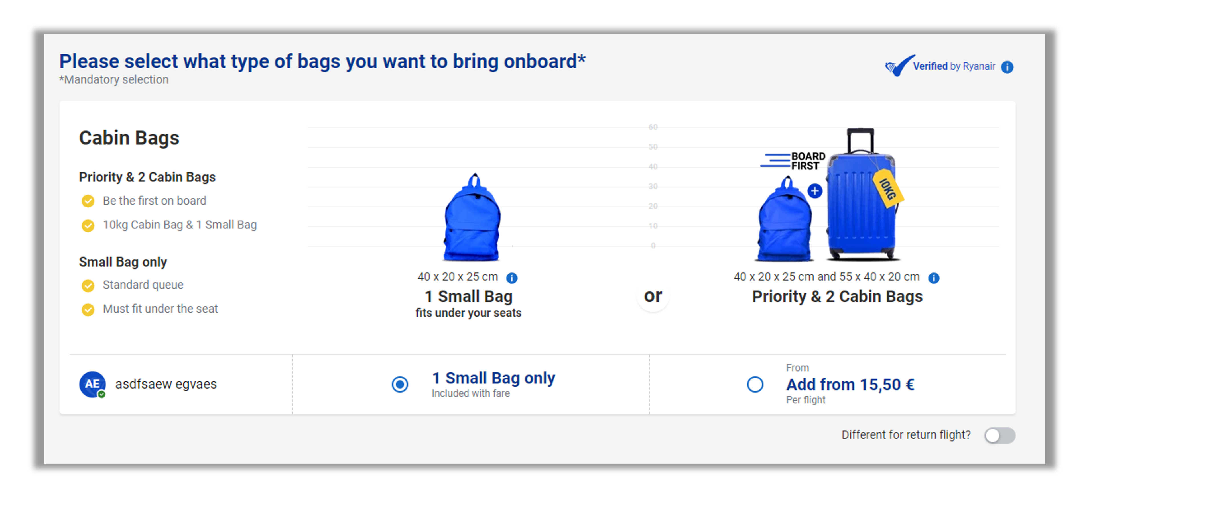
Figure 7 shows a short video (captured with MUIQ during the unmoderated think-aloud study) that shows the difficulty a participant had in selecting their seats on Delta. Although this video shows an issue with Delta, several users across various airlines had difficulty picking their seats because they did not know where this step should occur in the booking process. Additionally, several airlines have pricing tiers that may confuse users if the details of the package or seat are not included.
Figure 7: Difficulty selecting seats on Delta (video).
Summary and Takeaways
An analysis of the user experience of twelve airline websites found:
- SUPR-Q scores were mostly above average, but mean NPS was −2%. Southwest had the highest SUPR-Q rating (83rd percentile). Alaska Air had the highest NPS (16%). Frontier had the poorest SUPR-Q (34th percentile) and NPS (−32%).
- Eight variables accounted for 60% of the variation in SUPR-Q ratings. The top key drivers were “I feel comfortable booking a flight on this website” and “This website keeps my information secure” (respectively accounting for 15% and 12% of SUPR-Q variation). Another significant key driver was “I can easily find contact information when I need it” (8% of variation).
- Some common UX issues were reported across the websites. Respondents had a few common problems and frustrations across the airline websites, such as 1) difficulty navigating to find information such as pricing or contact information, 2) difficulty understanding the process of making flight selections, and 3) design issues.
- Users experienced various usability problems related to seat selection across the think-aloud study. There were examples of seat selection difficulties across the four think-aloud websites (Delta, Frontier, Ryanair, and United). In the SUPR-Q survey, strong agreement with the item, “It is easy to choose a seat on this website” was highest for American Airlines (38%) and lowest for British Airways (16%).
- The top key NPS driver was the same as the top key SUPR-Q driver. Using the same set of low-level predictors as in the SUPR-Q KDA, the top key driver was “I feel comfortable booking a flight on this website” (14%). At a high level, the top key driver of likelihood-to-recommend was brand attitude (34%).
Full details are available in the downloadable report.