 While life can feel like a metaphorical roller coaster, in some cases, there is a literal roller coaster. In 2021, over 100 million people ventured to a theme park in North America. For many of these visitors, the experience started well before the thrill of the ride, when they bought tickets and researched details about the theme park on its website.
Although most park visitors have come to tolerate long lines for the reward of the ride, the extent to which website visitors are willing to endure a bumpy experience is less clear.
To measure the experience of theme park websites, we used our MUiQ platform to conduct a two-part study using both retrospective benchmarks (existing users) and task-based benchmarks (existing and new users). We collected data on a variety of attitudes and intentions toward six theme park websites:
- Disneyland
- LEGOLAND (California)
- Magic Kingdom at Walt Disney World
- Six Flags (California)
- Universal Studios Florida
- Universal Studios Hollywood
We computed SUPR-Q® and Net Promoter scores, investigated reasons for using the websites, measured users’ attitudes regarding their experiences, computed task-completion rates and times, and analyzed reported usability problems.
Benchmark Study Details
In the retrospective part of the benchmark study, in April 2023, we asked 122 recent visitors to one of four theme park websites (Disneyland, Magic Kingdom at Walt Disney World, Universal Studios Florida, or Universal Studios Hollywood) to reflect on their most recent experience.
Participants completed the eight-item SUPR-Q (which includes the Net Promoter Score) and the two-item UX-Lite® standardized questionnaires and answered questions about their prior experiences.
The retrospective approach provides a high-level quantitative perspective of the website experience that is less impacted by the immediacy of task completion. Retrospective metrics tend to be more stable than a task-based benchmark, but they don’t usually provide as much diagnostic information (what the problems are and what to fix). Retrospective benchmark data, by definition, includes only data from existing users.
To better understand problems for common tasks, we also collected task-based metrics in an unmoderated usability study. In April 2023, we asked a different set of 180 participants who had visited a theme park in the US to complete two tasks (find ticket prices for an adult and a child; find a park map) to assess usability issues on one of the six theme park websites. Participants were randomly assigned to websites, so the website they viewed didn’t necessarily match the park they had visited, so for some (but not all) participants, this was the first time they had worked with the website.
Quality of the Theme Park Website UX: SUPR-Q
The SUPR-Q is a standardized questionnaire widely used for measuring attitudes toward the quality of a website user experience. Its norms are computed from a rolling database of around 200 websites across dozens of industries.
SUPR-Q scores are percentile ranks that tell you how a website’s experience ranks relative to the other websites (50th percentile is average). The SUPR-Q provides an overall score, as well as detailed scores for subdimensions of Usability, Trust, Appearance, and Loyalty.
The results of the retrospective survey of existing users revealed that the theme park websites in this study (Disneyland, Magic Kingdom at Walt Disney World, Universal Studios Florida, or Universal Studios Hollywood) collectively averaged at the 80th percentile (above average). Universal Studios Hollywood scored the highest at the 94th percentile, while Disneyland scored the lowest at the 65th percentile. These high scores were somewhat unsurprising, given the generally positive nature of the theme park experience compared to health insurance or banking websites. These results do, however, show some room for improvement. We dug into the component scores to better understand what factors might be driving the overall SUPR-Q scores.
Usability Scores and Trust
We asked participants in the retrospective study to rate how easy they thought it was to use and navigate through the websites. Universal Studios Hollywood had the highest usability score (93rd percentile), and Disneyland had the lowest (40th percentile). The high retrospective rating for Universal Studios Hollywood is consistent with the results of the usability study, in which participants using the Universal Studios Hollywood website had the highest ease scores and high success rates for both tasks.
Comments regarding usability for Disneyland from the task-based usability study included:
- “There is just a lot of info and it’s not really presented in an easy to find manner.”
- “Some of the things aren’t as obvious where you need to go to find them.”
- “It was a bit confusing at first that the form above-the-fold on the home page was for booking a hotel. I imagine most people coming to the site want to pay for admission first, before booking a hotel.”
Top issues with the Disneyland website’s usability included cluttered webpages (20%) and confusing navigation (7%).
Usability concerns about other theme park websites also included difficulty with navigation and findability of information. Navigation came up as an issue for all six theme park websites in the task-based study as well, with some comments including:
- “Trying to find the right place to go to find the map, there wasn’t a simple link at the bottom of the website like I thought there would be.” — LEGOLAND
- “Everything was hard to find. Why would the park map be all the way at the bottom, why are there no options to just click tickets.” — Six Flags
- “Finding the right places to get felt harder than it needed to be. The button to search by parks was not really labeled.” — Universal Studios Florida
We also asked participants to rate the trust and credibility of the theme park websites. Trust scores were high for all theme parks. Universal Studios Hollywood had the highest trust scores (92nd percentile), with the Florida location close behind (90th percentile). Disneyland had the lowest trust score (87th percentile), which was still very high.
Loyalty/Net Promoter Scores
The average NPS for the theme park websites was 44% (more promoters than detractors) in the retrospective study, ranging from 25% for Universal Studios Florida to 73% for Universal Studios Hollywood. All four theme park websites had positive NPS scores. In general, a better user experience is a good predictor of customer loyalty.
Comments about Universal Studios Florida made by detractors in the task-based usability study included:
- “The website is very busy, they crammed a lot of information into the website because it’s clear the focus is on upselling you rather than getting you right to the information you want to view. I feel like in some cases, searching for the information on Google would get you to the page on the Universal site you want quicker than actually using their own site.”
- “They try to sell you extra days and things a lot. Seems harder than it should be to find the basic information on some of the packages.”
Users noted slowly loading pages on all four websites due to busy/overwhelming user interfaces. Finding accurate pricing for admission was made difficult by variable prices based on day and park and the excessive attempts to upsell products or add-ons. For example, Magic Kingdom website users said:
- “Well, it sort of tries to fool you into thinking that a ticket is going to be $109 . . . then surprise! $164. The lower price is for other parks, Magic Kingdom is always the most expensive. They should put a huge gold dollar sign beside Magic Kingdom.”
- “Everything loaded very slowly. It was sometimes hard to find what you were looking for.”
More verbatim comments are available in the downloadable report.
Task-Based Benchmark Findings
We used our task-based benchmark to better understand friction points for two core tasks: finding ticket prices and finding a park map.
Summary of Metrics
Participants had little trouble finding the park maps, but some struggled to find ticket prices, especially on the Universal Studios Florida website, where only 53% were successful. Challenges participants faced included tickets that were bundled with other parks and prices that changed based on the date.
While most participants across the sites completed the task of finding ticket prices, there were clear signs of friction. The task on all websites was rated harder than average on the SEQ®; in particular, Magic Kingdom at Walt Disney World and Six Flags had ratings below the 12th percentile, reflecting a difficult experience. These two websites also had the longest task times and the highest number of clicks.
On both websites, standard ticket prices were easier to find compared to specialized ticket prices, such as child tickets. Child ticket options were often shown in separate dropdown menus or shown later in the buying process. Full details are available in the downloadable report.
Causes of Poor Task Experiences
To better understand what was driving the longer task times, more clicks, and low ease scores, we reviewed participant comments and videos—both suggested unexpectedly lengthy steps.
Too long to accomplish a core task
It took participants more than 70% longer to find the price of an adult and child ticket on the Magic Kingdom website compared to Universal Studios (Video 1).
Video 1: A user searching for ticket prices on the Magic Kingdom website encountered challenges requiring many steps to succeed.
“It took a lot of clicks just to get to exact ticket prices.”
“It took a while to finally get the info I was looking for. The first several screens I went to for the ticket prices would only give ticket prices for Ages 10+. It also took a while to figure out that the price of the ticket(s) were dependent on the reservation date.”
On the Magic Kingdom website, users have to complete a portion of the booking process before even seeing the price for a child ticket. Users must first select the number of days they want to visit the park, the dates, and the type of ticket (e.g., 1 Park Per Day, Park Hopper Option, Park Hopper Plus Option) before they can finally see the prices for adult and child tickets. Ticket prices varied depending on all these factors, so there wasn’t an easy or quick way for participants to determine how much they would be charged per ticket.
Participants felt that this was too many steps, especially for someone who is just looking at ticket pricing rather than booking a park reservation.
Not easy to find desired information
During the task-based study, users on four of the six websites had challenges distinguishing or finding the different ticket options (Disneyland, Six Flags, Universal Studios Florida, and Universal Studios Hollywood). For some websites, like Six Flags (Figure 1), ticket options are hidden under additional dropdown menus, while others, like the Disney properties, require many steps to find the different types of tickets.
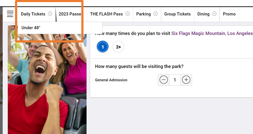
Figure 1: Screenshot of the Six Flags ticketing interface. Tickets for children, or shorter guests, are hidden in a dropdown instead of provided on the main ticket sale interface.
“It was hard to find exact ticket pricing for kids and if they are priced the same as adults, it should be made more clear.” — Six Flags
“It did take a minute to figure out how the adult and child tickets broke down when you bought them both at once.” — Disneyland
“It took me a little long to figure out how to find prices for a single ticket and a single theme park.” — Universal Studios Florida
Similar to Magic Kingdom, the Disneyland website also asks users to complete some of the booking process before showing the price per ticket (this included selecting the number of days, the dates, and the type of tickets). Specifically, the Disneyland website only shows the standard ticket price until late in the process (Figure 2). Once users select their desired dates, a small pop-up finally gives the price per ticket (Figure 3).
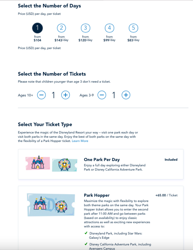
Figure 2: The adult and child ticket prices are not shown on the Disneyland website when the user is selecting the number of tickets. From here, it appears that both tickets will cost the standard rate ($104 each). The price per ticket is not shown until the next page.
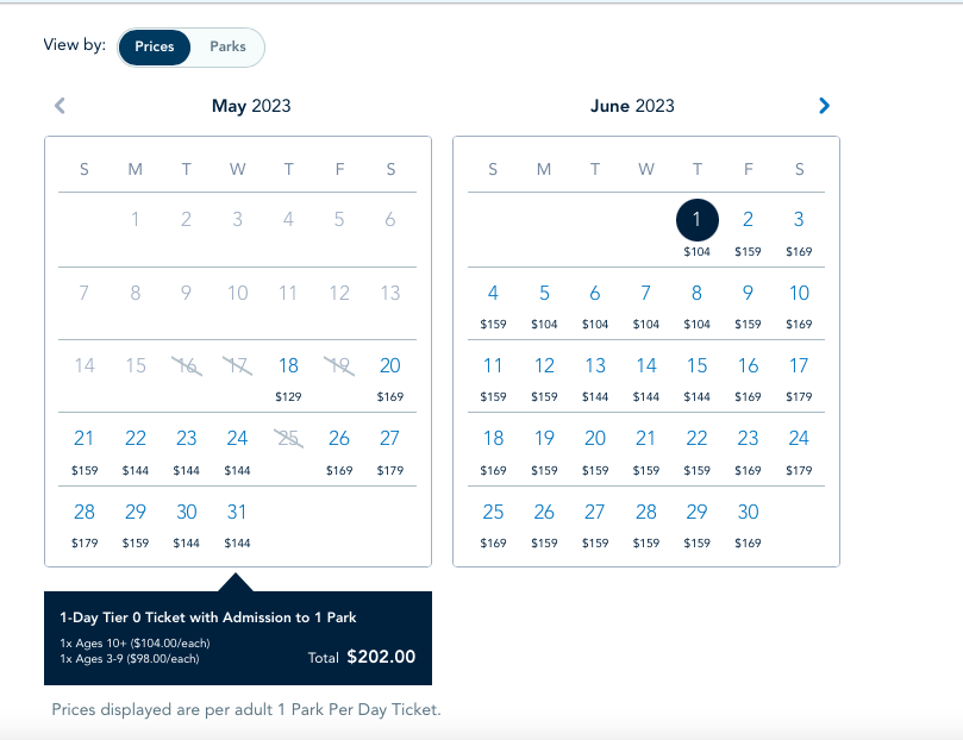
Figure 3: The adult and child ticket prices are only shown on the Disneyland website once users select their dates. By this point, the user has completed much of the booking process.
Overall, there were many ticket options with varying prices, which likely confused participants and created a long, challenging experience.
Websites are cluttered and overwhelming, making navigation difficult
While participants felt excitement toward theme park websites, many noted that they were often too exciting, feeling overwhelmed by all the images, videos, and information displayed on each screen. This prevented some users from finding information such as ticket prices or park maps, and in the case of one user on the Universal Studios Hollywood website (Video 2), prevented the user from moving forward intuitively.
Video 2: On the Universal Studios Hollywood website, it took extra time to figure out how to move forward in the purchase process.
“The website didn’t make it clear where I was supposed to click to move to the next step of checking out. I feel like maybe there was too much going on the pages to focus.” — Universal Studios Hollywood
“Weird checkout flow, could not easily go back. Too many add-ons being pushed on me.” — LEGOLAND
“It’s hard to look for info, it is a little crowded.” — Magic Kingdom at Walt Disney World
“Too much info, hard to find what I’m looking for, pop up offers are annoying.” — Six Flags
Summary and Takeaways
An analysis of the user experience of six theme park websites found that:
- Universal Studios Hollywood was a high performer. In the retrospective study, the Universal Studios Hollywood website had the highest overall SUPR-Q score and was most likely to be recommended. In the usability study, participants on the Universal Studios Hollywood website had the highest ease scores and high success rates for both tasks.
- The long process of finding ticket prices was a key pain point. Overall, finding ticket prices was lengthy and confusing, especially on the Disney websites. Ticket prices varied by visitor age, number of days at the park, dates visited, and the ticket type. Providing all this information made the process of finding ticket prices feel extensive and difficult.
- Theme park websites were cluttered and difficult to navigate. Difficult navigation and website clutter were mentioned as issues on all the theme park websites. In the retrospective study, clutter was the top issue on the Disneyland and Universal Studios Florida websites. Clutter was distracting for users and made finding important information difficult.
For more details, see the downloadable report.