 For measuring the user experience, I recommend using a mix of task-based and study-level measures that capture both attitudes (e.g. SUS, SUPR-Q, SEQ, and NPS) and actions (e.g. completion rates and times).
The NPS is commonly collected by organizations and therefore UX organizations (often because they are told to).
Its popularity inevitably has brought skepticism. And rightfully so. After all, the NPS was touted as the one number you need to grow. It’s no doubt overhyped, but is the NPS really a waste of time—or worse, harmful?
Don’t make the mistake in outright rejecting or dismissing this metric. While there may be a cult of NPS followers, there’s an equally vocal cult of NPS detractors. Don’t drink the Kool-Aid from either cult.
One criticism against using the NPS is that it doesn’t tell you what to fix in a product or in a user experience. And it doesn’t, but it was never intended to.
In fact, most UX measures aren’t diagnostic and won’t tell you what the problems are. To be diagnostic, you need lots of questions to capture enough interactions that will identify problems in the interface.
You shouldn’t think of the NPS as a one-stop shop for all your metric needs. I see the NPS as a sort of common denominator of attitudinal metrics that can be compared across different contexts. It’s not always the best metric but rarely so far off that it’s useless or harmful.
Despite the shortcomings of the original research that promoted NPS, we’ve found that both the NPS and System Usability Scale are leading indicators of revenue growth in the software industry. A reasonably minded person should ask: If the NPS is bad, what’s a better alternative and why?
The CE11
Is there a better alternative to the NPS? One vocal critic argues a questionnaire called the CE11 is better because it’s predictive and diagnostic. What is the CE11?

Figure 1: Criticism from a vocal critic of the NPS advocating for the CE11 instead.

You might not be familiar with this measure as it wasn’t developed to assess interactions with websites or software. It wasn’t something we were familiar with either. But applying measures to new domains can yield fruitful results so we were intrigued to understand its psychometric properties and potential as a UX metric.
In our 2nd Edition of Quantifying the User Experience, Jim Lewis and I provide details on 21 questionnaires used in UX research, including the SUS, SUMI, WAMMI, SUPR-Q, PSSUQ, UME, USE, EMO, ACSI, and CxPI), but not the CE11 (Customer Engagement 11).
In an earlier article, I described multiple approaches to assess whether a questionnaire (or measure) is adequate or even superior to existing ones. We’ll go through many of those steps here to objectively assess the claim with data instead of diatribes so you can decide whether it’s a measure to use for your UX research.
CE11 Background
The CE11 is a proprietary measure developed by Gallup; some limited psychometric information is available in an article called The Constant Customer as well as one other study [pdf] I found with some international benchmark data. There’s no information on its predictive abilities such as correlations with business outcomes however.
It was developed around the same time as the NPS but never really caught on, possibly because of its length and proprietary nature—and it was also dwarfed by the marketing efforts of Bain and Satmetrix. The CE11 consists of the following 11 items and is scored on a five-point Likert scale.
- Overall, how satisfied are you with [brand]?
- How likely are you to continue to choose/repurchase [brand]?
- How likely are you to recommend [brand] to a friend/associate?
- [Brand] is a name I can always trust.
- [Brand] always delivers on what they promise.
- [Brand] always treats me fairly.
- If a problem arises, I can always count on [brand] to reach a fair and satisfactory resolution.
- I feel proud to be a [brand] customer.
- [Brand] always treats me with respect.
- [Brand] is the perfect company for people like me.
- I can’t imagine a world without [brand].
In addition to a total score, it has two factors: rational loyalty (the first three items) and emotional attachment (the latter eight items) addressing what are called “facets” of confidence (items 4 and 5), integrity (items 6 and 7), pride (items 8 and 9), and passion (items 10 and 11).
You may also recognize item 3 in the CE11 as the same question used in the much-maligned Net Promoter Score! In other words, the vocal critic of NPS seems to be advocating for using more items in addition to the NPS and a different response scale. Let’s see what the CE11 provides then.
In at least two talks (Is Design Metrically Opposed? and Journey to the Center of Design) given dozens of times to probably thousands of UX designers over the last decade, Jared Spool describes a study in which the CE11 is used to assess interactions on ecommerce websites.
They modified the response options to a 3-point scale (it’s unclear why) and described this scoring technique as a weighted Guttman scale. The response options were scored (I agree=1, not sure=0, and I don’t agree=-1) and summed the values so the scores ranged from -11 to 11 (23 points). Figure 2 shows the scales from the slides available online.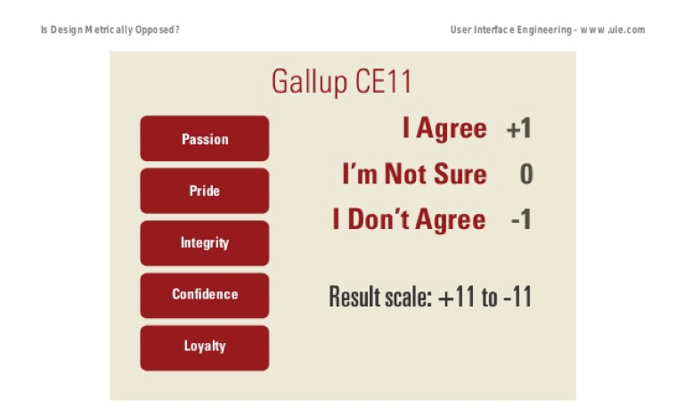
Figure 2: Scaling properties of the modified CE11 from the Is Design Metrically Opposed? presentation. Slide from Slideshare.
In the talk, a study is described in which 72 participants are asked to make a purchase they were ready to buy on one of five websites (Amazon, Circuit City [changed to BestBuy], Dell, HP, and Walmart). It’s unclear how many participants were used per website, but likely between 10 and 14. It could be fewer because he described 13 total websites but only five were shown.
The CE11 was administered multiple times to participants and they “measured every step of the shopping process with this survey just to see what would happen” with the goal to “hone in on exactly where the problem is by looking at the different questions.”
It’s unclear how many times the CE11 was administered to each participant, but from what we can tell, participants answered the survey at least three times (prior to purchasing, after purchasing, and after receiving the product days later). Despite being asked the same 11 items repeatedly, Spool assured the audience it wasn’t tedious:
“It didn’t annoy anybody that we kept asking those 11 questions because once you’ve done them like twice it takes you like 10 seconds to go through and rank them.”
The data appears to have been collected sometime between 2007 and 2008 and referenced up until at least 2018. Figure 3 shows the difference in CE11 scores between two-time points by website. All scores were lower, except Walmart, which increased after initial ratings of the brand.
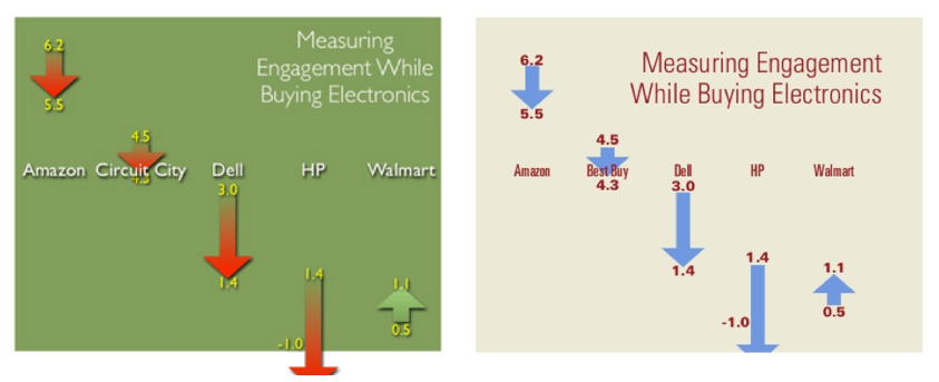
Figure 3: Results of a study using the modified CE11. Note, Circuit City is changed to Best Buy in later presentations. Left slides from Slideshare and right slide from Springboard.
Note: Spool initially reported Circuit City (left side of Figure 3) but then later presentations showed Best Buy. Either he repeated the study and only switched Best Buy for the bankrupt Circuit City, which happened to get the exact same values, or he just changed the name from Circuit City to Best Buy.
Replication Study Details
We attempted to replicate the claims that the CE11 both was superior to the NPS and was diagnostic using a similar approach described in these presentations. We had to piece together information from tweets, slides, and transcripts because nothing was published on using this metric (that we could find) for UX research.
In our study, we used additional websites and a larger sample size. In November 2018, we recruited US participants from an online panel who said they planned to make a purchase at one of seven websites in the next month.
- Amazon
- Best Buy
- Dell
- eBay
- HP
- Target
- Walmart
We included all the same websites reported in the Spool slides plus two additional (except Circuit City). We then followed up with these participants and asked them to make the purchase on the website using an unmoderated study in MUIQ.
We recorded the participants’ screens while they looked for their products so we could understand problems they might encounter. The major difference in our approach is that we didn’t assign participants to a website; they had already indicated they were planning to make a purchase and we only compensated them for their time (not for their purchase).
We administered multiple questionnaires at multiple points to see how well these measures might capture problem points, how attitudes toward the brand may change, and how attitudes correlate with each other. We used:
- CE11: Using the modified 3-point scale at three-time points
- Likelihood to Recommend and NPS: The 11-point LTR item at three-time points
- SUPR-Q: 7 items with a 5-point scale plus the 11-point LTR at three-time points
- UMUX-Lite: The two item 5-point scale asked at three-time points
- SEQ: The single item 7-point scale asked at two-time points (after each task action)
- Estimated SUS: The 5-point ease item from the SUPR-Q to estimate the SUS using a regression equation.
Results
In total, 149 participants completed the study with between 18 and 25 participants on each of the seven websites. Some participants reported not making the purchase because they wanted to think about it more before purchasing (mostly on the Dell and HP websites). Participants selected a wide variety of products ranging in price from $2 to $2,000, including hardware, laptops, makeup, and groceries.
The modified CE11 showed good (although lower) reliability compared to Gallup’s data (Cronbach alpha = .86, .90, .92 for the three presentations) and compared to the SUPR-Q (alpha = .89, .92, .93). The lower reliability isn’t surprising as the number of response options for each item was reduced from 5 to 3.
CE11 Scores by Site
The differences in CE11 scores (after selecting the product minus before purchasing) are shown in Figure 4. There is a similar difference in ranges to those shown in Figure 3, except the scores all increased and Target had a lower score after participants selected their product. These higher scores are likely a consequence of our recruiting method that selected participants who already had an intent to purchase on these sites (and therefore likely had a more favorable attitude).
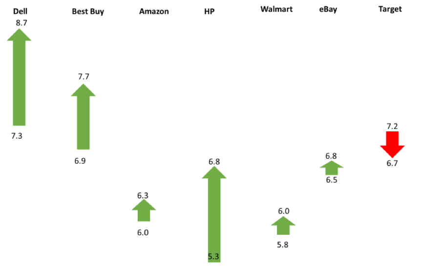
Figure 4: Differences in CE11 scores (after finding the product minus before purchasing) by website.
The largest absolute difference was 1.5 on the 23-point scale for HP. The arrows show a difference, but the scale based on the sample size can be deceiving. When we take into account sampling error using a confidence interval around the difference, the differences look large, but none are statistically significant.
I’ve added blue boxes to show the boundary of the 95% confidence interval around the differences in Figure 5. The blue box shows where we can expect the actual differences to fluctuate if we were to take repeated samples, or a much larger sample. For example, while the CE11 scores for Best Buy increased by .8 (6.9 to 7.7), we can expect the difference to be a drop of .3 to 6.6 or an increase of 1.8 to 8.7.
Only HP is close to being statistically significant (p = .055) as the difference could be a slight drop (.1 increase to 3.1). The uncertainty ranges are large enough around the differences that it’s plausible with a larger sample size the differences could reverse many of the website scores (leading to a different conclusion as we see later).
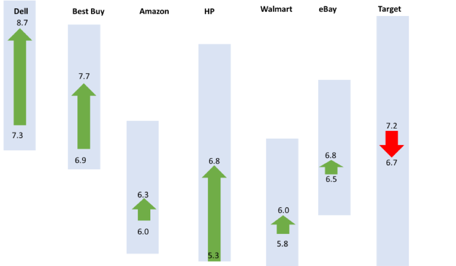
Figure 5: Differences in CE11 scores (after finding the product minus before purchasing) by website with 95% confidence intervals around the differences that are shown as shaded areas (the noise) to differentiate them from sampling error.
I’ve rescaled the values so the y-axis accounts for the entire 23-point range of the modified CE11 in Figure 6. The drop in Target now can be seen as falling well within the zone of uncertainty from this sample size and variability—meaning that drop is noise and the increase in other websites is also difficult to differentiate from sampling error.
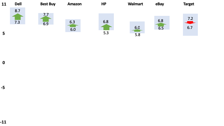
Figure 6: Differences in CE11 scores (after finding product minus before shopping) by website with 95% confidence intervals around the differences that are shown as shaded areas (the noise) scaled to the full range of the scale (-11 to 11) to differentiate them from the sampling error.
Separating “Noise from Science”
With some idea about the variation of the CE11 (the standard deviation of our CE11 data is 4.1), we can compute the expected sample sizes needed to detect differences from the same participants over time (Table 1) assuming a within-subjects comparison (e.g. initial score to later score).
| Difference | Sample Size Needed | % of Range |
|---|---|---|
| 2.5 | 19 | 11% |
| 2 | 28 | 9% |
| 1.5 | 48 | 7% |
| 1 | 106 | 4% |
| 0.5 | 418 | 2% |
| 0.25 | 1665 | 1% |
| 0.2 | 2600 | 1% |
Table 1: Expected sample sizes needed for statistical significance using the CE11 for difference scores (within-subjects) using a standard deviation of 4.1.
Using Table 1, we can revisit the differences reported in the slides from Figure 3. The largest difference reported was 2.4 for HP. While this is a large difference (~half a standard deviation), this difference isn’t statistically significant unless there were at least 20 participants (see the first row in Table 1). Larger sample sizes would be needed for a between-subjects study.
It appears closer to half that many were used (maybe 10-14 per website), meaning the differences were more noise than signal. If you give people enough questions to answer, their responses may vary because of random error or mistakes. This is especially the case with relatively small sample sizes. Explaining such differences is like explaining how a coin turns up heads three times in a row—it’s likely random noise. Or to quote Spool himself, it’s “Pretending Noise is Science”. Not properly accounting for sampling error is a common problem in UX research.
What Does the Score Mean?
But even with a sufficient sample size, what do the scores of the modified CE11 mean? Is 5.3 good? Is 0 average? We don’t know because the scale was changed from what Gallup provided so we can’t compare it to its reported averages. We do have these two studies (the one we conducted and the original ones from Spool) so we now have some idea about the ranges of popular websites (ranging from -1 to 9) for both studies.
Not a Guttman Scale
The rescaling from 5 points to 3 points was described as a Guttman scale. A Guttman scale is like climbing a ladder, where each item is higher, or harder to agree to. If a participant agrees to harder to agree items, the same participant must agree to all easier items.
The idea is the score is the last ordered item to get a sense of how much a respondent has of the construct (in this case customer engagement). Guttman scaling is neat in concept but in practice, it’s difficult to find items that follow the Guttman ladder (see Bond & Fox 2007 p. 272). Instead, other approaches, notably the Rasch model (which we used to develop the SUPR-Qm), take the idea of Guttman difficulty ladders (scalograms) and incorporate a probabilistic model to account for the inherent error you get from measuring people.
When we average the scores for each item we do see variation but not the expected Guttman pattern (Figure 7). The fewest people agree to item 11 (I can’t imagine a world without [brand]) but more agree to items 9 and 10 than 8. This can also be seen by examining the individual response patterns. For example, one participant responded (1=agree, 0=not sure, and -1=disagree): 10011110101.
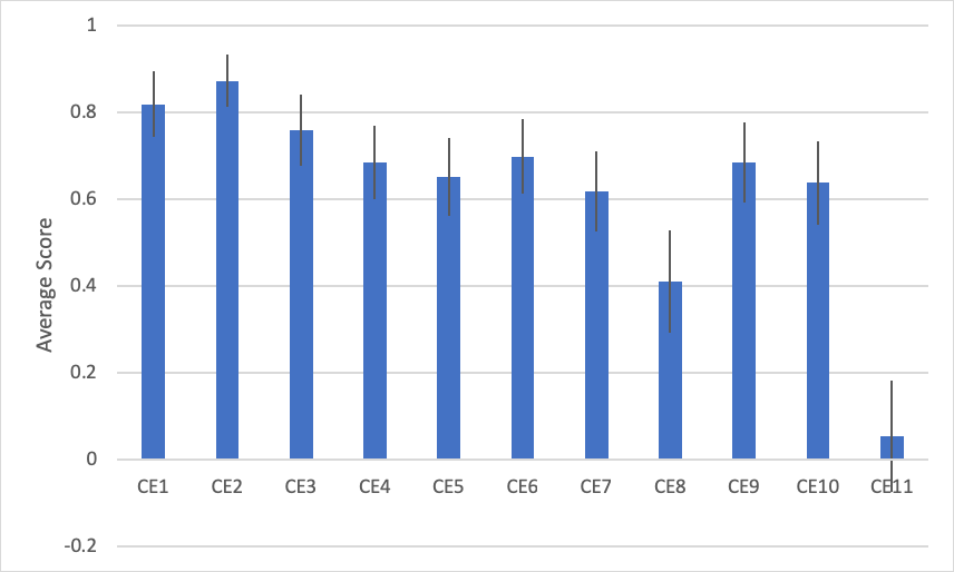
Figure 7: Average agreement to each of the 11 items (average of -1, 0, and 1) and 95% confidence intervals (error bars) show variation of agreement (higher scores mean more agree), but not the expected Guttman pattern.
This result isn’t too surprising given Guttman scales should be based on a unidimensional scale (Gallup reported two dimensions). Our factor analysis also found two factors, but the factors didn’t align with what Gallup reported for rational loyalty (items 1 to 3) or emotional attachment (items 4 to 11). This may be due to the rescaling of the response options from 5 to 3 or the context. A future confirmatory factor analysis can confirm the structure.
Likelihood to Recommend Question Was More Sensitive
As a point of comparison, the mean Likelihood to Recommend scores for the same time points (after finding the product minus before purchasing) by website are shown in Figure 8 along with their corresponding confidence intervals around the differences (blue shaded boxes).
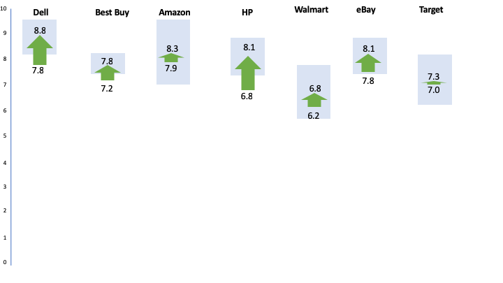
Figure 8: Differences in LTR scores for initial administration of the NPS item and after participants selected their product. Dell, Best Buy, and HP all have differences that are statistically significant (p <.05).
Using the LTR alone revealed three websites with statistically significant increases in mean scores (Dell, Best Buy, and HP) at p < .05. Figure 8 shows the arrows outside the uncertainty zone to indicate the statistically significant differences. Interestingly, this shows the 11-point LTR item was better able to detect differences with only 1 item compared to 11 items for the modified CE11.
What’s more, the pattern of differences across the sites are very similar. In fact, the correlation between the LTR and CE11 difference scores is very high at r = .92. Or, the single 11-point LTR item can account for 85% of the variation in CE11 difference scores! There’s very little the CE11 is adding beyond what is captured in the LTR item.
How impactful this lift might be is a separate question to be decided by the researcher (statistical significance is not practical significance). However, you want a measure that is sensitive enough to detect differences to allow researchers to decide whether they’re meaningful.
Detecting Problems
We had a researcher unfamiliar with the ratings independently review each video and code all problems and issues encountered by each participant. While many purchase experiences were problem free, the most common problems were participants having trouble finding an item in the search results page and navigating to their item.
Some users were also required to interact with distracting popups that asked for the user’s email to search for the “perfect gift” while other users would accidentally activate a customer service popup like the one shown in Figure 9. Ten of 24 participants (42%) on the Dell website had some trouble with the popup blocking the page or accidentally clicking it as they scrolled (it appears right next to the scroll bar).
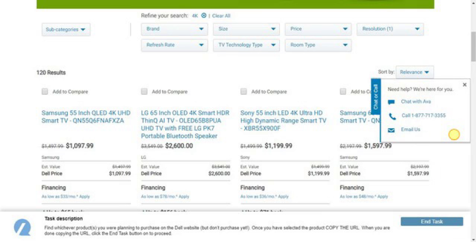
Figure 9: While problems weren’t common, a more common point of friction was participants (10 of 24) encountering popups while trying to make a purchase, including this one from Dell that was ironically offering assistance.
We found none of the measures we collected correlated with the number of usability problems at the participant level. The low incidence of usability issues is likely masking the relationship as the average number of problems encountered was between .30 and .68 per website. Low variation masks correlations (e.g. correlation of height and weight is strong, except when restricting the sample to say NBA players).
When we averaged together the number of usability issues by website, we did find a relationship as shown in Table 2. The correlation ranged from r = .4 to r = .9.
| Metric | R | P-Value |
|---|---|---|
| CE11 | 0.79 | 0.04 |
| LTR | 0.54 | 0.20 |
| SUPRQ | 0.78 | 0.04 |
| SEQ | 0.53 | 0.22 |
| UMUX-Lite | 0.89 | 0.01 |
| NPS | 0.39 | 0.39 |
| SUPR-Q% | 0.54 | 0.22 |
Table 2: Correlation between average number of UI issues by website and metrics.
The CE11, SUPR-Q, and UMUX-Lite are the only statistically significant correlations, with the two-item UMUX-Lite having the largest correlation (r = .89) with the average number of UI issues by website. This provides a good measure of concurrent validity.
Despite the correlations, the items in the CE11 give no indication of exactly what to fix. Nor do the items in the UMUX-Lite or SUPR-Q. But that’s not what they’re for. What do you fix in an interface when a participant rates “I disagree” to the item “[Brand] always treats me fairly?” Was it a bad search results page, was the product description insufficient, or do the navigation categories change? You can, of course, get this information from observing and asking the participant to report on problems as we did in this analysis. And at least the SUPR-Q narrows the focus to appearance and navigation of a website and the UMUX-Lite has ease of use and functionality items (e.g. missing function versus difficult functions). The CE11 items are so high-level that I’m not sure they can indicate what the problems are.
Summary
In this article, we used a lesser-known questionnaire called the CE11, which was modified and applied to a usability test administered over multiple time points. This analysis found:
Its reliability and validity are adequate but not exceptional. The modified CE11 was found to be reliable (although its reliability was decreased because of its modified scale) and showed some evidence of validity (correlating with the average number of problems), although other questionnaires had higher correlations (notably the two-item UMUX-Lite, which is a measure of usefulness and ease of use).
The CE11 is not diagnostic. The items in the CE11 give no indication of what to fix in an interface and don’t correlate with participant level usability problems. What do you fix in an interface when a participant rates “I disagree” to the item “[Brand] always treats me fairly?” The CE11 doesn’t tell you (it wasn’t intended to). You can, of course, get this information from observing and asking participant to report on problems.
Scoring is problematic. Reducing the CE11 to three points and summing the items to range from -11 to 11 may present an illusion of larger differences (this also happens with the NPS% scoring). A 1.5 difference sounds big but needs on average 48 participants to differentiate it from random noise (in a within-subjects study). Changing the scale also removes the ability to compare to Gallup external benchmarks that it publishes in several languages. What does 6 mean here? Is that good? As is often the case, what little gain you may get from changing a scale is usually offset by the loss of comparisons. If you use the CE11, use the original 5-point scale. (You’ll also increase your reliability.)
It’s not a Guttman scale. The CE11 doesn’t exhibit a Guttman pattern as later items were agreed to more than earlier items (e.g. items 9 and 10). Scoring using the “Guttman approach” also assumes the measure is unidimensional. But both the original Gallup data and our analysis found evidence that it has more than one factor. A probabilistic model like Rasch should be used instead of the deterministic (and antiquated) Guttman approach.
There’s little evidence for its superiority. There’s nothing wrong with trying the CE11 with your research, although this study suggests other measures will work better. Both the UMUX-Lite and SUPR-Q had high correlations with UI problems at the study level, both are shorter (2 and 8 items), and both have benchmarks; and with the SUPR-Q, you generate an overall UX measure, along with subscales of trust, loyalty, and appearance. What’s more, this analysis found only using the mean of the 11-point Likelihood to Recommend item actually detected more statistical differences than the CE11. (In other words, the standard Likelihood to Recommend item is more sensitive.)
Don’t use the wrong tool. Questionnaires generally shouldn’t be used as substitutes for observational techniques (e.g. usability testing) or inspection methods. Instead of pestering participants with many questions asked repeatedly through a task in the hopes of figuring out what to fix, use a short questionnaire once (like the SEQ) to gauge difficulty and use observational techniques (like a usability test) or an analytic technique (like a heuristic evaluation or PURE) to identify problems. UX metrics should be used to tell you whether your design changes improved the experience and not relied on to tell you what needs to be fixed.
Is the CE11 better than the NPS? If you’re using the NPS to uncover problems or tell you what to fix (you shouldn’t), the CE11 is just as ineffective as the NPS. This analysis found that while the CE11 was reliable and valid, it was less able to discriminate between differences than the single LTR item. In fact, the mean LTR correlated so highly with the CE11 (explaining 85% of the variance in difference scores) that very little extra is gained by asking it over the NPS (especially because this modified CE11 doesn’t have any external benchmarks). In short, there’s no clear evidence the CE11 is better and in fact, this analysis suggests it’s worse!
You should NOT rely exclusively on the NPS. This analysis showed, at best, the NPS is a crude correlate of interaction behavior. I think of the NPS as a sort of common denominator. It’s so ubiquitous (for better or worse) that it allows you to connect UX findings with findings across an organization (as we’ve shown how SUS correlates with NPS). For measuring the interactions with an interface, you should use other task-level metrics (like the SEQ or completion rates) and study-level metrics (like the SUS, UMUX-Lite, or SUPR-Q).
It’s lengthy for what you get. The CE11 provides an overall measure of engagement, (a form of satisfaction) loyalty, and emotional attachment. It actually contains the LTR item used in the NPS. If you want to measure loyalty, satisfaction, and brand attitude you can likely do this with fewer items and still have external benchmarks and a reliable instrument. Likelihood to recommend, likelihood to repurchase, satisfaction, and brand attitude are all common items included in many company surveys already. A future analysis can examine other combinations of items that may differentiate satisfaction/loyalty better or whether they’re better than existing questionnaires such as the ACSI, which has an extensive set of benchmarks.
No predictive data is available. There’s no published information on the predictive validity of the CE11 nor any corroborating data to show that using the CE11 is associated with revenue or growth rates. However, the CE11 contains items (satisfaction and likelihood to recommend) that have been shown to correlate to future items. If you’re interested in predicting future business metrics, you’ll likely have better luck using satisfaction, SUS, or NPS instead.
Future research, not rants, are needed. The range of websites used here was unable to uncover the “superiority” of the CE11 as a UX metric. We did, however, use the same websites as described in the only other study, so even this could be a best-case scenario (similar to what we did with Reichheld’s data). Future research can select different websites and a different context. It’s unclear for example whether customers need to make a purchase—which is expensive and difficult to recruit for (especially for the high-ticket websites like Dell and HP that we had higher drop-out and non-purchase rates for).
Thanks for Jim Lewis for providing comments on this article.