 Many topics about the design of rating scales can provoke strong opinions and heated debates. The arguments include whether or not scales should include a neutral response.
Unlike rating scales with an even number of points (e.g., 4, 6, or 10), rating scales with an odd number of points (e.g., 5, 7, or 11) contain a middle, presumably neutral, point.
Researchers who want to avoid a neutral response option are concerned that having a neutral point attracts respondents who slightly lean toward a favorable or unfavorable response but don’t want to commit. Having a neutral response would then mask these sentiments. But with an even number of options, respondents are forced to indicate a favorable or negative attitude when their actual sentiment is neutral.
Most standardized UX questionnaires (e.g., SUS, PSSUQ, SUPR-Q®, SEQ®, UX-Lite®) have items with odd numbers of points. It seems reasonable that people could genuinely have a neutral attitude toward items that ask about usability or general satisfaction with a system—there’s less incentive to hide sensitive beliefs in the neutral zone than when responding to social or political questions.
In a previous study, we found a small (1.4%) difference in means when the neutral point was removed from the eleven-point Likelihood-to-Recommend item used to compute the Net Promoter Score. In that within-subjects experimental design, a ten-point version (no neutral point) had a slightly lower mean versus the standard eleven-point version (with a neutral point) and a very slightly higher top-box score (0.2%). Neither result was statistically significant.
We were curious what would happen if we did this kind of manipulation to four items that we often use in our research (the SEQ, one item; the UX-Lite, two items; and the LTR, one item) if we also systematically manipulated task difficulty, so we ran an experiment to find out.
Experimental Design
Using our MUiQ® platform for conducting unmoderated remote UX studies, we set up an experiment to compare ratings of participant experiences in which the number of scale points included or did not include a middle (neutral) response option—in other words, we changed whether the number of scale points was odd (the standard format for these items) or even (an alternate format).
The Greco-Latin design. We set up a Greco-Latin experimental design to support a within-subjects comparison of two item formats when rating experiences with easy and hard tasks. We collected data from 200 participants (sampled in February 2023 from a U.S. panel provider).
In this experimental design, there were three independent variables:
- Item Format: SEQ, UX-Lite, and LTR items, either with odd numbers of response options (standard) or even numbers of response options (alternate)
- Rating Context: Easy or hard task (retrospective ratings)
- Order of Presentation: The Greco-Latin design had four orders of presentation:
- Standard/easy then alternate/hard (n = 53)
- Standard/hard then alternate/easy (n = 37)
- Alternate/easy then standard/hard (n = 71)
- Alternate/hard then standard/easy (n = 39)
The study tasks. There were two tasks in this retrospective study:
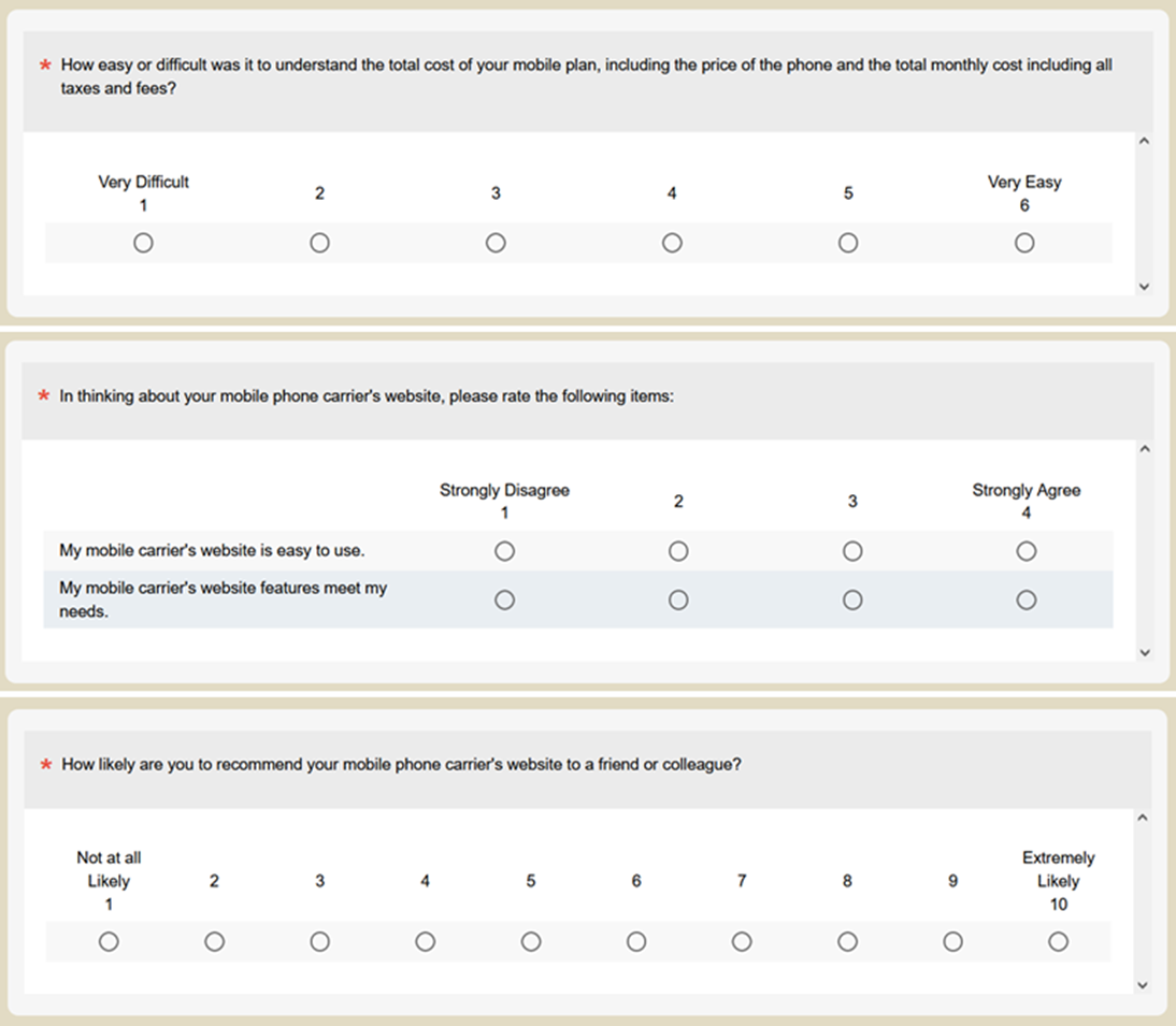
- Easy task: We’d like you to think back to your most recent purchase on Amazon.com and recall what you purchased and how easy or difficult the experience was.
- Hard task: We’d like you to think back to when you purchased your most current mobile phone. Recall as best you can how easy or difficult it was to understand the total cost of the plan, including the cost of the phone and the total monthly cost including all taxes and fees.
The item formats. Figures 1 and 2 show the two item formats.

Using this experimental design, all participants rated a hard and an easy task with the standard (odd) and alternate (even) versions of the rating scales with different orders of presentation. After experiencing both conditions, participants indicated whether they had noticed any difference in the rating scales, and what that difference was. Those who noticed that there were a different number of response options in the two item sets were asked which, if either, they preferred, and why.
Participants were randomly assigned to one of the four orders of presentation. Across the experiment, this controls for the “nuisance” variable of order of presentation while enabling balanced analysis of item format and task difficulty. It also enables a purely between-subjects analysis using data from the first condition participants experienced in their assigned presentation order.
Results
We conducted analyses of means and top-box scores, both with all the data (within-subjects) and just initial ratings (between-subjects). In this kind of experiment, there is value in both types of analysis because the strengths and weaknesses of within- and between-subjects experimental designs are complementary. For example, within-subjects analyses are more sensitive to detection of statistically significant effects and allow for assessment of preference, while between-subjects analyses are immune to the possibility of asymmetric transfer.
Was the Easy Task Actually Perceived as Easier than the Hard Task?
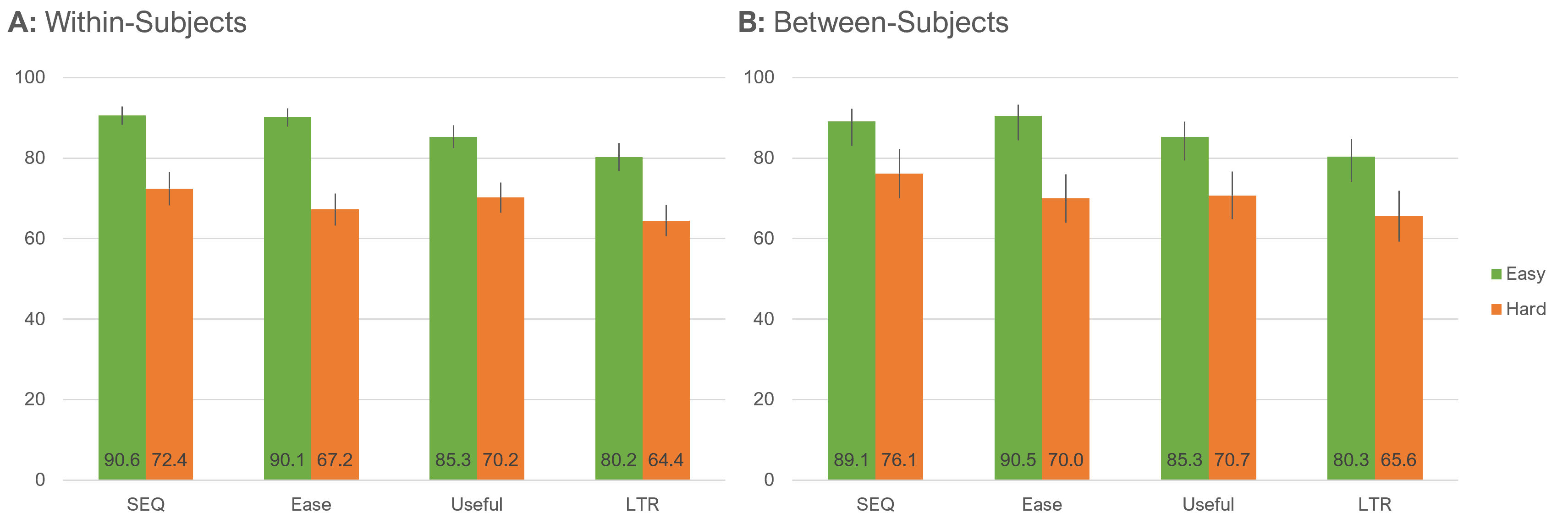
We conducted a manipulation check to ensure the tasks differed in their levels of perceived ease (Figure 3). All differences between ratings of easy and hard tasks were statistically significant (all p < .0001), with similar patterns for within- and between-subjects analyses. The significant differences in perceived difficulty are not too surprising given that one task was intended to be hard and one easy and that their relative difficulty had been validated in earlier research. But it’s good to verify. This analysis, however, also shows that the “hard” task, while rated lower than the “easy” task, is still on the higher side of the scale.
Did the Item Format Affect the Means?
We analyzed the effect of item format on item means, both overall and as a function of task difficulty.
Overall means. Figure 4 shows the overall within- and between-subjects differences in mean ratings for the two item formats.
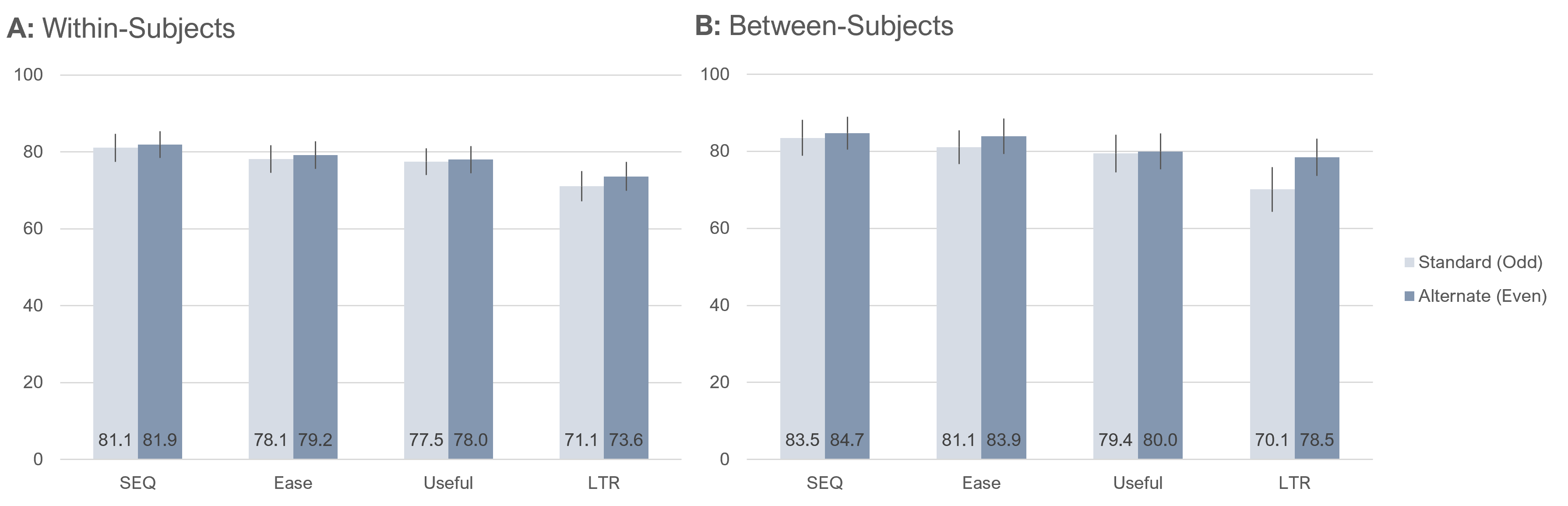
Only one difference between standard (odd) and alternate (even) item formats was statistically significant. In the within-subjects results, there were no significant differences. In the between-subjects results, the only significant difference was for LTR (alternate about 8.4 points higher than standard, t(198 = 2.2, p = .03). Averaging across items, the within-subjects estimate of the overall difference was 1.2 points higher for the alternate format, and the between-subjects estimate was 3.2 points higher for the alternate format.
Means by task difficulty. Figure 5 shows the within- and between-subjects differences in mean ratings for the two item formats for each level of task difficulty.

Analyses of both the within- and between-subjects results shown in Figure 5 indicated highly significant main effects of task difficulty.
The outcomes for SEQ, Ease, and Useful ratings were almost identical for both analyses and for LTR in the within-subjects analysis. The pattern of means for LTR in the between-subjects analysis was different. When the task was easy, the difference in formats was statistically significant (alternate format 9.1 points higher than the standard format, t(122) = 2.025, p = .045). The pattern in means was similar when the task was hard, but the difference was not statistically significant (alternate format 5.1 points higher than the standard format, t(74) = .81, p = .423). Focusing on between-subjects results to estimate unstandardized effect sizes, the mean of the differences between standard (odd) and alternate (even) ratings across the easy and hard tasks was −2.2% (SEQ: −0.9%, Ease: −1.7%, Useful: 0.8%, LTR: −7.1%), which, after including the 1.4% from our previous research, is an estimated effect size of 1.5%.
Did Item Format Affect Top-Box Scores?
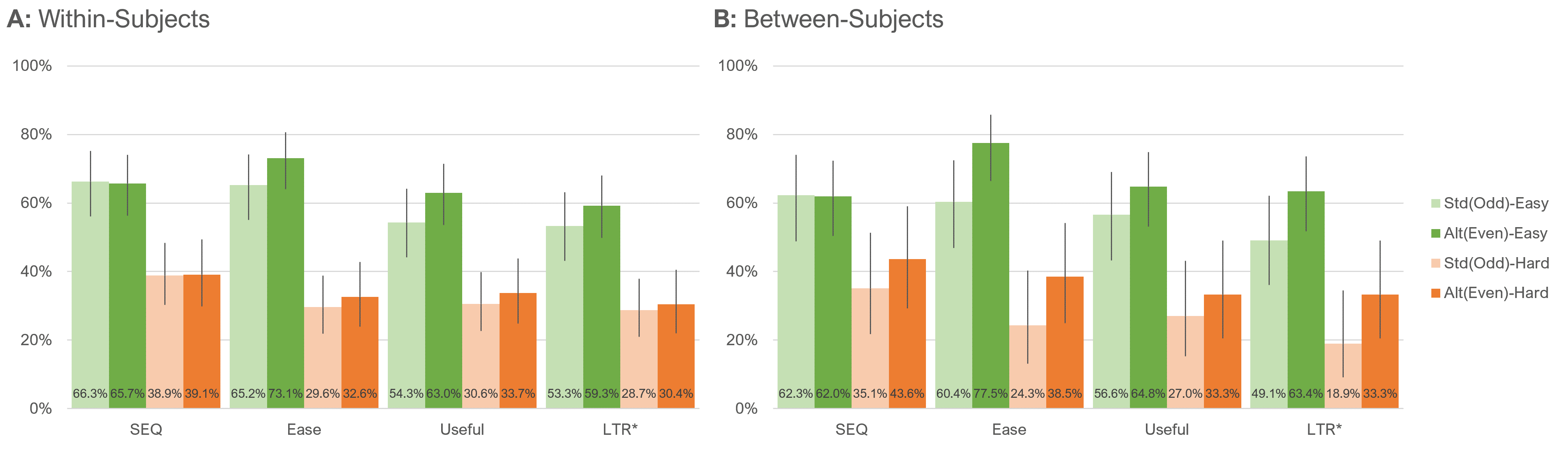
Another popular way to summarize the results of rating scales is to compute their top-box scores or, in the case of LTR, its top-two-box score.
Because the LTR item has so many response options, we computed its top-two-box score for comparison with the top-box score of the UX-Lite Useful item. This is consistent with the protocol for assigning the top two response options of the LTR (9 and 10) to the Promoter category when converting LTR to NPS. The top-box score of a five-point scale covers 25% of the range from 1 to 5; the top-two-box score of an eleven-point scale covers 20% of the range from 0 to 10—not identical, but closer than 10% of the range for the top-box score of an eleven-point scale.
Top-box scores by task difficulty. Figure 6 shows the within- and between-subjects differences in top-box scores for the two item formats for each level of task difficulty.
Both panels of Figure 6 clearly show the significant main effect of task difficulty (consistent with manipulation check of means). The only statistically significant difference between standard (odd) and alternate (even) formats in Figure 6 was the between-subjects comparison of Ease (N−1 Two-Proportion test, z = 2.0, p = .04).
Again focusing on between-subjects results to estimate unstandardized effect sizes, the mean of the differences between standard (odd) and alternate (even) top-box scores across the easy and hard tasks was −3.6% (SEQ: 0.2%, Ease: −5.5%, Useful: 5.9%, LTR: −3.6%), which, after including the 0.2% from our previous research, is an estimated effect size of 3.0%.
Which Version Did Participants Prefer?
After attempting both tasks, participants were asked whether they had noticed a difference in the rating scale formats they had used and, if so, what it was. As shown in Figure 7, over 90% of participants indicated they had not noticed any difference. Only nine participants (4.5%) indicated they had noticed the difference and selected the correct choice from a list of plausible differences. Ten participants (5.0%) selected one of the two distractors.
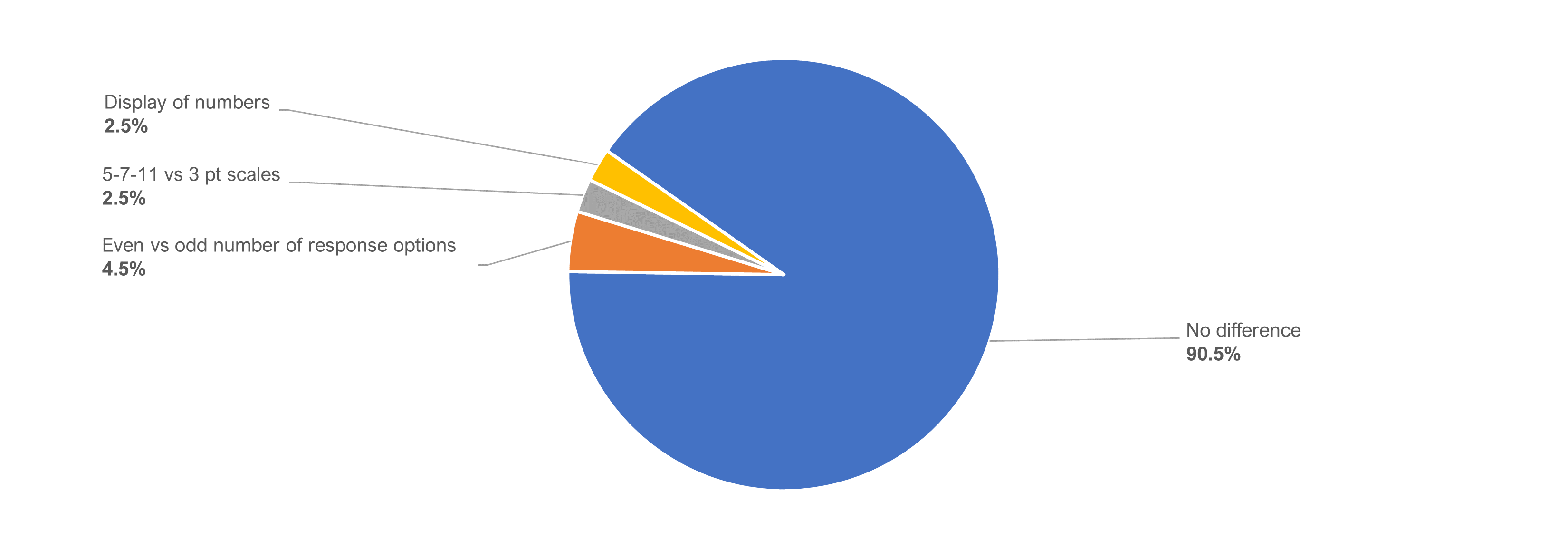
Figure 8 shows the preference percentages for the nine participants who had correctly identified that the difference in the item formats had to do with the odd or even number of response options.

Two participants (22.2%) indicated having no preference, three participants (33.3%) preferred an even number of response options, and four participants (44.4%) preferred an odd number.
Only one participant wrote a reason for preferring even numbers:
- “It’s just nicer to have it in even numbers.”
The three participants who preferred an odd number focused on the desirability of being able to choose the middle value:
- “I think even numbers you are forced to choose which answer you lean more towards versus the odd point scale you are able to be directly in the middle.”
- “Odd numbers have a middle point, which is a very useful scale point when one does not have much of an opinion about something.”
- “The odd numbers allow for a midpoint.”
Summary and Takeaways
Our analysis comparing the impact of removing the neutral point from four standardized items (SEQ, UX-Lite’s Ease and Useful items, LTR) using 200 participants indicated:
Top-box scores were slightly (3%) higher with no neutral point. Top-box scores for even-numbered (no neutral point) items were consistently higher than the odd-numbered (neutral point) format items, especially in the between-subjects analyses. This suggests that the ratings that otherwise would have gone to the middle (neutral) option tended to be higher when the neutral point is removed. This trend was more attenuated with means which, by their nature, tend to be more stable than percentages of extreme responses. Our best estimate from this and the previous study is a slightly higher mean (1.5%) for the alternate (even) format.
Most differences in response patterns for means or top-box scores were not significant. We found little evidence for systematic differences in response means or top-box scores based on varying the number of points from odd to even for most comparisons of standard versus alternate formats. Across 32 within- and between-subjects comparisons of formats by task difficulty (Figures 5 and 6), only two were statistically significant. One of the significant differences was between LTR means when the task was easy (between-subjects), and the other difference was between Ease top-box scores when the task was easy (also between-subjects). When p is set to .05, however, you expect one or two false positives across 32 tests, where there is really no difference.
It isn’t clear whether the significant differences in LTR and Ease are interpretable or anomalous. One way to interpret significant differences in this type of experiment is to look for patterns. The commonalities in these two outcomes are they were between-subjects with higher scores for the alternative (even) format when the task was easy. The key differences between the items are that Ease is a bipolar attitudinal scale (endpoint anchored with “Strongly Disagree” and “Strongly Agree”) while LTR is a unipolar behavioral intention scale (endpoint anchored with “Not at All Likely” to “Extremely Likely”). The Ease finding is hard to interpret because neither of the other two bipolar attitudinal items (SEQ and Useful) showed this pattern, especially given that the SEQ is another way to measure perceived ease. We suspect that the LTR patterns in top-box scores and means could be influenced by its unipolarity where the middle value doesn’t necessarily act like a neutral value. We will watch for this potential effect in future research.
Over 90% of respondents didn’t notice the change in rating scales. Not only were response behaviors generally similar with the two item formats, but over 90% of respondents also reported not noticing any difference in formats. Of the nine respondents who did notice the change in item format, two had no preference, three preferred the alternate (even) version, and four preferred the standard (odd) version.
Key finding. We found some evidence suggesting that the absence of a middle option in rating scales tends to increase the magnitude of ratings by a small amount. Our best estimate is that this effect size for means is about 1.5% of the range of the scales, and for top-box scores, the effect size is about 3%.
Key recommendation. Unless there is a compelling reason to do otherwise, we recommend using the standard versions of well-known items like UX-Lite, SEQ, and LTR that use five, seven, and eleven points respectively, for easier comparison across studies, especially since the presence of a middle option (for a neutral attitude) is reasonable and customary in most UX research.