 The summer of 2022 has seen a significant rebound in both U.S. and international travel.
Earlier this year, we benchmarked the airline website experience. But many travelers start at travel websites that aggregate airfare, hotels, rental cars, and experiences into one portal. In 2021, these websites generated some $11 billion in revenue (still below 2019 levels).
We collected UX benchmark data from several leading travel websites to measure the experience of researching and booking consumer travel. Similar to our analysis in 2014, we collected data on a variety of attitudes and intentions toward several travel aggregator websites.
- Booking.com
- Expedia
- Google Travel
- Kayak
- Orbitz
- Priceline
- Travelocity
- Tripadvisor
- Trivago
We computed SUPR-Q® and Net Promoter scores, investigated reasons for using the websites, measured users’ attitudes regarding their experiences, conducted key driver analyses, collected think-aloud data, and analyzed reported usability problems.
Benchmark Study Details
In May 2022, we asked 457 users of travel aggregator websites in the U.S. to recall their most recent experience of one of the travel websites on desktop and mobile (app or website) in the past year.
Participants completed the eight-item SUPR-Q (which includes the Likelihood-to-Recommend item that is the basis of the Net Promoter Score) and two-item UX-Lite standardized questionnaires and answered questions about their brand attitudes, usage, and prior experiences.
UX Quality of Travel Website Experience: SUPR-Q
The SUPR-Q is a standardized questionnaire that is widely used for measuring attitudes toward the quality of a website user experience. Its norms are computed from a rolling database of around 200 websites across dozens of industries.
SUPR-Q scores are percentile ranks that tell you how a website experience ranks relative to the other websites (50th percentile is average). The SUPR-Q provides an overall score as well as detailed scores for subdimensions of Usability, Trust, Appearance, and Loyalty.
The travel websites in this study collectively averaged at the 69th percentile. Google Travel received the highest SUPR-Q score at the 96th percentile, and Trivago scored the lowest at the 44th percentile (the only site below the 50th percentile).
Usability Scores and Trust
We asked participants to rate how easy they thought it was to use and navigate through the websites. Kayak had the highest usability score (93rd percentile) and Trivago had the lowest (45th percentile). Comments about Trivago regarding usability included
“Sometimes rooms aren’t available at the price listed, especially at the host site.”
“Sometimes I want to find a general price but I always have to put in a date.”
“Doesn’t always seem to have every option listed, or has options listed twice.”
“The map does not zoom in when you use the scroll wheel on the mouse.”
We also asked participants to rate the trust and credibility of the travel aggregator websites. Trust scores were generally lower than the usability scores. Tripadvisor had the highest trust score (96th percentile). Orbitz had the lowest trust score (37th percentile).
Based on respondents’ feedback, this may be related to inaccurate pricing or a lack of trust in Orbitz to follow through with the main company organizing the travel (as a third-party booking company). Comments about Orbitz included
“Sometimes though, prices are suggested but then are not available—that is the most frequent annoyance.”
“It has given me some trouble when trying to change third-party bookings or edit preferences with my bookings.”
“[I’ve heard of] customer horror stories of being double booked with these companies and they have no refund policy.”
“I am always worried about getting someone and my reservation not being available because it’s a 3rd party vendor but it hasn’t happened to me yet.”
More verbatim comments are available in the downloadable report.
Loyalty/Net Promoter Scores
The average NPS for the travel aggregator websites was 15% (slightly higher numbers of promoters than detractors), ranging from −2% for Priceline to 40% for Tripadvisor. In general, a better user experience is a good predictor of customer loyalty.
2014 versus 2022 Comparison
While the online travel space has changed significantly in eight years, notably with new entrants like Google Travel, we were able to compare scores and relative rankings to our 2014 data. The websites included across both years (Expedia, Kayak, Orbitz, Priceline, and Travelocity) saw a drop in overall SUPR-Q scores, component scores, and the NPS. This drop could be due to a general souring of consumers towards travel websites, possibly impacted by the pandemic or past experiences, or their opinions may be affected by new entrants like Google Travel.
However, while Kayak’s overall SUPR-Q score dropped by a few points, its usability score increased over the period, suggesting it’s not necessarily an overall industry trend.
Websites and Mobile App Usage
As a part of this benchmark, we asked participants how they accessed the travel aggregator websites. All participants reported using their desktop/laptop computers (this was a requirement for participation in the survey), with 33% using mobile apps and 70% using mobile websites.
The typical frequency of use was a few times a year for desktop/mobile websites (on average, about 1% reported daily use). For those who reported mobile app use, typical frequency of use was also a few times a year. Booking.com, Orbitz, and Tripadvisor tied for the most frequently used mobile app (overall usage of 22%).
Usage patterns were roughly equivalent for all travel aggregator websites, with 100% of participants going to travel aggregator websites to look at flights/airfares and 58% looking for hotels. Other reasons for visiting travel aggregator websites include looking for cruises (28%), looking for ideas of what to do on vacation (11%), looking for rental cars (5%), and looking for travel packages (2%).
Interestingly, while finding airfare dominates the reasons people visit, travel websites make the bulk of their revenue through hotel bookings. This means travel websites need to attract and retain users by providing an excellent and often unprofitable airfare experience while hoping to get them to purchase more profitable hotel stays.
Key Drivers of the Travel Website Experience
To better understand what affects SUPR-Q scores and likelihood-to-recommend (LTR) ratings, we asked respondents to rate the following attributes of the travel aggregator websites on a five-point scale from 1 (Strongly disagree) to 5 (Strongly agree). We conducted key driver analyses (regression modeling) to quantify the extent to which ratings on these items drive (account for) variation in overall SUPR-Q scores and, separately, LTR (the rating from which the NPS is derived).
- It is easy for me to filter on the website
- They have a good selection of available hotels
- Interacting with the calendar on the website is simple and intuitive
- I feel comfortable booking a flight on the website
- I know how much I’ll be charged, including fees and taxes
- They have a good selection of available experiences
- It’s easy to purchase an airline ticket
- It’s easy for me to save a reservation before purchasing
- The website keeps my information secure
- It’s easy to find a flight that meets my needs
- It’s easy to find the cheapest hotel
- I’m able to share reservation information
- It is easy to find the cheapest airfare for a flight
- It’s easy to choose a seat on flights booked with the website
- It’s easy to get the best deals on the website
- I can easily change my reservation on the website
- They have a good selection of available rental cars
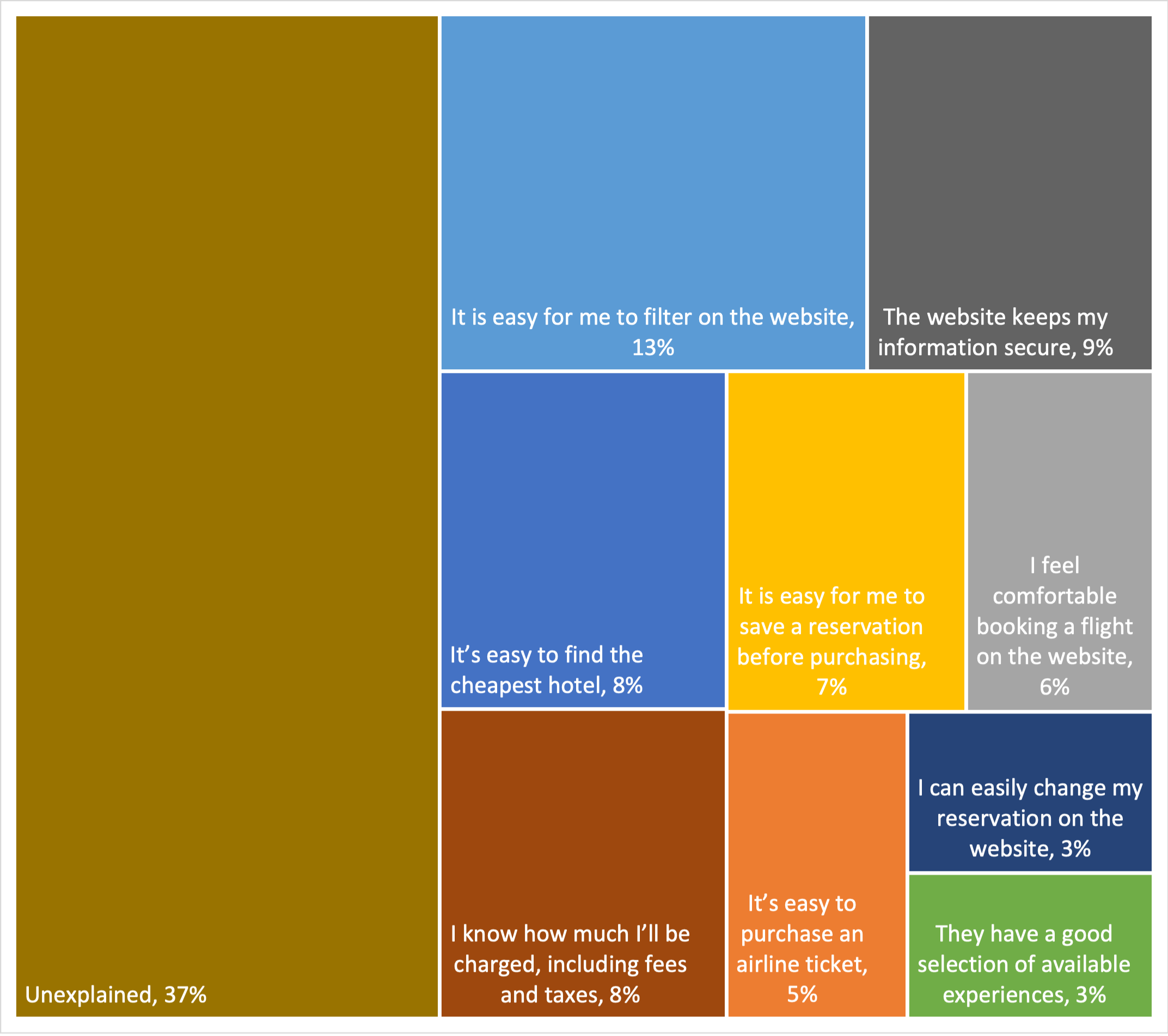
SUPR-Q Drivers. As shown in Figure 1, the top key drivers from this list were “It is easy for me to filter on the website” and “The website keeps my information secure” (respectively accounting for 13% and 9% of SUPR-Q variation). Other significant key drivers were “It’s easy to find the cheapest hotel” and “I know how much I’ll be charged, including fees and taxes,” each accounting for 8% of SUPR-Q variation.
LTR Drivers. At a high level, the top key driver of likelihood-to-recommend (LTR, the basis of the NPS) was brand attitude (32%).
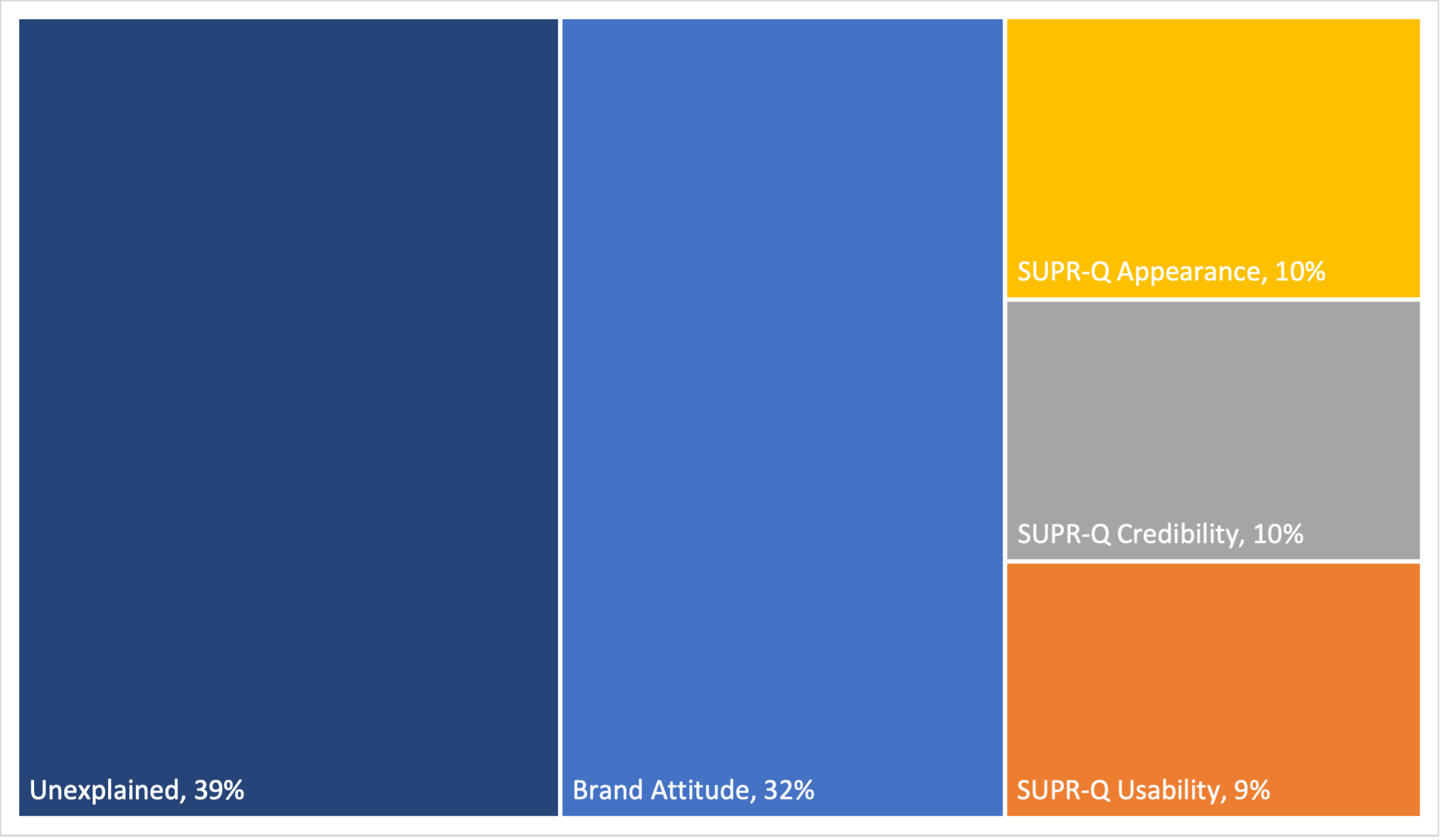
At a lower level, using the same set of predictors as in the SUPR-Q KDA, the top key drivers were “It is easy for me to filter on the website” (9%), “I know how much I’ll be charged, including fees and taxes” (8%), and “It’s easy to find the cheapest hotel” (8%).

We did a deep dive on the key drivers to better understand what’s separating the best from the worst performers. In particular, we found that selecting hotels and interacting with the calendar provided differing experiences.
Hotel selection
Participants were asked to rate their experience when finding an applicable hotel for their travels. Booking.com received the highest percentage of participants who selected Strongly Agree (top box) when asked if the selection of hotels was good, at 50%.
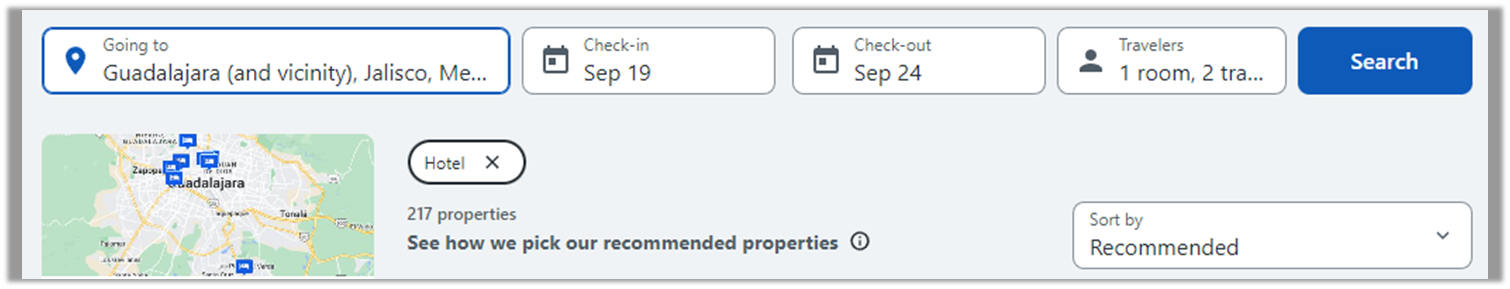
Travelocity had the lowest percentage, with only 26% of participants strongly agreeing. When users searched for hotels from September 19th–24th in Guadalajara, Mexico, the results between Booking.com and Travelocity were quite different. Booking.com produced 417 properties (Figure 4) while Travelocity produced 217 properties (Figure 5).

Interacting with the calendar on the website is simple and intuitive
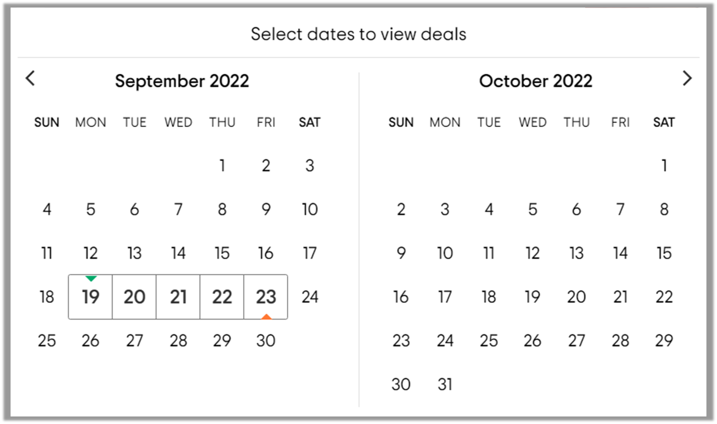
Participants were asked to rate the ease of interaction with the booking calendar on travel aggregator websites. Google Travel performed the best on this metric, with 48% of participants strongly agreeing that the calendar was easy to use, while Tripadvisor performed the worst with 22% of participants strongly agreeing.
When comparing Google Travel’s and Tripadvisor’s booking calendars, each has a basic calendar that displays two months of dates at a time. However, the Google Travel calendar also displays active prices that change as each stage of the flight is selected.

What to Improve
Respondents had a few common problems and frustrations across the travel aggregator websites, such as 1) not finding the best deals or experiencing price fluctuations and 2) unappealing designs or cluttered websites.
1) Specific examples of price issues cited by respondents for each website/app include
- Booking.com: “I have noticed that the prices reflected on the Booking.com website are much higher than simply booking the flight through the company’s website you plan on using. They need to do that in order to collect fees, but it’s misleading to many.”
- Expedia: “I feel like I don’t always get the best deals.”
- Google Travel: “Sometimes the cheapest airfare shown has the worst flight options (e.g. 3 stops) so it sometimes feels deceptive.”
- Kayak: “I have seen flight prices change while spending extra time in the platform.”
- Orbitz: “Sometimes I get frustrated because the prices fluctuate too much.”
- Priceline: “Price changes before I check out.”
- Travelocity: “They don’t always have the lowest prices. I usually check several different websites and I can usually find a cheaper rate somewhere else.”
- Tripadvisor: “Air fare is expensive right now. I am seeing lower rates on other sites. I would like to be offered the best rate right away.”
- Trivago: “Doesn’t always seem to have the best deals and prices.”
2) Across all the websites, users experienced issues with various design elements:
- Booking.com: “There’s just so much information on each page. So many things to click. It’s a little overwhelming.”
- Expedia: “The webpage has a lot of blank/white space. It’s almost too bright in my opinion.”
- Google Travel: “Slightly crowded pages.”
- Kayak: “There is a lot going on the website, almost too many options jumbled together. The website itself is ugly and cluttered.”
- Orbitz: “Too much ad-type areas, no real helpful info there.
- Priceline: “I do not like the interface, it is busy.
- Travelocity: “The amount of information can be intimidating. I love the options but you really have to read through a lot sometimes to get to what you want.
- Tripadvisor: “Could be more aesthetically pleasing.
- Trivago: “Too much information is condensed into one little area, when the rest of the webpage is empty and unused. It seems like this could be done much more effectively, attractively, and easier for the consumer.”
Figures 8, 9, and 10 illustrate additional design-related issues observed for Expedia, Google Travel, and Priceline.

Summary and Takeaways
An analysis of the user experience of nine travel aggregator websites found:
- SUPR-Q scores were mostly above average, and mean the NPS was 15%. Google Travel had the highest SUPR-Q rating (96th percentile) while Trivago had the worst (44th percentile). Tripadvisor had the highest NPS (40%), while Priceline had the poorest NPS (−2%).
- Nine variables accounted for 63% of the variation in SUPR-Q ratings. The top key driver was “It’s easy for me to filter on this website,” which accounted for 13% of the variation.
- Some common UX issues were reported across the websites. Respondents had a few common problems and frustrations across the travel aggregator websites, such as 1) not finding the best deals or experiencing price fluctuations and 2) unappealing designs or cluttered websites.
- The top low-level key driver of variation in likelihood-to-recommend ratings was the same as in the SUPR-Q KDA. Using the same set of low-level predictors as in the SUPR-Q KDA, the top key driver was “It’s easy for me to filter on this website,” (9%). At a high level, the top key driver of likelihood-to-recommend was brand attitude (32%).
Full details are available in the downloadable report.