 In earlier articles, we identified 70+ UX metrics and provided guidance on how to select a metric.
Seventy of anything is hard to keep track of, much less master.
However, there are two ways to make that large list of metrics more approachable: The first is to decompose that list into logical groups (Figure 1). The second is to identify the most used and versatile ones, prioritizing them.

Figure 1: Overview of 70+ UX metrics (as of the publication date of this article).
Note: This taxonomy is a living document. Like anything else, the popularity of metrics can rise and fall, new methods make formerly difficult metrics easier to collect, and metrics that do not have benchmarks this year might have some next year. We plan to update this infographic over time, so in the future, you can click here for the latest version.
As shown in Figure 1, the metrics have two main groupings. The first reflects the bifurcation of UX metrics into actions (what people do) and attitudes (how people feel). They are then also divided by how they are collected: at the task level (e.g., task-based metrics collected multiple times in a usability test) or at the study level (e.g., overall metrics typically collected once at the end of a study or retrospectively).
We go through many of the most common ones in our MeasuringUniversity course on UX metrics. While we encourage you to take the course, we also realize that choosing the right metric can get overwhelming. For example, desirability and mental effort may sound interesting, but they aren’t commonly used, meaning they are not the best first choices. So, where should you start?
Our recommendation is to start with the ones that are most commonly used and that provide the best coverage across the categories of attitude and action, task level and study level.
Figure 1 includes 19 metrics that we’ve identified as having high popular usage (green triangle). An additional 43 metrics with green circles indicate ease of collection. Finally, 11 metrics with green squares reflect solid benchmarks. Only three metrics have all three green shapes, but they have limited coverage because all three are attitudinal metrics (no action metrics).
All UX metrics serve a purpose, but if you had to start to measure UX, which ones should you master and get comfortable knowing how to use, collect, and interpret them?
We’ve identified four essential UX metrics, three at the task level (two action, one attitudinal) and one at the study level (attitudinal).
At the task level, you should master what we call the big three task metrics: completion, ease (SEQ®), and time. Although the System Usability Scale (SUS) is the most popular UX metric at the study level, we recommend getting comfortable with the UX-Lite® because it measures perceived usefulness as well as perceived ease of use with fewer items.
Task Completion
What it is: It’s the most common way to quantify the effectiveness of an interface. If users can’t do what they intend, not much else matters. It’s a great place to start.
How it’s measured: It’s a binary measure coded as 1 for success and 0 for failure, ideally based on objective task-success criteria identified ahead of time (e.g., the correct product located, the right page selected, or the correct price found).
How it’s scored: Assessing task completion will vary based on whether data is collected from actual or simulated use, and in simulated use, based on the mode of evaluation (moderated or unmoderated usability testing). When an observation can be made (from actual or simulated use), researchers have more freedom in writing task scenarios and determining task success.
In unmoderated testing, the primary validation methods are by question and/or URL. When all else fails, self-reported task completion is better than nothing but tends to be highly inflated. As with most UX methods, use a combination of approaches to measure effectiveness. For example, ask participants a validation question, view a record of the URLs they visited, and when needed, review the session recordings.
How it’s interpreted: Because it’s an absolute percentage, it’s bound by 0% and 100%, making it easy to communicate. It can be interpreted by itself, compared to other tasks, compared to the same task performed on different products, or compared to historical scores.
An analysis we conducted in 2011 of 1,189 tasks from 115 usability tests (90% moderated) found the average task-completion rate for that reference group was 78% (but keep in mind that context matters).
We’ve used that reference data to create a curved grading scale for interpreting task completion. The top 15% of the scores are As, and the bottom 15% are Fs. Normally, we would divide the top 15% into A+, A, and A−, but because about 15% of the tasks in this distribution had successful completion rates of 100%, there was no way to establish A+ or A−. To be an A (top 15%), the completion rate has to be 100%.
If you don’t have your own historical data to help you set task-completion criteria, you can use Table 1 to either set the criteria or inform discussions with stakeholders. For example, if you want to target a grade-A user experience, you need to set your target to 100%. If that seems too radical for your situation, you might shoot for an above-average experience by setting the target to 90%, or you might at least be better than average by exceeding 78%.
| Successful Completion Rate (%) | Grade | Percentile Range |
|---|---|---|
| 100 | A | 85–100 |
| 96.9–99.9 | B+ | 80–84 |
| 90.3–96.8 | B | 70–79 |
| 86.7–90.2 | B− | 65–69 |
| 83.1–86.6 | C+ | 60–64 |
| 67.3–83.0 | C | 41–59 |
| 61.4–67.2 | C− | 35–40 |
| 33.6–61.3 | D | 15–34 |
| 0–33.5 | F | 0–14 |
Table 1: Curved grading scale for successful task-completion rates.
What’s good: A “good” completion rate is ultimately context dependent, with very high-stakes situations (loss of data, money, or life) requiring 100% completion rates. For somewhat lower (but still high) stakes, 90% or above covers the top 30% of tasks in our reference group.
What’s average: This also depends on the context. For our reference group, about half the tasks had completion rates above 78%, making that a reasonable target for low-stakes contexts.
What’s bad: 0% is as bad as it gets, and 50% is still pretty bad (about the middle of the D range in our grading scale). Anything below 67% drops below our C range, and rates lower than 78% are, strictly speaking, below average for our reference group.
What to watch out for: Realistic task-success criteria can take trial and error to get right, so plan to test and iterate. Use self-reported task-completion rates only as a last resort. Remember that our curved grading scale of completion rates should be used as a guide when you lack any context on completion rate data. It is not a universal rubric to always interpret completion rates.
Single Ease Question (SEQ)
What it is: The SEQ is a single seven-point question asked after participants attempt a task as part of a usability test or benchmark (Figure 2).
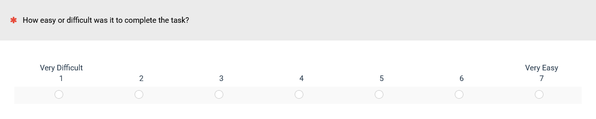
Figure 2: The current version of the SEQ.
It’s the most common way to measure post-task ease.
How it’s measured: While typically administered electronically as part of a survey, the single item can also be presented to participants on paper or aurally.
How it’s interpreted: The mean is calculated across participants (e.g., 5.1) and can be interpreted by itself, compared to other tasks, compared to the same task performed on different products, or compared to historical scores. The historical mean across several hundred tasks is 5.5. For easy interpretation, Figure 3 shows the correspondence between the SEQ and an adjective scale plus its historical deciles (every 10th percentile).
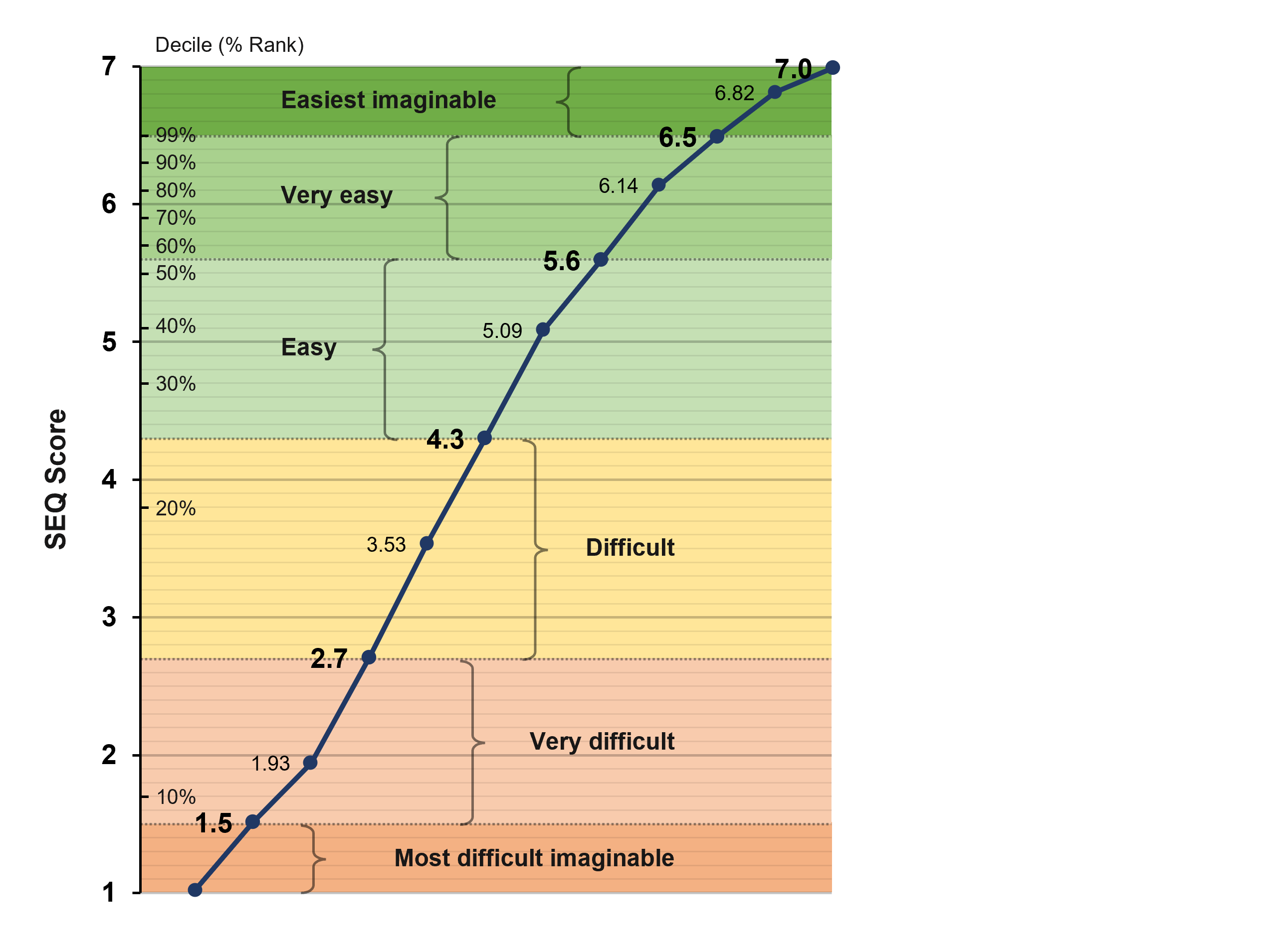
Figure 3: SEQ and adjective scale correspondence (including historical SEQ deciles).
What’s good: Anything above the historical average of 5.5 is at least Very Easy, and scores above about 6.3 put the task in the top 10% (90th percentile) of task ease (above 6.5 is in the Easiest Imaginable range).
What’s average: While it depends on the context (high-stakes tasks should be very easy), our analysis from 500 tasks (the reference group) shows that the average score (50th percentile) is around 5.5. Our adjective scale results suggest that our reference group (the 500 tasks) is made up of more easy than difficult tasks, so SEQ scores greater than 4.3 are at the boundary of Easy and Difficult.
What’s bad: While the midpoint of a seven-point scale is 4, that score translates to around the 25th percentile (harder than 75% of tasks). Below average is not great, but below 4 is bad.
What to watch out for: Don’t get hung up on slight changes in wording or labels. Keep the scale to seven points (and as close to the current form as possible) to keep it comparable to historical benchmarks. Having seven-point and five-point scales in the same study is fine (e.g., using the SEQ with the SUS, UX-Lite, or NPS).
Time
What it is: Task time is the quintessential measure of efficiency. When you need to measure efficiency, task time is the natural choice. Task time is used much less frequently than the other two task-level metrics because it’s harder to interpret—but when it’s the right tool for the job, you should be ready for its nuances. Because it’s often automatically collected without operator or user intervention, it acts as a good secondary measure.
How it’s measured: In unmoderated studies, task time is measured automatically using software like the MUiQ® platform, so it’s often considered “free” because its collection doesn’t take any additional researcher or user time. Moderated studies, however, often require some manual start/stop with software or a stopwatch.
How it’s interpreted: Task time is highly contextual. Twenty seconds may be quick for finding a product but a long time to get through a login. Task times are more meaningful when compared to a competitive task, or in some cases, external benchmarks (e.g., rent a car in under 60 seconds).
Because task times are skewed (some participants can take 2–10 times longer than others), the data should be transformed when computing averages and confidence intervals.
Typically, times from successfully completed tasks are reported, but task times from failures may be informative as well.
One option to interpret task times is to compare raw times to a benchmark and convert them to a percentage. This is the process when combining times in the Single Usability Metric (SUM).
What’s good: Lower variability and shorter times are better for productivity tasks. For engagement (e.g., time on social media or a webpage), longer times are sought after.
What’s average: Highly context dependent, but competing tasks or benchmarks can provide that context.
What’s bad: High variability and longer times indicate underlying problems for productivity tasks. For measuring engagement, short times are worse than longer times.
What to watch out for: Because less time is usually better for productivity tasks (which are more commonly studied than engagement tasks), lower scores are better, which may trip up other researchers or stakeholders when interpreting them.
UX-Lite
What it is: The UX-Lite questionnaire (Figure 4) consists of two items (how easy it was to use and how well the features met your needs). Like the SEQ, it’s beautifully compact but effective. It predicts future software usage. Why? Because there’s good evidence that people prefer a product that does what they need it to do and is easy to use.
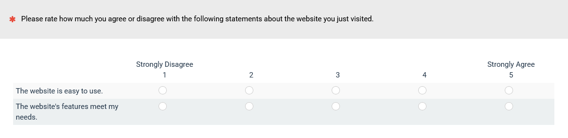
Figure 4: The current version of the UX-Lite.
How it’s measured: The UX-Lite can be administered as part of a retrospective survey or at the end of a task-based study. Administration can be electronic, written, or verbal.
How it’s interpreted: Once you collect data from participants, interpolate each item from a five-point scale to a 0–100-point scale. A shortcut to calculate the interpolated score for any five-point item is to subtract 1 from the rating and then multiply by 25.
Then, you can average the ease and usefulness scores to get the UX-Lite score. For example, if someone gives an ease rating of 4 and a usefulness rating of 3, their interpolated ease score is 75, the usefulness score is 50, and the combined UX-Lite score is 62.5.
There are several ways to interpret UX-Lite scores. The UX-Lite ease item correlates highly with the SUS, so you can also generate estimated SUS scores that are 98% accurate and interpret them using any of the methods developed for interpreting the SUS.
We have also developed two grading scales for interpreting UX-Lite scores (Table 2). The standard grading scale is appropriate for a general assessment of UX-Lite means at the product level, while the curved grading scale can be used when the UX-Lite data to be interpreted matches our reference group.
| Grade | Standard Grade Range | Curved Grade Range | Curved %ile Range | |
|---|---|---|---|---|
| A+ | 95–100 | 87.4–100 | 96–100th | |
| A | 90–94.9 | 85.3–87.3 | 90–95th | |
| A− | 85–89.9 | 84.0–85.2 | 85–89th | |
| B+ | 82–84.9 | 83.1–83.9 | 80–84th | |
| B | 78–81.9 | 81.3–83.0 | 70–79th | |
| B− | 75–77.9 | 80.6–81.2 | 65–69th | |
| C+ | 72–74.9 | 79.8–80.5 | 60–64th | |
| C | 68–71.9 | 77.0–79.7 | 41–59th | |
| C− | 65–67.9 | 76.0–76.9 | 35–40th | |
| D | 50–64.9 | 71.8–75.9 | 15–34th | |
| F | 0–49.9 | 0.0–71.7 | 0–14th |
Table 2: Standard and curved grading scales for the UX-Lite.
Our reference group for the curved grading scale has five years of UX-Lite data collected from 1Q 2020 through 1Q 2025 (48 business software products, 81 consumer software products, and 160 websites with ratings from 13,768 respondents). The data collection method was to collect the UX-Lite data with retrospective surveys of business software products, consumer software products, and websites from multiple consumer sectors with participants from online panels. This enables the interpretation of UX-Lite means with percentiles for that reference group.
The process of curving compresses the grading scale from D to A+ to a range of 71.8 to 100 rather than the standard grading scale that ranges from 50 to 100. This allows better discrimination among UX-Lite scores that match this reference group.
What’s good: A UX-Lite score of 85 corresponds to an A− on both grading scales (the 90th percentile is better than all but 10% of the products in the reference group).
What’s average: The median UX-Lite score in our reference group is 78.8. Keeping in mind that our reference group is primarily made up of premium products and websites collected with retrospective surveys, we suspect a more general UX-Lite average to be about 71 because the historical SUS average is 68, and UX-Lite scores concurrently collected with the SUS tend to be about three points higher (which is why the center of our standard UX-Lite grade range for C is close to 71).
What’s bad: Anything below C− (below 65 on the standard grading scale or, when applicable, below 76 on the curved grading scale).
What to watch out for: The UX-Lite is the most recent evolution of the UMUX-Lite, the UMUX, the SUS, and the TAM. We recommend using the current format and wording for the best benchmark comparisons. Avoid using the curved grading scale unless your data matches the reference group.
Note: Inside our reference group, there are differences in the means of the subgroups from 72.6 for business software (sd = 4.23) to 77.7 for consumer software (sd = 6.42) to 79.7 for websites (sd = 5.38). If you have a specialized research need for percentiles for any of these subgroups or for the UX-Lite subscales of perceived ease and perceived usefulness, they are available in our UX-Lite Calculator Package.
Summary and Discussion
Over 70 UX metrics are divided into attitudinal (how people feel) and action (what people do) categories, as well as task-level (measured multiple times typically in a study) and study-level (measured once per study or collected retrospectively in a survey) categories.
It can be an overwhelming list. We recommend learning to get comfortable with four metrics that together address many research questions:
- Task Completion: Measures effectiveness by tracking whether users successfully complete tasks.
- Single Ease Question (SEQ): A single post-task question assessment of ease of use.
- Task Time: A measure of efficiency, evaluating how long users take to complete a productivity task (or spend on an engagement task).
- UX-Lite: A two-item questionnaire that measures perceived ease of use and perceived usefulness, collected at the end of a usability study or in a retrospective survey.
Getting comfortable with UX metrics means understanding what they are, when they’re used, how they’re measured, and how to interpret them (what’s good, average, and bad). Not coincidentally, these metrics reflect the three pillars of classic usability (effectiveness, satisfaction, and efficiency).
Attitudes and actions: These four metrics include a mix of measuring what people think/feel and do. The SEQ and UX-Lite are examples of attitudinal measures, and task completion and task time are examples of behavioral metrics.
Time is the least used of the four. Task time is used much less frequently, but when it’s the right tool for the job, you should be comfortable with its nuances. Because it’s often easy to collect without operator or user intervention, it acts as a good secondary measure for task completion and SEQ.
UX-Lite and SEQ can be collected in a task-based or retrospective study. It’s not always possible or even desirable to collect data in a task-based study. The UX-Lite and SEQ can both be collected in task-based studies or retrospectively.