 Advice on rating scale construction is ubiquitous on the internet and in the halls of organizations worldwide.
The problem is that much of the advice is based not on solid data but rather on conventional wisdom and what’s merely thought to work.
Even published papers and books on survey design can present a perspective that isn’t necessarily generalizable or gets taken out of context.
For example, we’ve found that alternating between positive and negative wordings in scales tends to cause more harm than good. Yet alternating the tone is a commonly cited “best practice.”
Another concern we’ve heard is that people have a hard time differentiating between too many response options in rating scales, which, if true, would lead to a recommendation to avoid response options with more than, say, seven points.
For example, on an eleven-point scale such as the one shown in Figure 1, what is the difference between 6 and 7 in terms of satisfaction? Does having so many points increase the cognitive burden of responding and lead to measurement problems?
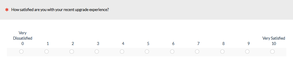
Figure 1: A sample eleven-point satisfaction item.
In an earlier article, we showed that having too few response options (three or fewer) leads to a significant reduction in both reliability and validity as respondents could not accurately express the intensity of their feelings. But what about the opposite: do too many points cause problems? Is the optimal number of response options driven by a Goldilocks effect where too few is a problem and too many is also a problem? In this article, we dive deep into many sources to understand the evidence for or against too many points.
Research on Too Many Points
We first looked to some commonly referenced survey books for any rationales and data for why more points might add problems. We do see guidelines in survey books on not using too many points.
For example, Dillman et al. (2014) generally recommend limiting scales to four or five categories because “… respondents can only hold a limited number of categories in their head at once, so offering fewer categories can help reduce the cognitive complexity involved in providing a response, especially over the telephone” (p. 153). The authors don’t provide a study to support the guideline, but the caveat about phone administration may be warranted when the response options are words or phrases rather than a numeric scale. The guideline is probably not applicable to electronically administered surveys where respondents can see all options, changing the mental processing from memorization-plus-selection to simple selection.
In Survey Scales, Johnson and Morgan (2016) also warn against using too many scale points that “might result in respondents experiencing problems discriminating the scale points” (p. 75). They argue this will contribute to measurement error—one of the four horsemen of survey errors. They cited three studies to support this warning against too many points.
Study 1
The first study (Lozano et al., 2008) concluded that beyond “seven alternatives onwards psychometric properties of the scale scarcely increase further.” They used simulations to explore the effect of varying both the correlations among items and the number of response categories per item from two to nine. Their main finding was that increasing the number of response options increased the reliability of the associated scales (monotonically increasing with diminishing returns from three to nine options).
This finding is consistent with the foundational work of Nunnally (1978), who reported a strongly diminishing return in reliability from 11–20 scale points and no significant increase thereafter. Note that neither Lozano et al. nor Nunnally reports a reduction in reliability as the number of points increase, but rather a flattening of the increase in reliability. Regarding multipoint scales for the measurement of sentiments, Nunnally (pp. 595–596) concluded:
In terms of psychometric theory, the advantage always is with using more rather than fewer steps. … To some extent, the monotonic relationship between scale reliability and number of scale steps may be at variance with common sense. For example, one might reason that, if there are numerous scale steps, subjects would have difficulty making up their minds and might mark a different point on a retest. It is true that as the number of scale points increases, the error variance increases, but at the same time the true-score variance increases at an even more rapid rate.
A basic principle of psychometric theory is that every measurement has two components—true score (T: the true value) and error (E: random effects). Reliability is defined as the ratio of true-score variance divided by observed variance, where observed variance is the sum of true-score and error variance: T2/(T2 + E2). From the formula, it’s clear that if something causes true-score variance to increase faster than error variance, two things will happen. First, the reliability will increase. Second, measurement precision will improve. These effects will be most pronounced when comparing scales with very few response options to scales with more points.
Study 2
The second study Johnson and Morgan cited is Weng (2004), which replicated the earlier findings that too few categories decreased reliability and also reported that fully labeled scales tended to increase reliability (p. 956):
The results indicated that the scales with few response categories tended to result in lower reliability, especially lower test-retest reliability. The scales with all the response options clearly labeled were likely to yield higher test-retest reliability than those with only the end points labeled.
Carefully reading Weng’s methods and results paints a more nuanced picture regarding the comparison of full versus endpoint labeling: “The hypothesis that the full specification of response options improves reliability was only partially supported in the present study” (p. 969). Several hypotheses were put forth as potential explanations for why one set of data showed increased test-retest reliability for the fully labeled format with no difference for a second set of data, but the bottom line is that the findings were inconsistent. This is an example of statements made in the abstract of a peer-reviewed paper making broader claims than the data support, which is why we recommend against taking these statements at face value when reviewing research.
Our recommendation to take care about accepting the claims made in the abstracts of peer-reviewed papers applies as well to the claims made in books about original research. Although Weng was cited as evidence in support of limiting the number of response options, there is no finding in that study that indicates any measurement or cognitive disadvantage from using more rather than fewer response options.
Study 3
The third citation (Frary, 2002 [pdf]) includes the following warning against using too many points under the category of Scale Point Proliferation (pp. 4–5):
Psychometric research has shown that most subjects cannot reliably distinguish more than six or seven levels of response, and that for most scales a very large proportion of total score variance is due to direction of choice rather than intensity of choice. Offering four to five scale points is usually quite sufficient to stimulate a reasonably reliable indication of response direction.
This quote may have been the inspiration for the similar claim in Dillman et al. (2014). Unfortunately, Frary didn’t provide a reference for the “psychometric research,” but he did provide a frequency item scale from Never to Always as an example (see Figure 2).
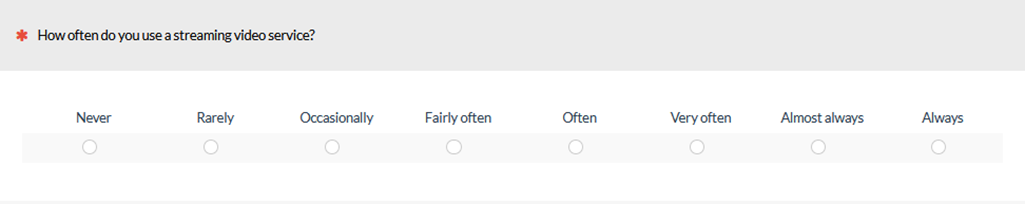
Figure 2: Example frequency item scale response options from Frary (2002).
Frary presented these response options as an example of what NOT to do: “Such stimuli run the risk of annoying or confusing the responder with hairsplitting differences between the response levels” (p. 4) Frary suggested just a bit later that more response options would probably be acceptable for numeric scales, as long as they had only the endpoints labeled: “Questionnaire items that ask the responder to indicate strength of reaction on scales labeled only at the endpoints are not so likely to cause responder antipathy if the scale has six or seven points” (p. 5).
Johnson and Morgan cited a survey from Kouzes and Posner (2003) that used a ten-point frequency scale with similar labels: Almost never, Rarely, Seldom, Once in a while, Occasionally, Sometimes, Fairly often, Usually, Very frequently, and Almost always.
In addition to splitting hairs, both of these sets of frequency response options use vague modifiers that can have wide variations in interpretation. For example, in Figure 2, what’s the difference between “fairly often” and “often?” Indeed, it may be quite challenging to differentiate between these categories. However, the problem shown here is more about the use of vague modifiers rather than the number of them. A five-point version drawn from these sets of vague modifiers may present similar challenges (although the problem is probably exacerbated as the number of response options increases and would be especially problematic when conducting research over the phone).
One strategy for avoiding this problem is to use specific options (e.g., 0–2 times per day, 3–4 times per month, etc.) rather than vague modifiers.
The preceding examples are about frequency of behavior, but what about sentiment? Johnson and Morgan also referenced a study by Dawes (2008). In the study, each participant answered a five-, seven-, or ten-point scale for the same eight purchasing items. The study was conducted over the phone with participants instructed to “‘please answer using the scale from 1 to X where 1 equals strongly disagree and X equals strongly agree’. X was either 5, 7, or 10 depending on the treatment group” (p. 67).
Despite being conducted over the phone, the surveys had comparable results when Dawes rescaled all scores to ten points (p. 61). The study also found that if a scale with more response options was administered, respondents made use of those additional response options, a finding that Dawes interpreted as favoring scales with more points.
Johnson and Morgan, however, noted that while the number of points used increased for the longer scales, the percentage of the available points used decreased. On average, respondents used 58% of the options for five-point scales (2.9/5), 51% for seven-point scales (3.6/7), and 40% for ten-point scales (4.0/10). Johnson and Morgan used this outcome to argue against using scales with more points.
While the percentage of available points used did indeed decrease by 18 percentage points in the Dawes study (a 31% relative reduction), it’s unclear how this metric indicates respondents had trouble differentiating between the number of points. If we reduce a scale from five to two response options, the percentage used would likely be close to 100%. At the other extreme, if respondents used slider scales with a hundred points of discrimination, then across eight items they would likely land on eight different values, using only 8% of the available points. Percent of points used seems like a poor metric for assessing discriminating ability.
Too Many Points or Too Many Labels?
In another survey book, Harris (2014) echoed the guidance from Johnson and Morgan and warned against scales with too many points. One example he cited is a ten-point bipolar scale used for assessing soap. Figure 3 is a recreation illustrating two example items in the scale:
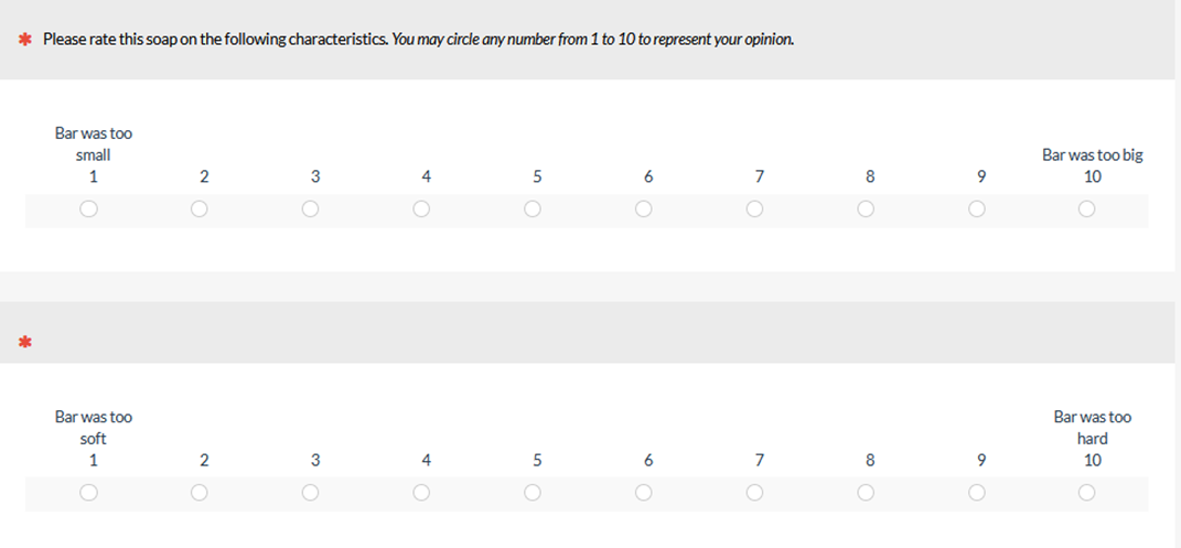
Figure 3: Example multipoint items from Harris (2014).
Harris argued that respondents probably don’t have five levels of positive ratings and five levels of negative ratings for soap. He recommended using a six-point scale, claiming that that would be easier for respondents to understand (but he provided no data that showed six points was easier than ten points in any way).
In our research, we’ve found that participants perceived three-point scales as being easier and slightly faster to complete compared to eleven-point scales, but participants felt that having only three options stifled their ability to express their opinion. We don’t, however, have preference data comparing ten- or eleven-point scales to six- or five-point scales.
Harris advised that if you have trouble adding labels to all scale points (e.g., on a ten-point scale), then you probably have too many points. For example, consider the ten hypothetical desirability options in Figure 4:
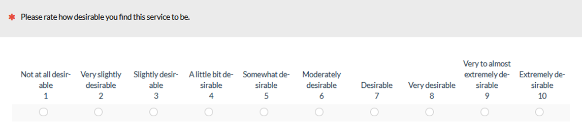
Figure 4: Example of an excessive number of response option labels from Harris (2014).
Based on our literature review of 17 studies and our own experimentation, we’d argue that this isn’t an example of having too many points, but too many labels. You don’t need to label all points all the time.
If More Points Confuse, Do Lots of Points Confuse Even More?
Consider Figure 5, which shows the arrangement of response options for 3, 5, 7, 11, and 101 points on a 0-100–point grid. We’ve used linear interpolation to place the options in the grid because (1) it’s simple and (2) it works well in practice.
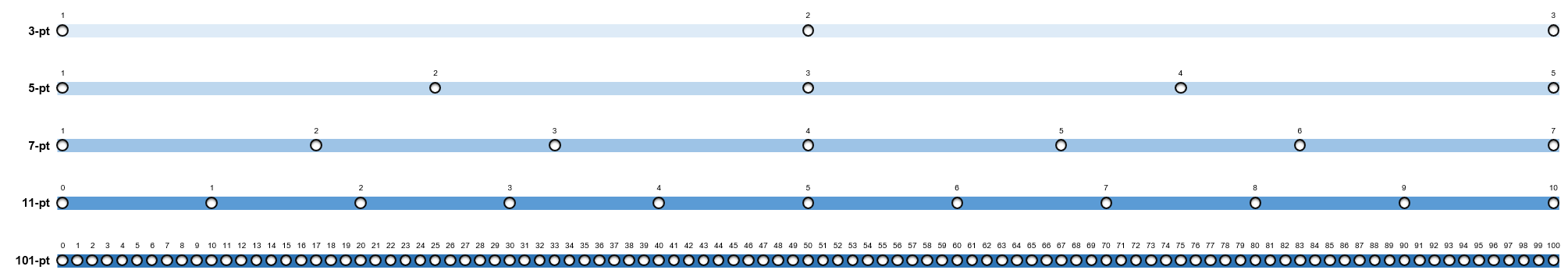
Figure 5: Depiction of 3, 5, 7, 11, and 101 points on a common scale.
Imagine working with the three-point scale. With those three points, you can indicate the direction of your feeling—negative, neutral, or positive, but you can’t express the intensity of your feeling. When you move to the five-point scale, you can provide at least some indication of intensity, but only two points worth in a positive or negative direction. With a seven-point scale, you now have three points of intensity in either direction, and with eleven points, you have five.
Moving now to the 101-point scale, you have 50 points of intensity on either side of the neutral point in the center. If there is some limit on the human capacity for engaging with this many points of discrimination, then why do some researchers prefer slider scales, which are, for all practical purposes, linear numeric scales with lots of points of discrimination? For example, if you set up a slider scale to measure from 0 to 100 in 1/10th point increments, you would have 1,001 points of discrimination, 500 on either side of the neutral point. But we know of no books on survey design that disparage sliders due to some hypothesized inability of humans to work with so many points of discrimination. Although the devil is in the design details when crafting usable sliders, we have found that 101-point sliders are indeed slightly more sensitive than five-point scales.
Discussion and Summary
We have a deep interest in effective UX measurement. That includes understanding the factors that do and do not affect people’s ability to use rating scales, especially in a UX research context.
We are also cautious about accepting at face value claims that appear in the abstracts of research papers and in book citations. To be fair, we encourage our readers to be cautious about uncritically accepting the claims we make in our articles.
In this article, we’ve examined the claims made in three books about survey design regarding the best number of response options to use in rating items (Dillman et al., 2014; Harris, 2014; Johnson and Morgan, 2016). Here’s a summary of the claims, the evidence backing them, and some additional considerations.
Consistent claims are to limit points but with poor justification. All three books recommend against providing too many response options based on the rationale that people can’t reliably distinguish among more than a small number of choices (usually no more than seven). The specific cognitive limitation responsible for this inability is, however, never clearly spelled out. We suspect it might be due to a vague memory from psychology classes of Miller’s (1956 [pdf]) article on the magic number seven (plus or minus two). This paper was a landmark in the genesis of cognitive psychology, but attempts to apply it to the design of artifacts such as visual menus and auditory menus have resulted less in effective design guidelines and more in misguidelines.
Too many labels with vague modifiers may be the real issue. The data cited in these survey books to justify using fewer points say more about labeling too many points with vague modifiers than about the number of points themselves. A need to label each response option clearly can restrict the number of options you can easily present. For numeric scales, consider setting aside the “requirement” to label all response options in favor of simply labeling endpoints. People are perfectly capable of using numeric linear scales with numerous response options, even when those options come as slider scales with as many as a thousand underlying points.
There is no Goldilocks point; more scale points improve reliability and sensitivity. There is strong evidence from psychometric research that long scales tend to have better reliability and sensitivity (and, in some cases, validity) than short scales. The increase in reliability does taper off, but importantly, we’re not aware of any evidence that reliability decreases as the number of points increases. In other words, we have not seen compelling evidence for a Goldilocks effect for the number of points in linear numeric scales. Guidelines that recommend using no more than five or seven response options should be interpreted with care, as they probably apply only to questions that require labels for each response option (and many questions don’t have this requirement).
Fewer points are less impactful with multiple items. It’s often the case that five or seven response options are sufficient for much UX research, especially when using standardized metrics such as the System Usability Scale, which have scores based on responses to multiple items. An exception to this is when there is a need to identify extreme responders, in which case eleven response options often appear to be sufficient.
More points take up more space. For numeric linear scales with only endpoints labeled, there does not appear to be an upper limit on the number of response options to provide due to some sort of human cognitive limitation. As a practical consideration, scales with more options take up more screen real-estate, especially on mobile devices. This problem also applies to slider scales, which become difficult to manipulate when presented in a small space.
This practical issue, however, has nothing to do with the claims we’ve been exploring in this article. The answer to the question posed in the title is that people can be confused by the presentation of too many verbal response labels, but can easily handle responding to multipoint numeric scales with many response options as long as only the endpoints are labeled.
Sliders have 100+ points. The survey books we reviewed did not discuss slider scales, but they can have hundreds to thousands of points of discrimination. Yet we know of no book on survey design that recommends against sliders due to some hypothesized inability of humans to work with so many points. Although the devil is in the design details when crafting usable sliders, we have found that 101-point sliders are indeed slightly more sensitive than five-point scales.
More than good enough doesn’t mean bad. There is a big difference between claiming that five- or seven-point scales are good enough for certain types of measurement—they clearly are—and claiming that there is a cognitive limitation that prevents people from effectively using numeric scales with more response options. Despite the extent to which books on survey design make the second claim, the evidence simply doesn’t support it. Finally, as Nunnally (1978) pointed out over four decades ago, any increase in overall measurement variation due to presenting more response options in numeric scales appears to be more than made up for by an increase in reliability and sensitivity.