 Few things seem to elicit more opinions, exaggerations, and accusations than rating scale response options.
From the “right” number of points, the use (or not) of labels, and the presentation order (to name a few), it seems we all have thoughts on what to do (or not to do) regarding conventions and “rules” when selecting response options.
Rules and conventions often provide reasonable advice for researchers, but not always. You don’t want to have to reinvent the survey wheel each time you need to collect data. But you also don’t want to rely on a shaky foundation.
The concern many researchers have is that if you use the “wrong” format you’ll skew your results. And that’s a legitimate concern. After all, why go through all the trouble and cost of building and collecting data only to be misled by the results? But what if the “cure” for potential errors in responses is worse than the putative problem? It helps to know first if there’s a problem and how large (impactful) it is.
In writing Surveying the User Experience, we were surprised by how flimsy some of the rationales were for certain conventions, or, when we did find deleterious impacts on responses, how small they were.
While you don’t want to callously ignore potential biases and errors in responses, we’ve found that most decisions in UX and customer research are based on generally large effects. For example, you rarely need to measure the sentiment in a customer population to within 1%. We usually see decisions impacted more when differences are in the 20% or 10% range.
For example, 80% approval versus 60% (a 20% difference) is large enough to affect an important decision, but a 1% difference (80% vs. 79%) will usually not be enough. Maybe 1% is enough in special circumstances, but if the stakes are that high, you’ll know.
Over the past few years, we have investigated and quantified 21 possible effects on rating scales. We summarized the literature and, in many cases, conducted primary research with thousands of participants and either replicated, qualified, or contradicted findings from the literature.
In this article, we briefly review these 21 effects.
Standardizing the Estimated Effects
There are different ways to standardize estimated effects. It’s easy when comparing data collected as percentages (e.g., checkbox selections or top box scores), but it’s trickier when standardizing differences in rating scales collected with different numbers of response options. To manage this, we focused on converting all effect sizes to percentages based on the maximum range of the scale.
For example, a comparison of the percentage selection of recently visited websites using a grid of select-all-that-apply (SATA) checkboxes had a mean selection rate of 54.06%, while the mean selection rate for the same websites presented in a forced choice yes/no grid was 54.11%—a nonsignificant difference of 0.05% on a 0–100% scale.
To accomplish a similar standardization with rating scales, we converted all rating scale outcomes to a 0–100-point scale. When we compared ratings made with two UX-Lite variants (standard linear-numeric scale with numbered radio buttons and scales with one to five stars), the UX-Lite mean for the standard numeric scale was 83.8 and for star scales was 85.1—a difference of 1.3 points on a 0–100-point scale, so the effect size was 1.3%. When there was more than one estimate of the effect available, the individual effects were averaged to get the final estimate.
The 21 Effects
Figure 1 shows the estimates for the 21 effects, from largest to smallest. Table 1 provides more detail about the sources of the estimates.
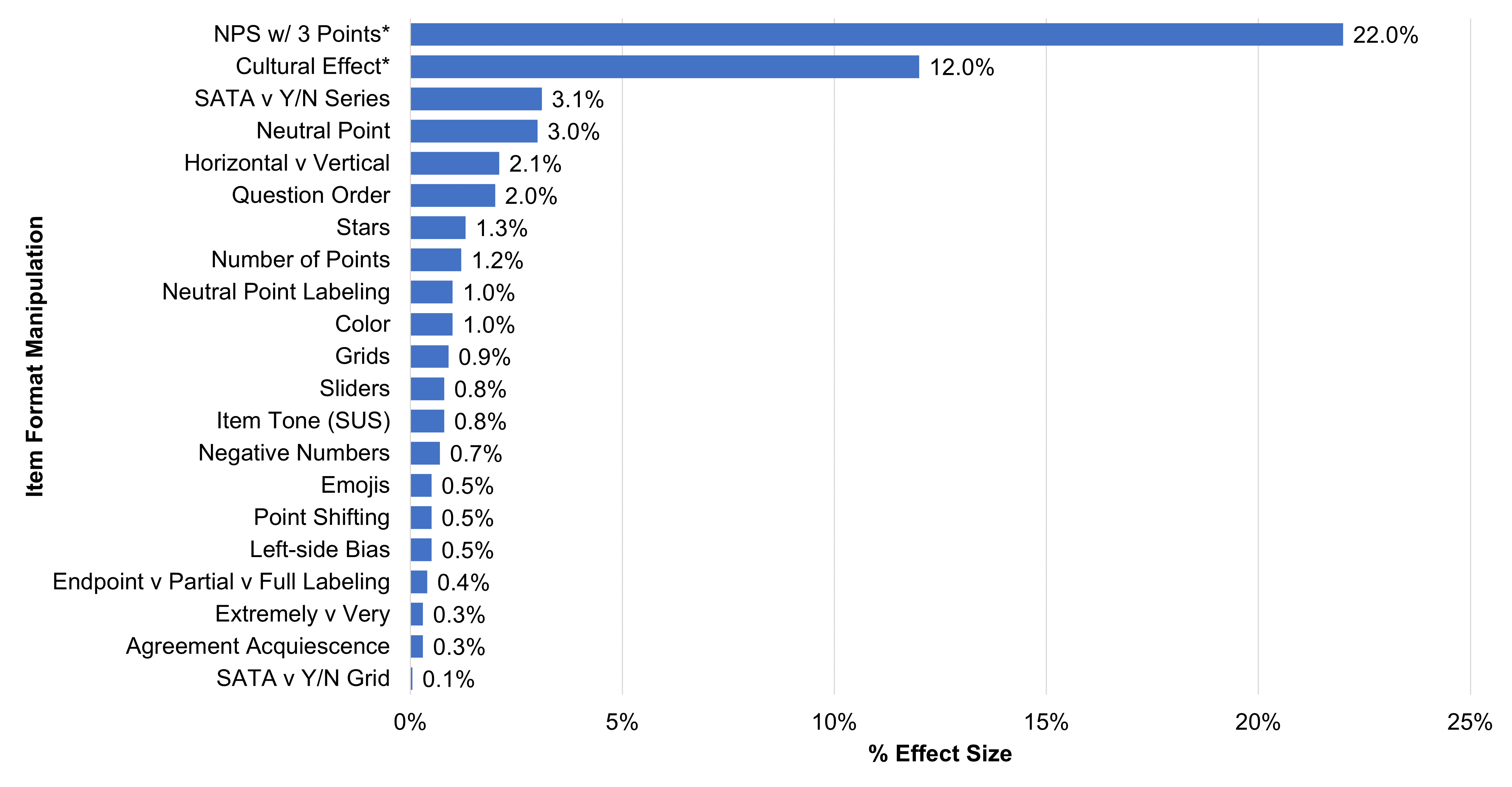
Figure 1: The 21 effects (* = statistically significant effect).
| Manipulation | Study Description | Effect Size | Takeaway/Sources |
|---|---|---|---|
| 3-pt NPS* | Ratings of common brands across three studies | 22.0% | 3 points not enough to measure extreme responses required to compute NPS Sauro (2019, Aug 21) |
| Cultural Effect* | Respondents from four countries rated mobile carriers, restaurants, and math questions | 12.0% | Respondents from Japan less likely to select upper extreme responses Sauro (2020, Feb 5) |
| SATA v Y/N Series | Selection frequencies for mass merchants/ seller market sites visited in past year | 3.1% | Slightly higher selection rate for Yes/No series of questions Lewis & Sauro (2021) |
| Neutral Point | One retrospective and one task-based study varying number of scale points | 3.0% | Top box slightly higher w/o neutral point (effect on means is 1.5%) Sauro (2017, Nov 29), Lewis & Sauro (2023, Aug 8) |
| Horizontal v Vertical | Multiple studies in which scale orientation was manipulated | 2.1% | Slightly higher for vertical Friedman & Friedman (1995), Chrzan et al. (2012), Mockovak (2018), Lewis & Sauro (2021, Nov 9) |
| Question Order | Multiple studies in which a general satisfaction question is answered before or after a series of more specific items | 2.0% | General satisfaction ratings slightly higher after responding to specific items (UX-only effect is 0.5%) Auh et al. (2003), Van de Walle & Van Ryzin (2011), Kaplan et al. (2013), Lewis (2019), Sauro (2019, Jan 9), Thau et al. (2020) |
| Stars | Ratings of streaming entertainment services | 1.3% | Slightly higher means for stars Lewis & Sauro (2020, Jul 22) |
| Number of Points | Multiple studies with variation in number of scale points | 1.2% | Slightly lower number with more points Sauro (2017, Nov 29), Lewis & Erdinç (2017), Lewis (2021), Lewis & Sauro (2022, Aug 16), Lewis & Sauro (2023, Aug 8) |
| Neutral Point Labeling | Ratings of common brands across two studies | 1.0% | Slight increase in selection of center point when labeled “Neutral” Sauro (2019, Mar 6) |
| Color | Multiple studies with constant or varied rating scale coloring | 1.0% | Slightly higher means for scales with color Tourangeau et al. (2009), Sauro (2019, Oct 23) |
| Grids | Multiple studies in which respondents provided ratings as individual questions or in grids | 0.9% | Slightly higher means for items in grids Chrzan et al. (2012), Mockovak (2018), Sauro (2019, Mar 20) |
| Sliders | Ratings of various websites across two studies | 0.8% | Slightly higher means for sliders relative to radio buttons Lewis & Sauro (2020, Jul 15, Nov 10), Lewis & Sauro (2021, Nov 30, Dec 14) |
| Item Tone (SUS) | SUS ratings of various products across two studies | 0.8% | Standard SUS scores slightly higher than positive version Sauro & Lewis (2011), Kortum et al. (2021) |
| Negative Numbers | Ratings of streaming entertainment services | 0.7% | Slightly higher means for scales with negative numbers Lewis & Sauro (2020, Sep 16) |
| Emojis | Ratings of streaming entertainment services | 0.5% | Slightly lower means for face emojis Lewis & Sauro (2020, Sep 9) |
| Point Shifting | Respondents rated a sequence of SEQ, UX-Lite, and LTR items with standard numbers of response options or unvarying 5-pt scales | 0.5% | Slightly higher means overall for unvarying 5-pt scales Lewis & Sauro (2022, Aug 16) |
| Left-side Bias | Multiple studies in which respondents provided ratings on scales with standard and reversed polarity | 0.5% | Slight tendency for respondents to select the leftmost option (Mathews (1927), Friedman et al. (1993), Weng & Cheng (2000), Lewis (2019), Lewis & Sauro (2022, May 17) |
| Endpoint v Partial v Full Labeling | Ratings of satisfaction with smartphone across two studies | 0.4% | Different outcomes: slightly higher means for 5-pt endpoint-only; slightly higher means for 7-pt fully labeled Sauro & Lewis (2020, Jan 22) |
| Extremely v Very | Recent retail purchase | 0.3% | Slightly higher means for "Very" Sauro (2019, Dec 11) |
| Agreement Acquiescence | Three studies estimating acquiescence in different ways | 0.3% | Slightly higher means for positive-tone agreement items Sauro (2020, Feb 5), Lewis (2018), Lewis & Sauro (2023, see Sauro & Lewis, 2024, p. 193) |
| SATA v Y/N Grid | Selection frequencies for mass merchants/ seller market sites visited in past year | 0.1% | Slightly higher selection rate for yes/no grid Lewis & Sauro (2021) |
Table 1: Summary details for the effects (* = statistically significant effect).
Discussion
Changes to rating scale formats can matter, but usually not that much.
As shown in Figure 1 and Table 1, more than half of the manipulations we investigated (11/21) had less than a 1% impact on outcomes. Only four manipulations had estimated effects of 3% or more, and only two of those were statistically significant.
The largest effect we found (22%) was from an experiment we conducted to investigate a poorly informed recommendation to use just three response options to measure the likelihood to recommend (would not recommend, unsure, would recommend) based on the mistaken belief that people have trouble responding to an eleven-point scale (0–10). Trying to fix this nonexistent problem would create a real problem—the inability to identify respondents with a very strong intention to recommend, making this a good example of the “cure” being worse than the “disease.”
The smallest effect was a difference of 0.1% in selection rates for a select-all-that-apply grid versus a forced choice yes/no grid. The format had virtually no effect on selection rates, but only 13% of participants indicated a preference for the forced choice yes/no grid, while over 70% preferred clicking the checkboxes they wanted in the select-all-that-apply grid.
Most manipulations had minimal impact. One thing is clear from Figure 1: there were no effects we studied where the estimated effect was exactly 0. On the one hand, that may fuel the concern that you should be even more cautious because this shows that changes do impact results. On the other hand, what this actually shows is something central to hypothesis testing. When you use a large enough sample size you will almost always find a difference, and at any sample size, it’s unlikely to get a difference of exactly 0. For practical significance, it’s not whether there’s a difference but the size of the difference that matters. In seven of the 21 manipulations in Table 1, the difference was less than or equal to half of a percent, and in 13 of 21 manipulations, the estimated difference was less than or equal to 1%.
There could be other effects. Although we have investigated many potential impacts on rating scales, other manipulations could possibly (and even likely) affect your data. After all, our largest effect came from some bad advice, so in the future, it’s certainly possible new cures will be proposed that cause more harm than good. If we see any, we’ll test and let you know!
We provided links in Table 1 so you can explore the literature that documents studies conducted on these 21 manipulations. Or, for a complete discussion of these effects and the supporting sources, see pp. 116-256 in Surveying the User Experience. We also have a companion course that follows the book on MeasuringUniversity.com.
Takeaway: Changes to rating scales matter, but usually not that much in applied UX research. Focus more on doing something about your findings than arguing over the number of points in a scale (or any of the other manipulations that have negligible effects on outcomes).


