 Happy New Year from all of us at MeasuringU®!
In 2025, we posted 48 articles and continued to add features to our MUiQ® UX testing platform to make it even easier to develop studies and analyze results.
We hosted our 12th UX Measurement Bootcamp—a blended virtual event attended by UX practitioners who completed a combination of MeasuringUniversity™ online courses and live Zoom sessions. It was a challenging four weeks of intensive training on UX methods, metrics, and measurements; plus, groups worked together to design a study in MUiQ, collect and analyze data, and prepare a report.
Through MeasuringUniversity, we continue to offer access to our webinars plus full courses on:
- Survey Design and Analysis for UX & Customer Research
- Practical Statistics for UX and Customer Research
- UX Metrics
- UX Methods
In addition to publishing our latest refereed journal article, “Streamlining the SUPR-Qm: The SUPR-Qm V2” in the Journal of User Experience, we conducted research and went deep into several UX topics, including metrics, methods, statistics, and industry benchmarks.
The annual review of our blog articles is a great way to catch up on what you’ve missed from MeasuringU in 2025!
20 Years of MeasuringU
2025 marked the 20th anniversary of the founding of MeasuringU. We had a party, of course, and we also published four articles about our history.
- The Foundational Years (1998–2008). Jeff incorporated MeasuringU in 2005, but the company’s story began in 1998 when Jeff was trained in statistical process control at General Electric. This led to an intense interest in usability measurement and the original measuringusability.com website in 2004. Between 2005 and 2008, Jeff had his first collaborations with Jim Lewis on sample size estimation and statistical methods for small samples, and he investigated statistical summarization of usability metrics with Erika Kindlund.
- Growth and Change (2009–2015). In the early part of this period, Jeff hired the first MeasuringU employee and hosted the first Lean UX Denver conference (basically, our first UX measurement bootcamp). Jeff published his first two books (A Practical Guide to Measuring Usability and A Practical Guide to the System Usability Scale) and, with Jim Lewis, published the first edition of Quantifying the User Experience. By the end of this period, the company had a new name (from Measuring Usability to MeasuringU), a new questionnaire for assessing the UX of websites (SUPR-Q®), and the first version of the MUiQ platform.
- MUiQ and an Explosion of Research (2016–2025). In the first part of this period, MeasuringU outgrew its original space and added custom labs with one-way mirrors, published Benchmarking the User Experience and the second edition of Quantifying the User Experience, enhanced MUiQ for data collection and licensing, developed new UX methods and metrics (PURE, SUPR-Qm®), and had over a million blog views in 2017. The period between 2020 and 2025 saw the publication of Surveying the User Experience, increased research and support staff, development of more UX metrics (UX-Lite™, TAC-10™, a streamlined version of SUPR-Qm), and an enterprise-ready version of MUiQ.
- What Metrics Has MeasuringU Created? So far, we’ve published sixteen, most notably the SUPR-Q and the UX-Lite. At MeasuringU, we don’t just use UX metrics—we create them. Working back from the most recent, this article describes the 16 psychometrically qualified UX metrics (both completely original and adapted from existing questionnaires) that Jim and Jeff have published in their careers (so far).
Standardized UX Metrics
This year, our work on standardized UX metrics included four articles on a taxonomy of 70+ UX metrics, six on the development of the SUPR-Qm V2, two on the relationship between perceived ease and satisfaction, and three on various other topics (grading scales for the UX-Lite, editing standard UX questions, and a report card on claims about the NPS).
Using a Taxonomy of 70+ UX Metrics
Users and clients often ask us how to get started with quantitative UX research, so we wrote a series of four articles, starting with a broad view of UX metrics before focusing on key metrics to get started.
- A Taxonomy (Visual Overview) of 70+ UX Metrics. Measuring the user experience starts with UX metrics. But there is no single UX measure—no universal gauge that provides a complete view of the user experience, so we rely on multiple metrics, each offering an incomplete yet complementary perspective. In this article, we identified over 70 UX task-based and study-level metrics, encompassing action metrics (what people do) and attitude metrics (what people think and how they feel). As shown in Figure 1, we rated each metric by its popular usage, ease of collection, and availability of reference benchmarks.
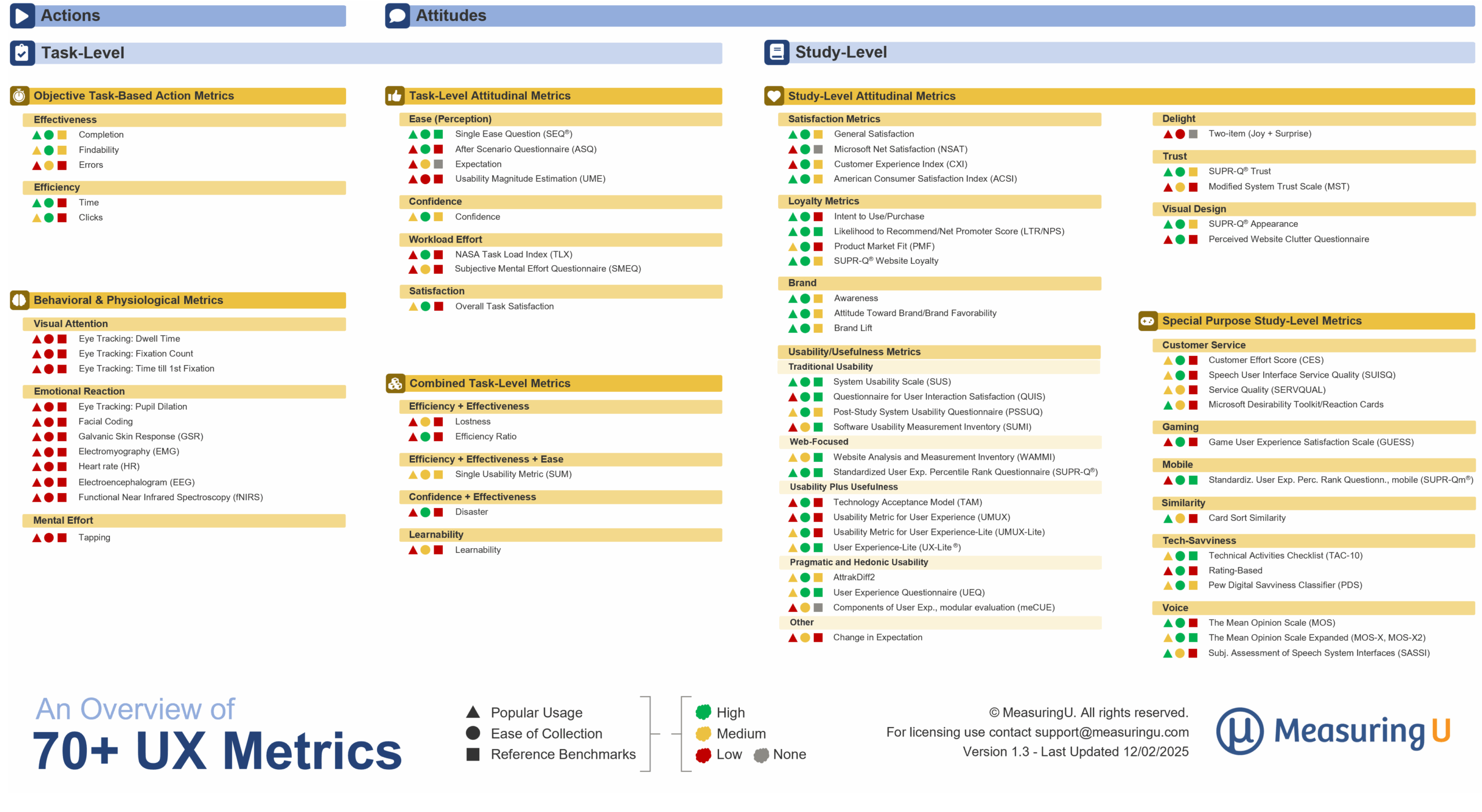
Figure 1: An overview of 70+ UX metrics (this is a living document with the most recent version available at https://measuringu.com/an-overview-of-70-ux-metrics/).
- How to Select a UX Metric. We described five steps for picking the right UX metric: Define what you’re trying to measure, find a match in our taxonomy of 70+ UX metrics, use widely used metrics, choose metrics that are easier to collect, and look for metrics with known benchmarks for ease of interpretation.
- There are 70+ UX Metrics, Start with These 4. Selecting the right metrics to use from so many can feel overwhelming. When you’re not sure what to use in task-based studies, we recommend starting with four: Task completion, the Single Ease Question (SEQ®), task time, and the UX-Lite. For each of these metrics, we described what it is, how it’s measured, how it’s interpreted, what are good, average, or bad values, and finally, what to watch out for.
- How to Get Comfortable with Quantitative UX Research. Getting comfortable with quantitative research takes patience and the right mindset. Five ways to get more comfortable are to look for keywords in research questions that suggest quant over qual methods, get to know the four key metrics (task completion, task time, SEQ, UX-Lite), understand binary versus continuous data types, use rating scales to measure attitudes without obsessing over minor format differences, and use magic ranges rather than magic numbers for sample size planning.
SUPR-Qm
The SUPR-Qm is a standardized questionnaire designed to assess the UX of mobile apps. In 2024, we gathered and analyzed SUPR-Qm data collected from 2019 through 2023 to develop a streamlined version of the questionnaire. This process was documented across six blog articles in 2025.
- A Review of Mobile App UX Questionnaires. Mobile apps are a distinct type of product that warrant their own measurement, but work on standardized mobile app questionnaires has been limited. In this article, we reviewed how mobile UX has historically been measured and then reviewed three mobile-specific questionnaires: the MPUQ, mod-AUG scales, and SUPR-Qm.
- How Stable Is the SUPR-Qm After 8 Years? Very stable. We developed the SUPR-Qm in 2017 to focus on the quality of the mobile app experience. But a lot has changed since 2017, and mobile apps aren’t the same. We reviewed our latest results from a large-scale data collection effort to assess the stability of the SUPR-Qm and found that it demonstrated a high degree of stability over eight years.
- Streamlining the SUPR-Qm from 16 to 5 Items. The original version of the SUPR-Qm from 2017 has 16 items. Analysis of the location of the items on a Wright map indicated opportunities to reduce the number of items while retaining the questionnaire’s good measurement properties. After exploring different numbers of items, we found that five items gave the best balance between accuracy and brevity (published as the SUPR-Qm V2).
- Verifying the Stability of the Five-Item SUPR-Qm V2. With only five items, it was an open research question whether the SUPR-Qm V2 would be stable over time. To check this, we divided our large sample in half to compare Group A (data collected from Feb 2019 through Aug 2021, 11 industries, 58 websites, n = 2,143) with Group B (data collected from Feb 2022 through May 2023, 12 industries, 97 websites, n = 2,006). As shown in Figure 2, the locations of scores on Rasch logit scales were nearly identical, demonstrating the stability of the SUPR-Qm V2 with varying dates and industries.
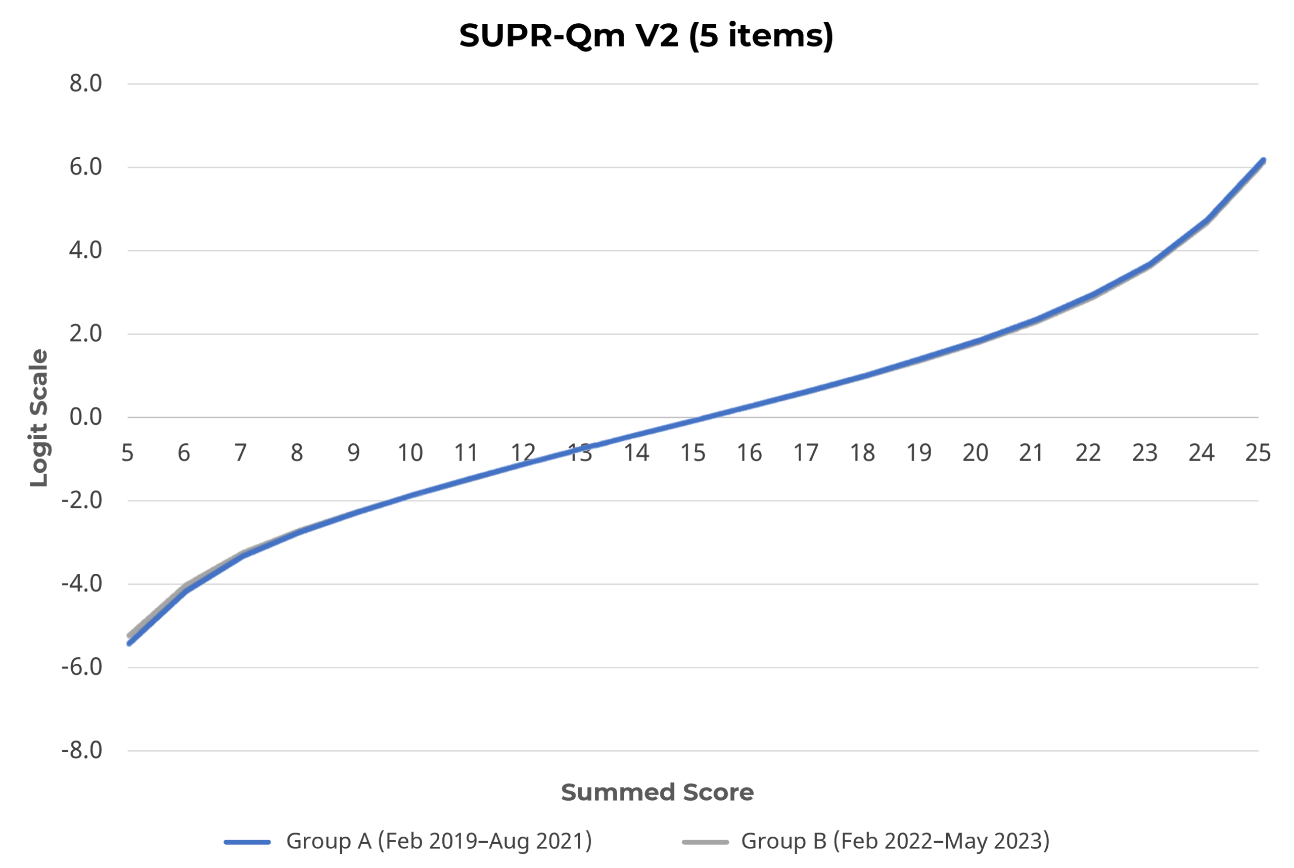
Figure 2: Stability of Rasch scale for SUPR-Qm V2, indicated by the overlap of lines for Groups A and B.
- How to Score and Interpret the Five-Item SUPR-Qm V2. We used the probability of the location of a SUPR-Qm V2 score (interpolated to 0–100 points) to develop a grading scale for its interpretation. Practitioners can use the new curved grading table to interpret SUPR-Qm scores.
- Ten Things to Know About the SUPR-Qm. We listed the ten things to know about the SUPR-Qm, from the statistical to the practical, including a description of our new SUPR-Qm calculator.
Perceived Ease and Satisfaction
It’s very common in UX research to measure perceived ease of use. It’s less common to measure satisfaction. To understand whether measuring satisfaction is good practice for UX researchers, it’s important to know the difference between these two constructs, so we published two articles on this topic.
- What’s the Difference Between Ease and Satisfaction? The conceptual difference is that ease is a key experiential driver of the broader construct of satisfaction. Customer satisfaction is a key metric in market research and business. In this article, we discussed the measurement of satisfaction and ease at the study and task levels and presented an argument for measuring both in UX research (at least at the study level) to provide a quantitative connection between UX and business metrics.
- How Much Does Satisfaction Correlate with Ease? A lot. To quantify the relationship between satisfaction and ease, we reviewed our recent (2020–2025) retrospective and task-based studies at both the study level (for multiple products) and the task level for measures of satisfaction and ease. We found ratings of ease and satisfaction were strongly correlated; when put on a common scale, their means differed by only 1%.
Other UX Metrics
We published three additional articles on various other metrics (UX-Lite grading scales, effect of editing standardized UX questions, NPS).
- Grading Scales for the UX-Lite. Early in its development, we used our well-known curved grading scale for the SUS to interpret UX-Lite scores. After collecting several years of UX-Lite data, we started interpreting UX-Lite scores with percentiles. We now have two grading scales for interpreting UX-Lite scores, one standard and one curved. The standard grading scale is appropriate for a general assessment of UX-Lite means, while the curved grading scale is appropriate when new UX-Lite data match the reference group for determining percentiles.
- Is It OK to Edit the Wording of Standardized UX Questions? Usually, but only to a point. You can edit the wording of standardized UX questions, such as clarifying language or inserting a product name, as long as those changes don’t alter the intensity or scope of the original wording. Across multiple studies using the SUS, SEQ, and UX-Lite, we found that minor wording adjustments rarely affected response patterns, whereas more extreme modifications did. When possible, testing any changes before adopting them is best, but small, thoughtful edits are unlikely to compromise the reliability or validity of your measurements.
- A Report Card for the Net Promoter Score. Should you use the NPS? Maybe, maybe not. In this article, we don’t debate whether you should use it (and you may not have a choice). Instead, we used data (rather than opinions) to review and grade 13 claims made about the NPS, some from its critics and others from its proponents. At the end, we gave a report card (Figure 3) on how well these claims stand up against the evidence.
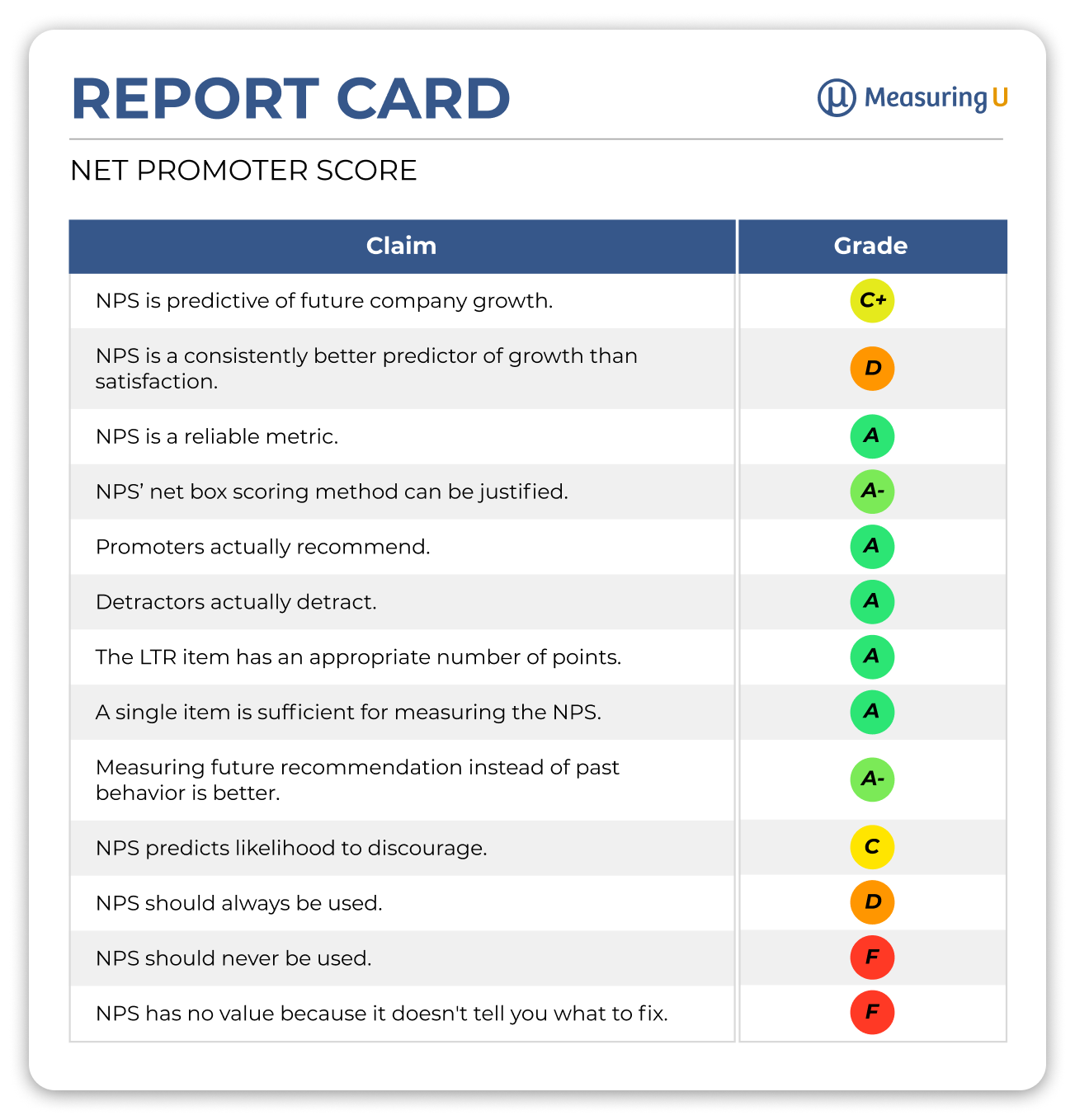
Figure 3: A report card for 13 claims made about the NPS.
UX Methods
This year, we published five articles on various aspects of UX methods (scoring, recruitment, prototype testing, research moderation, and UX deliverables).
- Three Ways to Score the UX of Products. We discussed three major types of UX studies: behavioral (task-based), attitudinal (retrospective), and analytical/inspection (PURE). The three methods have various pros and cons with regard to cost and setup effort.
- How Much Should You Over-Recruit? In our experience, by about 20%. To estimate how much to over-recruit for UX studies in this article, we defined the over-recruitment rate and found that almost all studies needed some amount of over-recruitment (on average, about 20%). We also noted that no-shows aren’t the only factor affecting recruitment because they accounted for only half of unusable sessions.
- What Happens When You Test a Mobile Prototype on Desktop? We found that metrics collected on mobile were slightly better. To compare UX data collected for a prototype mobile banking app displayed on a desktop computer versus on a mobile device, we had 100 participants (50 per condition) attempt three tasks: Check Balance, Card Transaction, and Credit Score. Overall, the results were generally better for the mobile condition (in some cases, significantly so).
- What Makes a Good UX Research Moderator? To paraphrase Liam Neeson, it’s having “a particular set of skills.” The skills of a good UX research moderator include, but are not limited to, establishing rapport, probing appropriately, managing time well, using interpersonal skills effectively, detecting misrepresentation, using silence strategically, avoiding leading questions, knowing when to move on, and knowing when to assist.
- What Are UX Deliverables? The recorded memory of UX research. Unlike UX design deliverables, which are primarily visual and tangible (what the website will look like, what using a prototype feels like), UX research deliverables must communicate the insights that drive the designs (e.g., what problems people had, how different groups in a sample had different experiences). One way to classify UX deliverables is by stages of research, including interim (e.g., test plans, screeners), final (e.g., presentations, reports, dashboards), and artifacts (e.g., raw data, participant videos).
Statistical Topics
Our nine articles on statistical topics included four on weighting data, two on interpreting percentages, and three on sample sizes.
Weighting Data
The four articles in this section cover the decision to weight data, how to weight means or percentages on a single variable, and how to use rake weighting when needing to weight on multiple variables.
- To Weight or Not to Weight. The purpose of weighting is to match the characteristics of a sample to a reference population. In UX research, we generally recommend against weighting unless there is an appropriate reference population (which is usually not the U.S. population). To avoid the risks associated with weighting, researchers should default to analyzing unweighted data. Even if the plan is to present weighted data, good practice is to compare the weighted and unweighted results to see which conclusions, if any, have been significantly affected by weighting.
- How to Weight Means. We covered how to weight means in the basic case of matching against a single reference variable at either group or case levels.
- How to Weight Percentages. We showed how methods for weighting means can apply to the weighting of proportions and percentages when those measures can be conceptualized as means.
- Rake Weighting: How to Weight Survey Data with Multiple Variables. When there is a need to weight data against multiple user variables, a popular method is rake weighting. For example, you may want your survey sample to match not solely the age of your customers, but the age, gender, and geographic region simultaneously. The article presented a fully worked-out example with an R script using the anesrake package.
Types of Percentages and 100-Point Scales
The two articles in this section explain the differences in three types of percentages and different types of 100-point scales.
- Three Types of Percentages. Interpreting percentages can be tricky because the same term is associated with three distinct concepts: absolute percentages, relative percentages, and net percentages. We discuss how they are the same and, more importantly, how they are different.
- Understanding Different Types of 100-Point Scales. Absolute percentages aren’t the only scales that range from 0 to 100. Other types of 100-point scales are percentiles (e.g., SUPR-Q scores) and 100-point scores (e.g., SUS, UX-Lite), both of which are distinct from absolute percentages and from each other.
Sample Sizes
The three articles in this section address different aspects of sample sizes, including the inverse square relationship, schools of thought, and magic ranges for sample size planning.
- Using the Inverse Square Relationship for Sample Sizes. Although the mathematics behind sample size calculations can look complicated (and they sometimes are), the concept is something you can see and experience. Like many natural phenomena, sample size and precision have an inverse square relationship. For estimation or comparison, to double the precision of measurement, you need to quadruple the sample size (Figure 4).
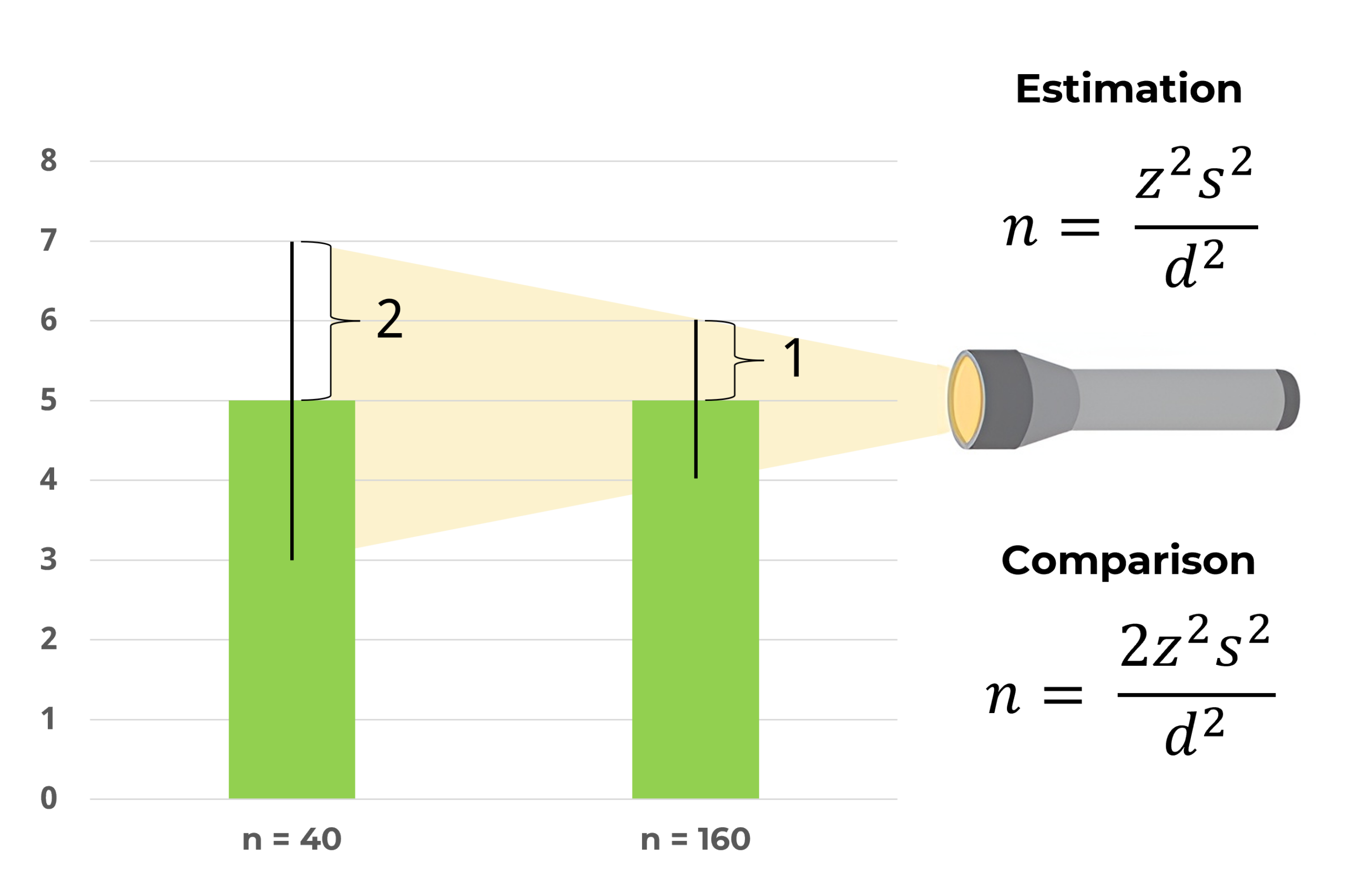
Figure 4: Quadrupling the sample size cuts measurement error in half—in other words, doubling the precision.
- Schools of Thought on Sample Sizes in UX Research. We’ve noticed that there seem to be two schools of thought when discussing sample sizes in UX. Both are too extreme, but both have a kernel (or more) of truth. One school preaches that small sample sizes are always enough; the other, that you always need large sample sizes. As is often the case with vocal opinions, the truth lies somewhere in between. To find a pragmatic position between them, it’s important to understand the philosophies of each school.
- Might Not Be a Magic Number but There Are Magic Ranges. It’s tempting to rely on “magic numbers” when planning sample sizes for UX research (e.g., five for formative usability tests, 30 for comparison studies). The problem with single magic numbers is that they’re more likely to be wrong than right. There are, however, Goldilocks Zones (“magic ranges”) that balance the various statistical and logistical forces that drive appropriate sample sizes for different goals (discovery, estimation, and comparison). In this article, we provided guidance for identifying upper and lower bounds for these magic ranges.
Data Visualization
Our article on data visualization explains why and how to use scatterplot jitter.
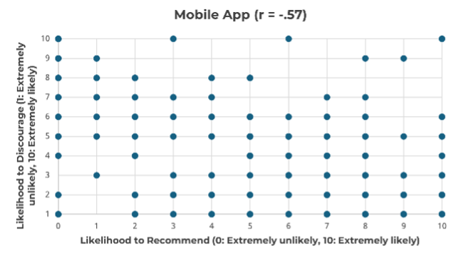
- Scatterplot Jitter—Why and How? Use to reveal more points in scatterplots when there are numerous ties. Scatterplots are powerful data visualization tools, but they do not work well when the values being plotted can easily tie (e.g., rating scale data). In this article, we described jittering, a popular strategy for breaking ties to reveal otherwise hidden relationships (Figure 5).
 |
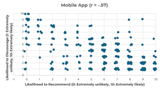 |
Figure 5: Standard (left) and jittered (right) scatterplots for ratings of likelihood to recommend and likelihood to discourage.
UX Industry Reports
We conducted mixed-methods benchmark studies using the SUPR-Q and NPS for three online consumer services and ran our biennial consumer and business software surveys. Thanks to all of you who have purchased our reports. The proceeds from these sales fund the original research we post on MeasuringU. We also published seven articles about the UX profession based on the 2024 UXPA salary survey.
SUPR-Q Benchmark Studies
In 2024, we published the results of three UX and NPS benchmark studies; SUPR-Q scores are included in a SUPR-Q license.
- Brokerage. Our survey (n = 508) of 11 brokerage websites (Ally Invest, Charles Schwab, Coinbase, Edward Jones, E-Trade, Fidelity, J.P. Morgan, Merrill Lynch, Robinhood, TD Ameritrade, Vanguard) found substantial variation in the UX of the sites. Users were primarily concerned with website responsiveness, difficult navigation, and issues accessing accounts [full report].
- Pets. A total of 240 users of pet websites in the U.S. rated their experience with one of four websites (Chewy, Petco, PetMeds, PetSmart). The UX of pet websites was high, ranging from the 82nd percentile for Petco to the 94th percentile for Chewy. The top UX problems reported by users were items being out of stock and cluttered/overwhelming options [full report].
- International Banks. For our survey of nine international banking websites (ANZ Banking, BNP Paribas, Commonwealth Bank, HSBC, ING Bank, Itaú Unibanco, National Australia Bank, Royal Bank of Canada, Westpac; n = 462), the UX differed widely by site, with Itaú Unibanco having the highest SUPR-Q score (96th percentile), followed by Westpac (73rd percentile), while BNP Paribas had the lowest SUPR-Q score (26th percentile). Our key driver analysis revealed an industry-wide opportunity to improve the ease of comparing rates and fees (Figure 6) [full report].
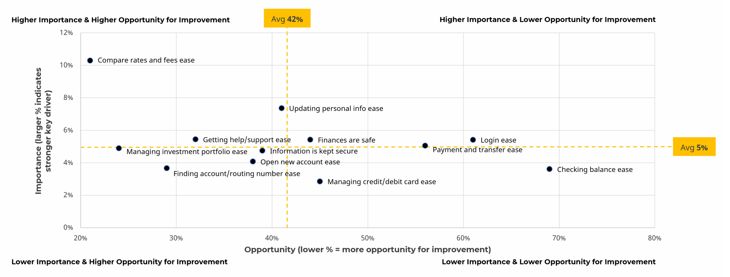
Figure 6: Scatterplot of importance and opportunity for improvement of key drivers of the international bank website experience.
SUS Benchmark Studies
Our 2025 SUS benchmark studies included reviews of business software and consumer software, plus separate reports on meeting software products used by both businesses and consumers, and a report on the UX of AI-based chat software.
- Business Software. Our 2025 report on business software benchmarks covered 23 products (n = 980) with a mix of productivity and communications software. Across the 23 products, the average NPS was −5%, ranging from −38% to 24%. This average is reasonably consistent with the previous averages of the business NPS from 2020 (−3%) and 2022 (−12%). For this report, we investigated the impact of perceived ease and usefulness from the UX-Lite on overall experience, brand attitude, and intentions to reuse and recommend (Figure 7) [full report].
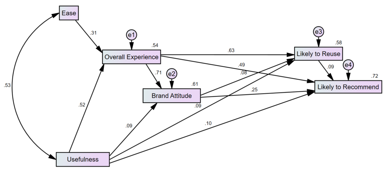
Figure 7: Structural equation model demonstrating the impact of perceived ease and usefulness on intentions to reuse and recommend (all beta weights significant, p < .001; excellent fit statistics, 𝜒2(3) = 0.9, p = .82; CFI = 1.0; RMSEA = .00; BIC = 124.9).
- Consumer Software. To understand the current consumer software landscape, in January 2025, we conducted a large-scale retrospective benchmark with 1,896 U.S. respondents on 40 popular consumer software products, similar to what we’ve done for the last 10+ years. Across the 40 products, the average NPS was 24%, ranging from −12% to 56%. The pattern of relationships and fit statistics for a structural equation model of the impact of perceived ease and usefulness on intentions to reuse and recommend were similar to the business software model above [full report].
- Meeting Software. Following up on our 2023 article on meeting software, we reported on five meeting software products (Google Meet, GoToMeeting, Microsoft Teams, Webex, Zoom, n = 233). Google Meet had top UX scores. Reported issues included performance, usability, and dated UIs [full report].
- AI-Based Chat Software. In January and February 2025, we conducted a retrospective study on three AI-based chat products (ChatGPT, Claude, Gemini) with 153 U.S.-based panel participants. This study included metrics from our standard UX & NPS survey as part of our larger consumer software data collection effort. All products had high and similar Net Promoter Scores. Reported issues included accuracy, generic content, and limited free versions [full report].
UXPA Salary Survey Analyses
Every few years, we assist our friends at the UXPA to help the UX community understand the latest compensation, skills, and composition of the UX profession, most recently for their 2024 survey (n = 444), which ended data collection in late 2024 (which is why we have seven UXPA survey articles in 2025).
- How Does the UX Job Market Look for 2025? Not great at the beginning, but hope for a rebound. Our analysis of the UX job market using historical data from the UXPA salary survey from 2009 through 2024 revealed significant UX job contraction, reduced tech jobs, and concerns about the future business climate. On the other hand, of those in a position to hire, most respondents (70%) reported plans to hire at least one UX position in 2025.
- Does an Advanced Degree Pay Off? Not much in dollars if you stop working to pursue a degree. We analyzed data from the 2024 UXPA salary survey to see whether there has been any change in the financial value of a PhD, and we expanded our previous analysis to include master’s degrees. Taking opportunity cost into account (lost wages if stopping work for the degree), after 35 years of employment, those with master’s degrees were estimated to make 5% more than those with undergraduate degrees, while PhDs were expected to make 7% more (and about 1% more than those with master’s degrees).
- How Much Is AI Used in UX? More than you might think. The responses of 444 respondents to three questions in the 2024 UXPA salary survey about past and expected future use of AI in UX design and research revealed a mix of optimistic and pessimistic views. The usage of AI in 2023 had a healthy start, with about half of respondents having tried AI (20% were not impressed). More companies supported using AI than discouraged it (by about 6 to 1). Most respondents expected to use AI more in 2025, but expectations over the next five years were mixed.
- The Methods UX Professionals Use. We looked for trends in 33 methods that UX professionals reported using in UXPA salary surveys from 2014 through 2024. Relative to 2022, the results of the 2024 UXPA salary survey revealed declines in the reported percentages of use for most of the tracked UX methods, with 11 dropping by more than ten percentage points. Despite the drops in the reported frequencies, the rank order of methods changed only slightly (r = .94), demonstrating the consistency of the relative importance of the UX methods tracked in the UXPA salary surveys.
- UX Professionals’ Job Satisfaction. We found that UX professionals report generally high job satisfaction (70 out of 100). However, job satisfaction declined slightly in 2024 compared to the last decade (and since 2022). The drop is partially explained by a small but significant increase in unemployment and by widespread fears of layoffs and AI replacing UX roles. Compared to other industries, UX satisfaction remains relatively strong. Salary explains little of the variance in job satisfaction. Job security concerns and industry shifts appear to be the strongest forces shaping UX professionals’ outlook today.
- What UX Hiring Managers Want and What UX Practitioners Report Doing. In the 2024 UXPA salary survey, 71 respondents planned to hire in 2025. We compared the practitioner skills they reported wanting in new hires with the skills that practitioners in the survey reported using. As shown in Figure 8, there was a high correlation (r = .93) between the skills UX hiring managers want and what UX practitioners do.
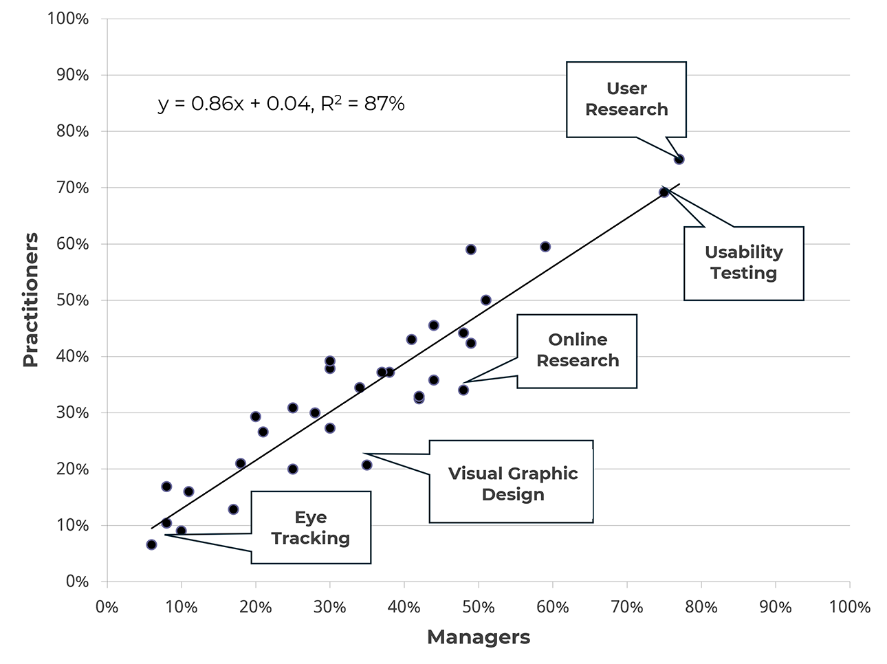
Figure 8: Scatterplot of skills UX managers wanted to hire in 2025 and the skills UX practitioners reported using in 2024.
- UX Professionals’ Satisfaction with Pay Transparency. Pay transparency has been a hot topic, so UXPA included three related questions in their 2024 salary survey. About half of UX professionals reported having at least some level of pay transparency. Satisfaction with pay transparency and fairness was low among UX practitioners, and pay transparency was associated with higher job satisfaction scores.
Coming Up in 2026
For 2026, stay tuned for a year’s worth of new articles, industry reports, webinars, MUiQ enhancements, and our annual boot camp.