Happy New Year from all of us at MeasuringU!
2020 was a crazy year, but we still managed to post 48 new articles and continued improving
MUIQ, our UX testing platform.
We hosted our seventh
UX Measurement Bootcamp, this time virtually. The change of format was a challenge, but it was fantastic to work with attendees from all over the world.
The topics we wrote about in 2020 include UX metrics, methods, rating scales, and UX industry benchmarks. Here’s a summary of those articles with some takeaways from each.
Standardized UX Metrics
As the field of User Experience matures, new standardized measures emerge, and research continues on the classic UX questionnaires. This section includes essays on various aspects of UX measurement and articles on new areas of research such as voice interaction, hedonics, and the UMUX-Lite.
- Three Branches of Standardized UX Measurement: We looked back on the history of standardized UX measurement and identified three branches in its evolution: Management Information Systems and User Satisfaction, System Usability, and Pragmatic vs. Hedonic Usability.
- What’s the Difference between Pragmatic and Hedonic Usability? Following up on our “three branches” article, we explored the differences between pragmatic and hedonic usability. Pragmatic usability focuses on the task-oriented nature of an experience, whereas hedonic usability focuses on emotional characteristics such as appeal, fun, and originality.
- Ten Things to Know about the Microsoft Desirability Toolkit: The most-used part of the popular Microsoft Desirability Toolkit is its (roughly) 100 product reaction cards that researchers use to assess intangible aspects of UX. Reaction cards seem to work well in qualitative UX research (e.g., word clouds and Venn diagrams), but have not worked very well in quantitative research. Surprisingly, there is no evidence that the Desirability Toolkit actually measures a desirability construct.

- Eight Manipulations of the Net Promoter Score: Which Ones Matter? Over the past few years, we’ve conducted a lot of research on the Net Promoter Score (NPS). This article summarizes the research on various manipulations of NPS formats: adding color or a neutral label, changing the number of scale points, using “will” versus “would” recommend, using “did you” versus “would you” recommend, and changing presentation timing and exploring cultural effects.
- Leading vs. Lagging Measures in UX: When setting up a UX measurement model, it’s useful to identify which metrics are leading, which are lagging, and which are both. The earlier a metric is in the causal chain, the more diagnostic it tends to be. There is little diagnostic information in ultimate lag measures, but they play a major role in tracking quality over time.
- Three Questionnaires for Measuring Voice Interaction Experiences: More and more, voice is becoming a major mode of interaction with systems. This article provided the content and summary of psychometric analyses of three voice interaction questionnaires (MOS, SASSI, and SUISQ).
- What Is the Mean Opinion Scale? Following up on our “three questionnaires” voice interaction article, we dug deeper into the origins of the Mean Opinion Scale (MOS), commonly used to assess the quality of speech production used over degraded channels or generated by voice synthesizers.
- The Evolution of the Mean Opinion Scale: From MOS-R to MOS-X2: In this article, we traced the evolution of the MOS over the past 20 years. The current version, the MOS-X2, is a concise, four-item questionnaire that is highly predictive of ratings of overall voice quality and likelihood to recommend for use in service systems.
- Simplifying the UMUX-Lite: The UMUX-Lite, an increasingly popular UX questionnaire, has only two items: Ease of Use ({System} is easy to use) and Usefulness ({System}’s capabilities meet my requirements). As a first step to simplifying the usefulness item, we tested “{System}’s functionality meets my needs.” This replacement had no significant effect on resulting UMUX-Lite scores, indicating practitioners could use either version in their UX research.
- From Functionality to Features: Making the UMUX-Lite Even Simpler: Continuing our UMUX-Lite simplification effort, we tested another version of the usefulness item ({System}’s features meet my needs). Again, we found no significant differences from data collected with the original wording, so UX practitioners can also use this simpler version in their research.
UX Methods
Our articles on UX methods covered a lot of ground, including essays on the history of usability testing, empirical guidance on sample size estimation, overcoming limitations of unmoderated usability testing, and prediction of usability problem discovery.
- Three Goals of Usability Testing: In this article, we distinguished between the three primary goals of usability testing—discovering problems, comparing against benchmarks, and comparing interfaces—and showed how these evolved from the classic view of formative and summative testing.
- Is Usability Testing Effective? Some research has shown a considerable lack of correspondence in the problems discovered during a usability test. On the other hand, a large body of evidence shows that conducting usability tests improves product usability. In this article, we reviewed these two bodies of evidence, concluding that usability testing is effective when the focus is on downstream improvement in user performance and experience.
- Ten Things to Know about the RITE Method: Formative usability testing has at least a 40-year history. About 20 years ago, a variation called the RITE (Rapid Iterative Testing and Evaluation) method was published. The principal characteristic of RITE is to iterate designs as rapidly as possible. Another characteristic, often ignored in practice, is the verification step in which iteration is not stopped until a set number of participants complete the tasks without requiring additional design changes.

- Where Did the ISO 9241 Definition of Usability Come From? The original definition of usability was embodied in ISO 9241, Part 11 as a combination of effectiveness, efficiency, and satisfaction. The ISO definition was heavily influenced by the European MUSIC project, a publicly funded investigation into the systematic collection of summative usability data.
- Approximating Task Completion When You Can’t Observe Users: If users can’t complete a task, not much else matters. Assessing task completion is straightforward in moderated usability studies but can be trickier in unmoderated research when the typical strategies of URL tracking or asking post-task questions isn’t possible. In those situations, it’s possible to approximate task completion from measures of perceived usability.
- User-Centered Design and Design Thinking: Different Origins, Similar Practices: Despite some differences in the role of users and the role of quantitative UX measures, User-Centered Design (UCD) and Design Thinking share a focus on understanding user needs, involving users, prototyping, and continuous improvement.
- Sample Size Recommendations for Benchmark Studies: Finding the right sample size for benchmark studies involves balancing statistical and logistical considerations. When logistics trump statistics, you can tolerate some loss of precision, but always check to see whether your planned sample size is simply too small to achieve the precision/saturation you need for the decisions you must make.
- What Do You Gain from Larger-Sample Usability Tests? The usual practice for iterative formative usability tests is to use small sample sizes (n = 5 to 10). When a usability test mixes formative and summative goals, increasing the sample size (n = 15 to 20) increases the discovery of infrequent problems and enables reasonably precise estimation of quantitative metrics.
- How to Code Errors in Unmoderated Studies: Having participants in unmoderated studies self-report errors from pre-selected lists and open-ended text boxes provides a reasonable idea about whether an error occurred and, to a lesser extent, which error occurred.
- Predicting the Number of Usability Problems Using Average Problem Occurrence: Early research in modeling problem discovery in usability testing relied on estimates of p from large-sample studies plugged into the cumulative binomial probability formula. This method is appropriate for some research but doesn’t work well when p is estimated from small-sample usability studies.
- Improving the Prediction of the Number of Usability Problems: Over the past 20 years, several methods have been developed to improve the prediction of usability problem discovery using data from small-sample usability studies. A new model uses the cube root of the sample size to predict the number of problems.
- What a Randomization Test Is and How to Run One in R: Randomization tests are distribution-free nonparametric methods for comparing mean differences. We don’t recommend using randomization tests instead of t-tests for standard UX metrics, but they can provide a valuable sanity check when working with atypical data that radically violate multiple assumptions of the two-sample t-test.
Research Methods
UX research borrows heavily from research methods in other disciplines, especially psychology and human factors engineering. In 2020 we published articles on the Von Restorff effect, confounded experimental designs, recent research in the validity of within-subjects experimental designs, Latin and Greco-Latin experimental designs, and practical advice on handling bad data.
- Does the Von Restorff Effect Influence User Preference? The Von Restorff (isolation) effect suggests that when stimuli are mostly similar but include a unique member, people will better remember the unique item. Some have suggested that this might also affect preference when choosing from multiple designs. Across a series of studies, we concluded that if the Von Restorff effect influences selection preference, it’s elusive.
- Confounded Experimental Designs, Part 1: Incomplete Factorial Designs: When reading published research, it’s important to read critically and see if the design of the experiment is confounded in a way that casts doubt on the researchers’ claims. This article discusses a pernicious type of confounding—the incomplete factorial design.
- Are Within-Subjects Designs Invalid? Within-subjects experimental designs are effective at demonstrating significant differences, but recent research has suggested that they might not be valid due to asymmetrical transfer between experimental conditions. We reanalyzed our data from recent within-subjects studies and found no significant evidence of asymmetrical transfer. It’s too early to declare these designs invalid, but it’s good practice for researchers to check for asymmetrical transfer.
- Latin and Greco-Latin Experimental Designs for UX Research: From patterns found on thousand-year-old amulets to card puzzles of the early 1700s that inspired new branches of mathematics, Latin and Greco-Latin squares have a rich history, including their use in current UX research.

Rating Scales
Rating scales remain essential for measuring the user experience. We use them a lot in our practice, both in usability studies and surveys, so we’re very interested in using them as effectively as possible (based on evidence rather than myth). In 2020, our research on rating scales included investigations of the effect of different labeling schemes, cultural effects, the left-side bias, and a variety of format comparisons (standard numeric response options compared with sliders, stars, emojis, and negative numbers).
- Should All Scale Points Be Labeled? In a review of 17 studies on labeling response options, we found no clear superiority for labeling all points, but context matters, as does the purpose of the item (rubric or rating scale).
- Comparing Fully vs. Partially Labeled Five- and Seven-Point Scales: Following up on our review of labeling, we conducted our own research. Like in the literature, our results were inconsistent across multiple studies, but we can conclude that the claim full labeling is always better isn’t supported.
- Cultural Effects on Rating Scales: We conducted a cross-cultural study involving 215 participants from four countries, finding relatively large statistical differences in ratings for similar experiences. We suspect the differences could be due to a combination of cultural norms and differences in education/experience. Use caution when comparing responses internationally.
- Rating Scales: Myth vs. Evidence: About halfway through the year, we published this summary of some of our research on rating scales, covering topics such as the relationship between the number of response options and scale reliability/validity, neutral options, mixed versus all-positive tone in standardized UX questionnaires, labeling, and cultural effects.
- How to Convert between Five- and Seven-Point Scales: A question we’re sometimes asked is how to convert between five- and seven-point scales. It’s a little tricky because you first need to shift the scales so they start with 0, and then shift them back after conversion. In this article, we show how to avoid a common “misinterpolation” error.
- Converting Rating Scales to 0–100 Points: In this article, we expand upon scale conversion for five- and seven-point scales, showing how to convert any scale to a 0–100-point scale.
- Are Sliders Better Than Numbered Scales? We reviewed the literature on the comparative use of sliders and numbered scales and conducted our own study. Concerning concurrently collected data with sliders and five-point scales, we found no mean or distributional differences. You can use sliders but be aware of their downsides: the need for more physical space, possibly lower completion rates, and greater difficulty of use for some populations.
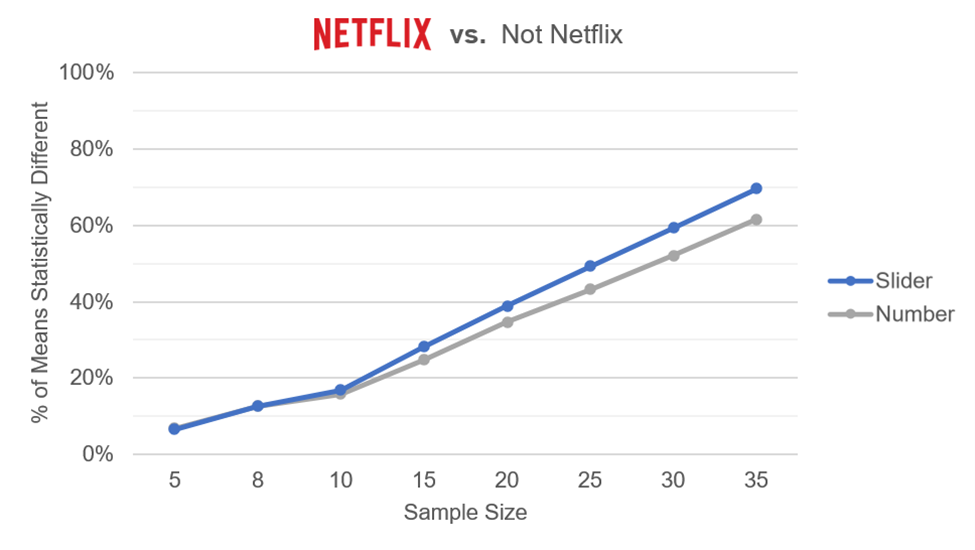
- Are Sliders More Sensitive Than Numeric Rating Scales? Following up on our analysis of standard sliders and experimentation with the SMEQ slider, we conducted additional analyses of our comparative data. A series of Monte Carlo resampling analyses demonstrated a moderate sensitivity advantage for sliders, which achieved statistical significance with smaller sample sizes relative to five-point scales.

- Are Star Ratings Better Than Numbered Scales? In an experiment comparing ratings with five-star and numeric five-point scales, we found a small nonsignificant difference in mean ratings and no striking differences in distributions of response options. Researchers can use either format, but due to a significant interaction we observed, we recommend against mixing them in the same study.
- Are Face Emoji Ratings Better Than Numbered Scales? We ran an experiment to compare ratings from scales using five face emojis (sad to happy) and numeric five-point scales. We found no significant differences in mean ratings or distributions of response options, supporting the use of either format.
- Should You Use Negative Numbers in Rating Scales? In a UX experiment comparing standard five-point scales (1 to 5) with five-point scales starting with a negative number (-2 to +2), we found no significant mean or distributional differences. Use either format in research where people rate systems (but not necessarily in research where people rate themselves).
- Revisiting the Evidence for the Left-Side Bias in Rating Scales: New evidence and reanalysis of old evidence led us to revise our understanding of the purported left-side bias in rating scales. It no longer seems plausible that the left-side bias, if it exists, is of sufficient magnitude for unethical researchers to use it to manipulate results.
- Rating Scale Best Practices: 8 Topics Examined: With so much research conducted on rating scales in 2020, we published a summary article toward the end of the year on eight topics we presented in a webinar, including the left-side bias, acquiescence in agreement versus item-specific endpoints, extreme endpoint labels, item grids, sliders, stars, face emojis, and negative numbers.
Interpreting Data
The pandemic has brought a plethora of data, dashboards, and opportunities for misunderstanding. Because of this, though our readers are more likely to be examining UX metrics, we wrote articles on handling bad data, appropriate ways of describing your data visually, and how to use change verbs.
- How to Handle Bad Data: Bad data happens. If it happens to you, you need to know how to handle it. We recommend (1) investigating the problem, (2) assessing the magnitude of the issue, (3) determining whether removing the data changes any conclusions, (4) identifying the problem source and fixing it, and (5) not expecting perfection.
- From Soared to Plummeted: Can We Quantify Change Verbs? What is a spike; how much is a surge? In a study of 12 verbs associated with a change in quantity, we found the verbs fell into four groups defined by increasing/decreasing direction and lower/higher intensity (with substantial variation in estimates).
- Are Cumulative Graphs Misunderstood? Using graphs to visualize data can be informative or misleading. In two studies in which we compared cumulative graphs with daily graphs of product sales and hospitalizations, we found respondents were between four and seven times more likely to misinterpret the rate of change on the cumulative graphs.
UX Industry Reports
We conducted six mixed-methods benchmark studies using the SUPR-Q and Net Promoter Scores. Thanks to all of you who have purchased our reports. The proceeds from these sales fund the original research we post on MeasuringU.
- The UX of Fitness and Nutrition Websites: Our retrospective analysis of four health websites found Weight Watchers leading and Livestrong lagging.
- The UX of Meeting Software: The results of our meeting software benchmark revealed few differences in UX metrics after COVID-19. One striking effect was a clear effect of trust on Zoom NPS ratings likely due to reports of “Zoom bombing” and other security issues.
- Business Software UX and NPS Benchmarks: Our 2020 report on business software benchmarks covered 19 products with a mix of productivity and communications software. Most products had reasonably high ratings of usefulness and usability, but there were some exceptions.
- Consumer Software UX and NPS Benchmarks: Our biennial update of consumer software benchmarks included 41 products with a mix of popular productivity, storage, and security software. Our data continue to show a strong relationship between perceived usability (SUS) and loyalty (NPS).
- The UX of Vacation Rental Websites: The COVID-19 pandemic led to significant changes in how people vacationed in 2020. Our retrospective evaluation of Airbnb, HomeAway, and Vrbo found that they had above-average ratings, with the smoothness of booking the most important driver of ratings.
- The UX of Video Streaming Entertainment Websites & Apps: The pandemic made already popular video streaming services seem essential. We benchmarked the user experience of five services, finding that most of them had above-average UX ratings, though some users reported issues finding new movies and shows.
We’ll see you in 2021! We have planned a year’s worth of new articles and will hold our annual Bootcamp in Denver (stay tuned for details), launch an online UX learning program, and add several new features to the MUIQ platform.
 Happy New Year from all of us at MeasuringU!
2020 was a crazy year, but we still managed to post 48 new articles and continued improving MUIQ, our UX testing platform.
We hosted our seventh UX Measurement Bootcamp, this time virtually. The change of format was a challenge, but it was fantastic to work with attendees from all over the world.
The topics we wrote about in 2020 include UX metrics, methods, rating scales, and UX industry benchmarks. Here’s a summary of those articles with some takeaways from each.
Happy New Year from all of us at MeasuringU!
2020 was a crazy year, but we still managed to post 48 new articles and continued improving MUIQ, our UX testing platform.
We hosted our seventh UX Measurement Bootcamp, this time virtually. The change of format was a challenge, but it was fantastic to work with attendees from all over the world.
The topics we wrote about in 2020 include UX metrics, methods, rating scales, and UX industry benchmarks. Here’s a summary of those articles with some takeaways from each.