 All of us at MeasuringU® wish you a Happy New Year!
In 2023, we posted 49 articles and continued to add features to our MUiQ® UX testing platform to make it even easier to develop studies and analyze results.
We hosted our eleventh UX Measurement Bootcamp, again as a blended virtual event with a combination of MeasuringUniversity™ courses and live Zoom sessions. Students participated in a challenging four weeks of intensive training on UX methods, metrics, and measurement, plus worked in groups to design a study in MUiQ, collect and analyze data, and prepare a report.
Through our MeasuringUniversity course platform, we continue to offer access to our webinars plus full courses on:
- Survey Design and Analysis for UX & Customer Research
- Practical Statistics for UX and Customer Research
- UX Metrics
- UX Methods
We’ve continued to conduct research and go deep into UX topics in 2023, including UX metrics, methods, statistics, and industry benchmarks. If you’re looking for a good way to catch up on anything you missed, this is a great place to start. Here’s a summary of all our 2023 articles and some takeaways from each.
Standardized UX Metrics
This year, our work on standardized UX metrics included six articles on the development of a measure of tech savviness based on a Technical Activities Checklist (TAC™), plus articles on developing an adjective scale for the Single Ease Question (SEQ®), comparing the sensitivity of the standard SEQ with a click version of the Subjective Mental Effort Questionnaire (SMEQ), and an investigation of the effect of removing the neutral point from the SEQ, the UX-Lite®, and Likelihood-to-Recommend (LTR).
Tech Savviness
We published six articles documenting the development and validation of a new measure of tech savviness based on internal MeasuringU research from 2015 through 2023. In UX research, tech savviness is rarely the focus of interest, but measuring it is important because differences in tech savviness likely affect experiences using technologies, attitudes toward technologies, and resulting behavioral intentions to use or recommend technologies.
- In Search of a Tech-Savvy Metric for UX Research. A pilot study (n = 271) of three candidate tech savviness measures (quiz, activity checklist, self-assessment) conducted in 2015 found that quizzing seemed to be the least promising approach and self-assessment showed some promise, but the most promising approach was the technical activity checklist.
- Refining a Tech-Savvy Measure for UX Research. A second study conducted in 2016 to refine candidate tech-savvy measures confirmed that quizzing was the least promising approach, found issues with the sensitivity of the self-assessment approach, and confirmed the promise of the technical activity checklist method.
- Initial Validation of Tech-Savvy Measures. Based on findings from an in-person moderated study, conducted in 2018 with 46 participants who completed a tech savviness screener and attempted a technical task, we found significant correlations between successful task completion rates with attitudinal self-assessment items (r = .23 to .29) and a technical activity checklist (r = .35 to .42).
- Measuring Tech Savviness with Technical Activity Checklists. From our initial research through our most recent experiments with technical activity checklists, the number of items has varied, most often 16, 10, or 9. Rasch analysis of thousands of completed checklists revealed excessive redundancy with 16 items and a completeness issue with 9 items, so we recommend the ten-item version (TAC-10).
- Validating a Tech Savviness Metric for UX Research. We investigated the predictive validation of technical activity checklist scores (TAC-9 and TAC-10) with successful task completion rates across four studies that varied in testing method (unmoderated, moderated) and task difficulty. TAC-9 and TAC-10 scores correlated significantly with successful task completion rates, on average accounting for 22% of the variation in task completion rates.
- Classifying Tech Savviness Levels with Technical Activity Checklists. Based on the results of the four studies analyzed in the previous tech savviness article, we developed and validated methods for classifying participants into two (low, high) or three (low, medium, high) tech-savvy groups.
Single Ease Question (SEQ) Plus Other Rating Scales
We published three articles documenting experiments that included the SEQ plus other rating scales (adjective scale, SMEQ, UX-Lite, and LTR).
- Describing SEQ Scores with Adjectives. We worked out a way to interpret SEQ scores with descriptive adjectives of relative difficulty or ease of completing tasks based on data from 211 participants who rated five online tasks of varying difficulty with the SEQ and an adjective scale (Figure 1).
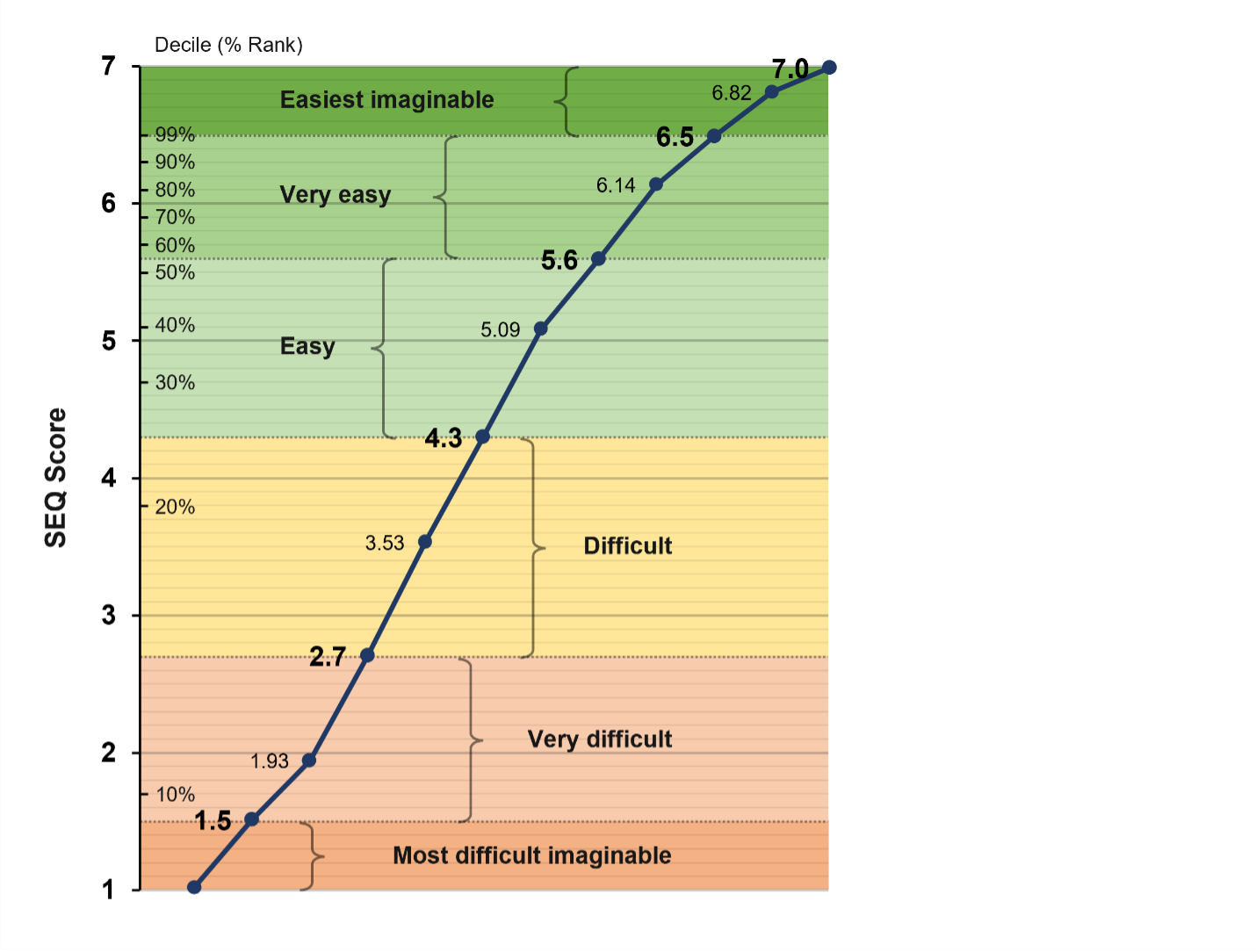
Figure 1: SEQ and adjective scale correspondence.
- Comparing SEQ and Click SMEQ Sensitivity. A potential alternative to the slider scales is the click scale—an image of a rating scale on which respondents can click anywhere to indicate their rating. Based on data from 103 participants who rated five online tasks of varying difficulty with the standard SEQ and a click version of the SMEQ, we found that the click version of the SMEQ was slightly more sensitive for confidence intervals around means, but the SEQ was slightly more sensitive when comparing means.
- Does Removing the Neutral Response Option Affect Rating Behavior? Not much. Our analysis comparing the impact of removing the neutral point from four standardized items (SEQ, UX-Lite’s Ease and Useful items, LTR) in a Greco-Latin experiment with 200 participants indicated little evidence for systematic differences in response patterns. Over 90% of respondents didn’t notice the change in the rating scales.
UX Methods
This year, our UX methods focus was on think aloud (TA) in usability testing (seven articles), click testing (four articles), using images in card sorting tasks (two articles), and four miscellaneous articles (rolling research, ChatGPT, ranking, and frameworks).
Thinking Aloud in Usability Testing
We published seven articles about the effect of thinking aloud on UX metrics, the evaluator effect, and participant characteristics.
- Does Thinking Aloud Affect Task Metrics? Results were mixed. Analysis of ten remote unmoderated usability studies with 423 participants (roughly half in a TA condition and half in a non-TA condition) revealed a tendency for TA to depress post-task attitudinal metrics, but there was only a negligible effect on task completion rates. Effects were not consistent across all studies, so researchers should be cautious about generalizing findings from just one study.
- Does Thinking Aloud Affect Study Metrics? Not much. We analyzed the results of ten remote unmoderated usability studies with 423 participants (roughly half in a TA condition) and found that thinking aloud had little overall impact on post-study attitudinal metrics. However, the effects were not consistent across all studies.
- What Do People Say When They Think Aloud? They mostly describe the actions they’re taking. A systematic review by multiple evaluators of 27 think-aloud categorized participant verbalizations into three levels (L1: reading text aloud, L2: describing actions during tasks, and L3: reporting feelings or explaining actions). We found that about a third of task time was spent thinking aloud, and L2 verbalizations accounted for most of the talking (Figure 2).
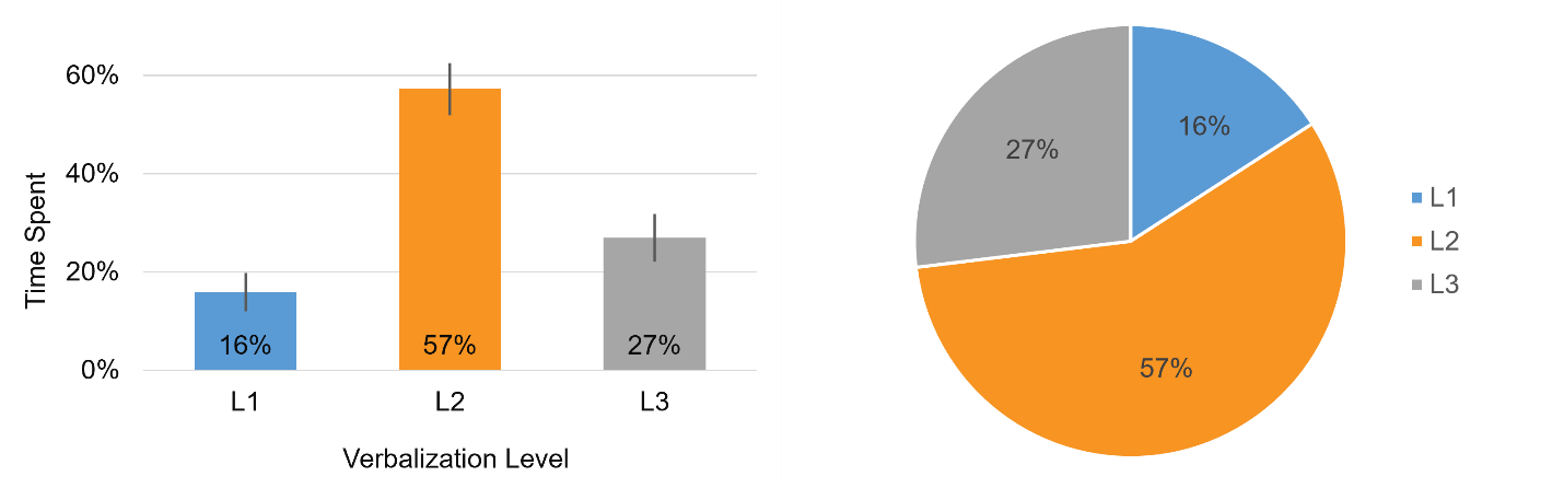
Figure 2: Average percentages of speaking time spent across verbalization levels with 90% confidence intervals (left panel) and shown in a pie chart summing to 100% (right panel).
- Is What You See What You Get? Examining the Evaluator Effect in Unmoderated Usability Testing. To investigate the evaluator effect, four evaluators independently reviewed 16 videos of participants attempting to book a flight on the United Airlines website in an unmoderated usability study. The evaluators identified 38 unique problems with an average any-2 agreement of 41% (relatively high but not perfect).
- Does Thinking Aloud Uncover More Usability Issues? Yes, it does. An evaluation of 153 videos, some with thinking aloud and some without, revealed that TA increased problem discovery by 36–50% (average problem discovery per video per evaluator was 1.33 for TA and .98 for non-TA).
- Does Thinking Aloud Reduce the Evaluator Effect? Maybe, but the evidence is weak. Our analysis of the evaluator effect comparing non-TA to TA videos revealed that any-2 agreement was nominally higher for TA (41%) than non-TA (34%), but be cautious about overgeneralizing from one study.
- Are People Who Agree to Think Aloud Different? In some ways. An examination of the demographic differences between those who completed a TA study compared to those who weren’t willing to participate found that most demographic variables didn’t matter, but willingness to participate was affected by country and age.
Click Testing
Click testing is a special type of usability testing that is especially useful for evaluating images or simple prototypes before developing a fully functional product. To use click testing with an image, you need a platform where you can upload the image and, ideally, designate areas of interest on the image, which you can use to analyze click percentages (these features are available in our MUiQ platform).
- When and Why to Use a Click Test. Click testing is an excellent methodological choice for UX research during the design and release phases of development because click metrics provide information about the potential quality of the UX and areas of concern. Common research/business scenarios in which click testing is an appropriate UX research method include testing early concepts and testing interactions that involve authentication or other sensitive information.
- Essential Metrics for Click Testing. The essential click-testing metrics can be classified as effectiveness (e.g., location, success), efficiency (e.g., completion time, number of clicks), and perception/satisfaction (e.g., SEQ). These metrics provide quantitative support for more visually interpreted representations such as click maps and heat maps.
- Do Click Tests Predict Live Site Clicks? They are reasonably predictive. Analysis of first clicks by 130 participants randomly assigned to a live website or image and attempting the same tasks found that first clicks were similar, but differences in functionality drove different clicking behavior.
- Do Click Tests Predict Clicks on Product Pages? First clicks are generally similar. Despite differences in stimuli from different screens and changing filters and inventory, many first-click regions had comparable percentages. This suggests that click testing is an adequate method for understanding general areas where people will click first—just don’t expect precision to be better than ±10%.
Card Sorting with Images
Card sorting is a popular activity that researchers use to understand how people group and associate items such as products or information. Using a research platform like MUiQ, card sorting is typically done electronically and often without an attending moderator. One advantage of digital over physical card sorting is that it’s easier to add images and even videos to cards. But what happens when you use images in a card sort?
- Do Images Make Card Sorting Easier? In some ways, but not in other ways. A study with 623 participants assigned to one of three card sorting conditions (Text-Only, Image-Only, Image+Text) found that Image-Only doubled the dropout rate, and adding images increased sorting time. However, images made sorting seem easier, and combining text with images helped to resolve ambiguities.
- Do Images Change Card Sort Results? Mostly not, but there are some exceptions. Analysis of 623 participants randomly assigned to perform a card sort in one of three conditions (Text-Only, Image-Only, Image+Text) revealed that using images in place of or in addition to text labels usually does not affect card sort results except when a text label is ambiguous or an image is difficult to recognize.
Miscellaneous Methods
The articles in this section provide information about rolling research programs, using ChatGPT in UX research, and assessing the difficulty of ranking items in surveys.
- 13 Tips for Running a Successful Rolling Research Program. Rolling research (RR) is the practice of having a regular schedule of participants lined up for testing (Figure 3). This article lists 13 helpful tips for starting or improving RR programs.
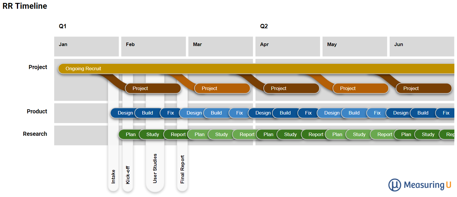
Figure 3: Visualization of an RR process (timelines and inputs) for a monthly cadence.
- Can ChatGPT Replace UX Researchers? An Empirical Analysis of Comment Classifications. To explore the potential for using ChatGPT to classify comments in UX research, we had three human coders and three runs of ChatGPT-4 classify the same comments and found only slightly lower interrater reliabilities between human coders and ChatGPT than between human coders alone.
- How Hard Is It to Rank Items in Surveys? It depends on several factors. Analysis of 24 ranking questions from 541 participants found that the more items in a ranking question, the longer it takes and the more difficult it feels to rank. But content also plays a role such that researchers can’t determine how many is too many by just counting items; they must also consider the respondents’ familiarity with and the conceptual closeness of the items.
- Frameworks for Classifying Usability Problems. We reviewed seven frameworks for categorizing usability problems and found that the frameworks differed in their strengths and weaknesses and, overall, had modest interrater reliability. The highest overall kappa was for UAF (.58, on the border between moderate and substantial), with overall kappas for UPT, HE, CUP, and OSUDC ranging from .304 to .403 (solidly fair to bordering on moderate).
Statistical Topics
Our 11 articles on statistical topics included three on analytical methods (finite population correction, Rasch analysis, McNemar test), four on the variability of rating scales, and four on sample size estimation.
Analytical Methods
The three articles in this section cover the finite population correction, applying Rasch analysis to UX research, and how to compare dependent proportions with the McNemar exact test.
- How to Use the Finite Population Correction. This is usually not an issue in UX research, but when a sample will significantly deplete your population (e.g., exceeds 10%), you should use the finite population correction (FPC) to improve the accuracy of estimates when computing confidence intervals and in sample size calculations.
- Applying Rasch Analysis to UX Research. Most standardized questionnaires for UX research were developed using the methods of classical test theory (CTT). Rasch analysis is an alternative approach to standardization with some advantages over CTT (although there are some contexts in which CTT is better). Figure 4 shows one of the key outputs of Rasch analysis, the Wright map, which researchers can use to identify redundant items in a scale.
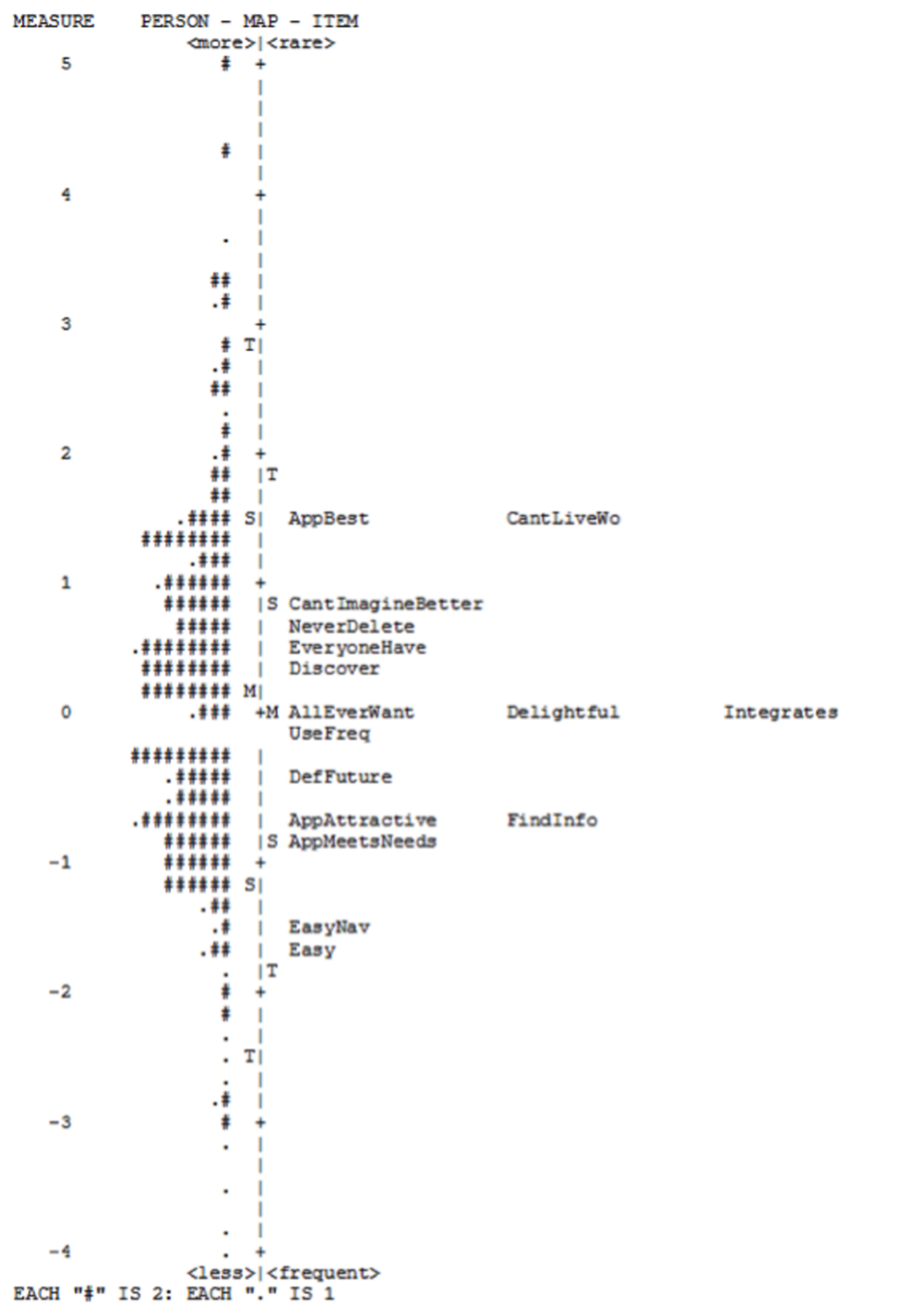
Figure 4: A Wright map of the 16 SUPR-Qm® items.
-
- How to Compare Two Dependent Proportions. Most introductory statistics classes cover methods for comparing independent proportions, but the method for comparing dependent proportions is more complex, focusing on the difference in discordant proportions. This article describes how to conduct significance test and compute confidence intervals for the McNemar exact test.
Variability of Rating Scales
To help in the development of general tables for sample size estimation when dependent variables are rating scales, we conducted a series of studies to estimate typical standard deviations for different types of rating scales.
- How Variable Are UX Rating Scales? Data from 100,000 Responses. An analysis of 4,048 five-, seven-, and eleven-point items collected in our UX research found that the mean standard deviation was about 25% of the maximum scale range, with about half of the standard deviations between 20% and 28% of the maximum scale range.
- The Variability and Reliability of Standardized UX Scales. An analysis of seven standardized UX questionnaires collected across 25 surveys and UX studies found that their typical standard deviation was about 19% of the maximum scale range, multi-item questionnaires have lower variability than single UX items, and low variability with high reliability leads to lower sample size requirements.
- How to Estimate the Standard Deviation for Rating Scales. We reviewed three methods for estimating unknown standard deviations of rating scales: binary data at maximum variance, a fraction of the scale range, and well-known distributions (normal and uniform). We found that dividing the scale range by four worked best for single rating scale items, and dividing by five usually worked for standardized UX questionnaires, but using actual historical data is the best approach.
- How Do Changes in Standard Deviation Affect Sample Size Estimation? Even modest changes to standard deviations can have large effects on sample size estimation. When planning sample sizes for quantitative research, standard deviations matter. When all other research considerations are the same and you have a choice, choose metrics with lower standard deviations.
Sample Size Estimation
Based on our studies of standard deviations for different types of rating scales, we worked out a set of general tables for sample size estimation when the key measurements are rating scales or dependent proportions.
- Sample Sizes for Rating Scale Confidence Intervals. We used estimates of unknown standard deviations for rating scales to create tables for sample size planning for when researchers don’t have a prior estimate of the standard deviation of the items they plan to use and have a focus on computing confidence intervals rather than testing hypotheses.
- Sample Sizes for Comparing Rating Scales to a Benchmark. To estimate sample sizes when comparing rating scale means to set benchmarks, you need several types of information, some common to all sample size estimation and others unique to statistical hypothesis testing. We created some tables to make this process easier for UX researchers.
- Sample Sizes for Comparing Rating Scale Means. When planning sample sizes for studies with a focus on comparing rating scale means, the “right” sample depends on the research details and a balance of statistics and logistics. We provide some tables to help with this balance.
- Sample Sizes for Comparing Dependent Proportions. We created a set of tables to help UX researchers plan sample sizes for studies in which they can compare dependent proportions (collected from the same people in a within-subjects study). Sample size estimation for differences in dependent proportions is fundamentally different from estimation for independent proportions due to the focus on discordant proportions.
Data Visualization
We published three articles on data visualization, two about using 3D in graphs and one on reporting numbers or percentages when sample sizes are small.
- Are 3D Graphs Always Worse Than 2D Graphs? Not always, but 2D is usually as good or better. We conducted this review to see whether the literature supported the claim that to avoid unspecified perceptual consequences due to “chartjunk,” the number of information-carrying dimensions in a graph should not exceed the number of dimensions in the data. We found that the published evidence does not support this claim. For most UX research, 2D is a good choice, but 3D appears to be mostly OK.
- An Experiment Comparing 2D and 3D Bar Graphs. To follow up our literature review on graph dimensionality, we conducted an experiment with 99 participants and found no difference in their ability to accurately select the larger of two columns. Selection was slightly slower when columns were about the same height, it took a little longer to compare with 3D graphs, and participants preferred 2D graphs to 3D (see Figure 5).

- Should You Report Numbers or Percentages in Small-Sample Studies? Yes, it’s usually good practice to report numbers, percentages, or both. As a UX researcher, you might have been exposed to the idea that you shouldn’t report numbers or percentages when sample sizes are small. In this article, we demonstrate that there are counterarguments to that assertion.
UX Industry Reports
We conducted mixed-methods benchmark studies using the SUPR-Q and Net Promoter Scores across a wide range of consumer services. Thanks to all of you who purchased our reports. The proceeds from these sales fund the original research we post on MeasuringU. We also published one UXPA profession article based on the 2022 UXPA salary survey.
SUPR-Q Benchmark Studies
In 2023, we published the results of eight UX and Net Promoter benchmark studies. SUPR-Q scores are included in a SUPR-Q license.
- Clothing Websites. Our survey (n = 550) of 13 clothing websites (e.g., Anthropologie, H&M, Zara) found wide variation in NPS and SUPR-Q scores, with Anthropologie leading and Zara lagging [full report].
- Wireless Websites. Users in the US (n = 523) rated their experience with one of ten wireless provider websites. Smooth checkout experiences drove SUPR-Q and the NPS, but respondents reported being especially frustrated by the difficulty of figuring out plans and pricing [full report].
- Electronics Websites. For our survey of nine consumer electronics websites (n = 468), the key UX drivers were “I thought the website was too cluttered” and “Easy to find exactly what I want” [full report].
- Office Supply Websites. Our survey (n = 203) of four office supply websites found seven variables that accounted for 66% of the variation in SUPR-Q ratings (e.g., “It’s easy to find exactly what I want”) [full report].
- Theme Park Websites. In this mixed-methods evaluation of theme park websites, 122 recent visitors to one of four theme park websites reflected on their most recent experience, while a different set of 180 participants completed two tasks on one of six theme park websites. A common UX issue across the websites was the long process of finding ticket prices [full report].
- Home Improvement Websites. In our survey (n = 311) of six home improvement websites, we found that the ease of finding products across different departments was the top key driver for the SUPR-Q [full report].
- Paint Websites. Our survey (n = 139) of three home paint websites found that project inspiration is important to users, but online color matching can be tricky [full report].
- Hotel Websites. Users of five hotel websites (n = 254) found that clunky booking calendar interactions are a poor way to start the experience [full report]. Figure 6 shows a graph of the key drivers of the hotel website experience as measured with the SUPR-Q.
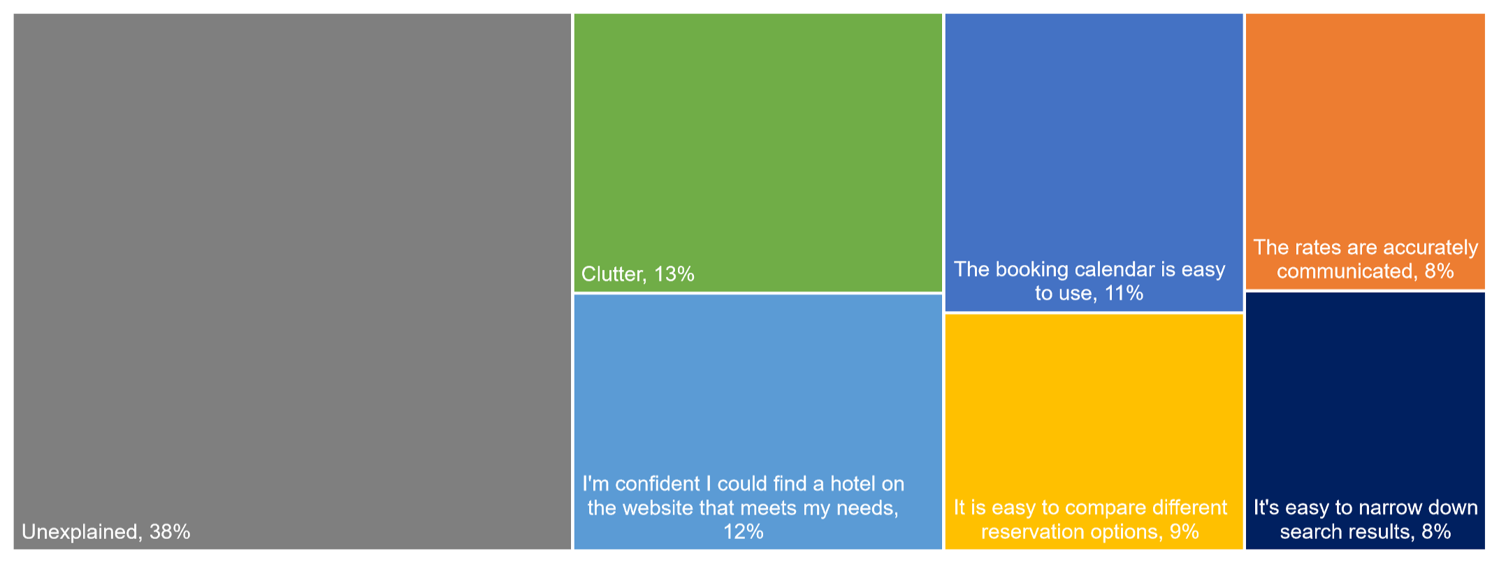
Figure 6: Key drivers of the hotel website experience.
UX Profession (UXPA Survey)
Every few years we assist our friends at the UXPA to help the UX community understand the latest compensation, skills, and composition of the UX profession, most recently from their 2022 survey.
- How Have UX Job Titles Changed in the Last 15 Years? Some roles were steady across the past 15 years, while others rose and fell. Historical analysis of job roles from the UXPA salary surveys is limited by changes over iterations in job labels, the number of options offered for selection, selection protocols, and sample composition. Despite those limitations, the data suggest an increasing selection of User Researcher and (User) Experience Designer and a decreasing selection of Interaction/Interface Designer.
Coming Up in 2024
For 2024, stay tuned for a year’s worth of new articles, industry reports, webinars, new MeasuringUniversity offerings, our annual boot camp, and a new book on surveys for UX research.