 All of us at MeasuringU® wish you a Happy New Year!
In 2022, we posted 48 articles and welcomed several new clients to our MUIQ® UX testing platform, where we continue to add new features and reduce the friction in developing studies and analyzing results.
We hosted our ninth UX Measurement Bootcamp—this time a blended virtual event with a combination of MeasuringUniversity™ online courses and live Zoom sessions—a challenging five days of intensive training in UX methods, metrics, and measurement, plus group work to design a study in MUIQ, collect and analyze data, and prepare a report.
We’ve expanded our MeasuringUniversity online course offerings to include access to our NPS and UX-Lite webinars. And we offer full courses on Survey Design and Analysis for UX & Customer Research, Practical Statistics for UX and Customer Research (with new lessons on multiple regression, ANOVA, cluster analysis, and discriminant analysis in addition to previous lessons on confidence intervals, tests of significance, and sample size estimation), UX Metrics, and UX Methods.
We’ve continued to research and dive deep into UX topics in 2022, including UX metrics, methods, rating scales, and industry benchmarks. If you’re looking for a good way to catch up on anything you missed, this is a great place to start. Here’s a summary of all our 2022 articles with some takeaways from each.
Standardized UX Metrics
This year, our work on standardized UX metrics focused on taxonomies, variants of the Single Ease Question (SEQ), sample sizes for the System Usability Scale (SUS), and prediction of grocery shopping behaviors.
UX Metric Taxonomies
We published three articles based on taxonomies we developed for UX metrics.
- Why Collect Task- and Study-Level Metrics? Both are useful. When conducting usability studies, it’s important to collect both task- and study-level metrics. Both types of metrics correlate, but they aren’t redundant because they measure different aspects of the user experience (task-level metrics focus on behavior and diagnosis; study-level metrics focus on participants’ holistic attitudes toward products).
- A Guide to Task-Based UX Metrics. There are several types of task-based UX metrics, including action metrics (e.g., task completion rates, findability rates, time on task), attitudinal metrics (e.g., SEQ, confidence, task load, mental effort), behavioral and physiological metrics (e.g., eye-tracking, facial expression coding, heart rate), and combined metrics (Single Usability Metric, change from expectation, lostness).
- A Guide to Study-Based UX Metrics. This overview of study-based UX metrics includes measures of satisfaction, loyalty, brand perception, usability/usefulness, delight, trust, visual design, and special purpose questionnaires, with key examples for each category.
Single Ease Question (SEQ)
We published five articles on variations of the standard format of the SEQ.
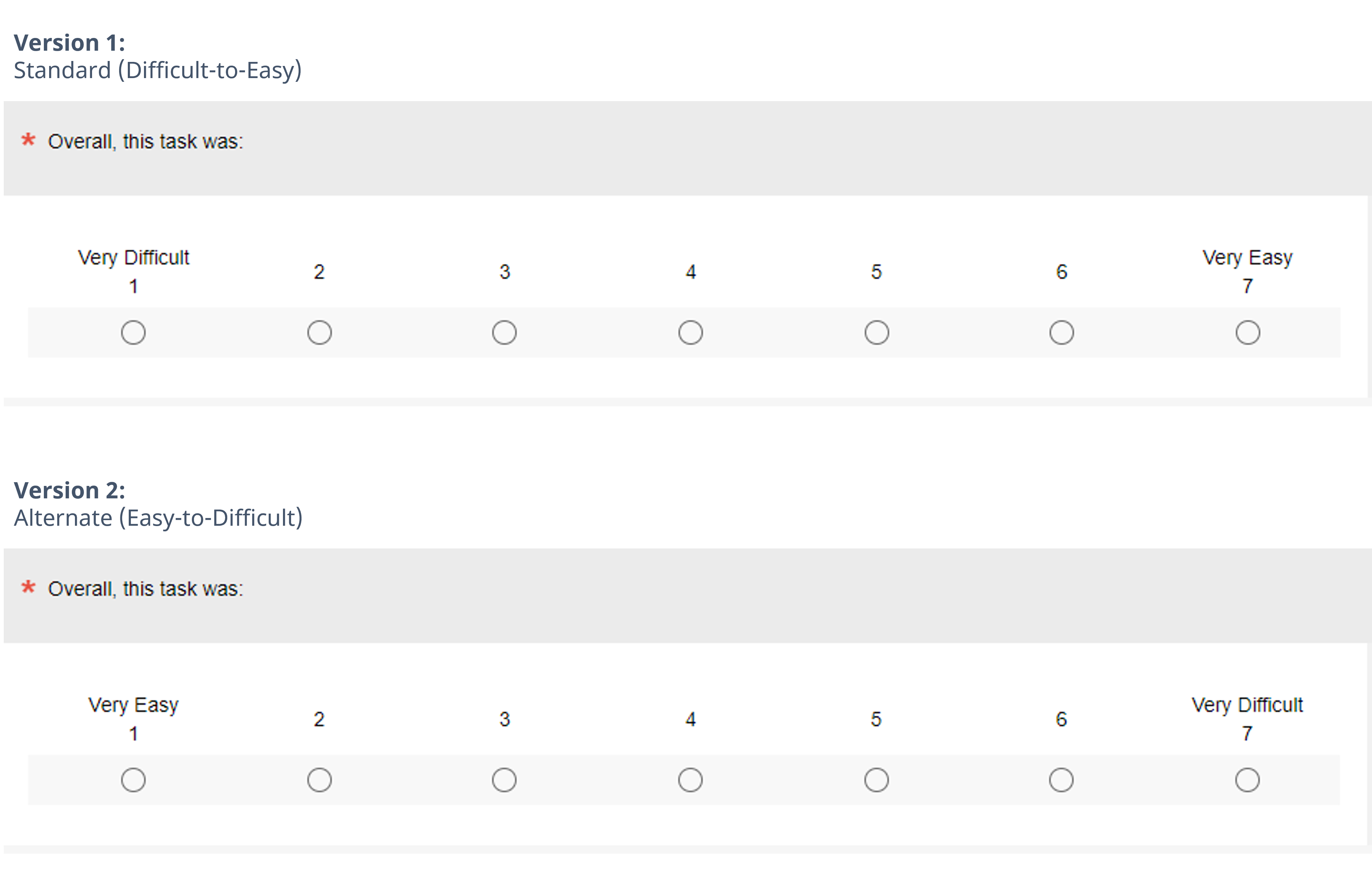
- Difficult–Easy or Easy–Difficult—Does it Matter? It doesn’t affect SEQ means. To explore the potential combined effects of left-side bias and acquiescence bias, we conducted a Greco-Latin study that varied the polarity of the response options of the SEQ (Standard: Very Difficult to Very Easy; Alternate: Very Easy to Very Difficult—see Figure 1) and task difficulty (Easy and Difficult). If the biases were present and of reasonable magnitude, we would expect them to inflate the SEQ means collected with the alternate format relative to those collected with the standard format. What we found, however, was that the differences in SEQ format did not significantly or consistently affect SEQ means overall or when analyzed by task difficulty for either within- or between-subjects analyses.
- Difficult-Easy or Easy-Difficult—Does It Affect Response Distributions? Shifting our analysis of the effect of SEQ response option polarity from means to top box scores painted a somewhat more complex picture. There were no significant differences for main effects, but we found a significant difference in the selections of extreme responses of Very Easy (“top-box”) when the task was difficult that was inconsistent with a left-side bias (or right-side bias or acquiescence bias). We concluded these SEQ formats were “mean equivalent” but were not “distribution equivalent.”
- Comparing Two SEQ Item Wordings. We found no effect. We checked potential differences in measurement properties between two SEQ formats that had the same response options but different stems—the original version (“Overall this task was:”) and our current version (“How easy or difficult was it to complete this task?”). We conducted this experiment because it seemed plausible that including the phrase “easy or difficult” in our current stem, with “easy” first, could slightly bias respondents toward selecting “Very Easy.” What we found, however, was that across many ways of analyzing the data, there were no statistically significant differences (in fact, the smallest p-value across the analyses was .30).
- Comparison of SEQ With and Without Numbers. There was no effect. Early in its history, it was common to present the SEQ as seven unnumbered radio buttons with standard agreement endpoints. It is now more common to number the response options. Across a broad suite of analyses, we found no statistically significant differences in means or top-box scores for the two SEQ formats (Figure 2).

- Evaluation of Three SEQ Variants. This article summarizes the three SEQ experiments we conducted in 2022 (endpoint polarity, item stem wording, and numeric labels). The results of these experiments support the continued use of the current standard version of the SEQ (endpoint polarity from Very Difficult on the left to Very Easy on the right, item stem wording of “How easy or difficult was it to complete this task?”, and numbered response options from 1 to 7).
System Usability Scale (SUS)
We published three articles providing guidance on appropriate sample sizes for the SUS.
- Sample Sizes for a SUS Score. We covered how to compute the needed sample size for a stand-alone estimate, which uses a confidence interval to describe the precision of a SUS score. The method needs three ingredients: the confidence level, an estimate of the standard deviation, and the desired margin of error. We provided the formula and two tables based on typical confidence levels and a typical standard deviation for the SUS in retrospective UX studies (s = 17.7) and a more conservative one (s = 20).
- Sample Sizes for Comparing SUS to a Benchmark. What sample size do you need when comparing a SUS score to a benchmark value (such as 70)? We provided two tables based on a typical standard deviation for the SUS in retrospective UX studies (s = 17.7) and a more conservative value (s = 20).
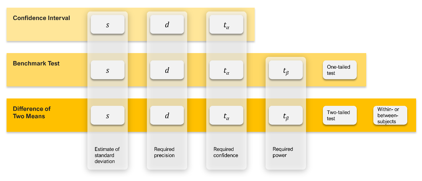
- Sample Sizes for Comparing SUS Scores. What sample size do you need when comparing two sets of SUS scores? Using the process illustrated in Figure 3, we developed two tables based on a typical standard deviation for the SUS in retrospective UX studies (s = 17.7) and a more conservative standard deviation (s = 20), with values for between- and within-subjects designs, 90% and 95% confidence, and power set to 80%.
Predicting Future Behavior with Standardized UX Metrics
We published two articles documenting the prediction of grocery shopping behaviors with the SUPR-Q and predicting recommendations with the Net Promoter Score (NPS).
- Can UX Metrics Predict Future Grocery Purchases? Yes, especially bad experiences. A longitudinal analysis of 320 users of eight online grocery services found that UX attitudes were predictive of future purchase behaviors (nonlinear relationship where poor experience led to significantly lower purchase rates and amounts).
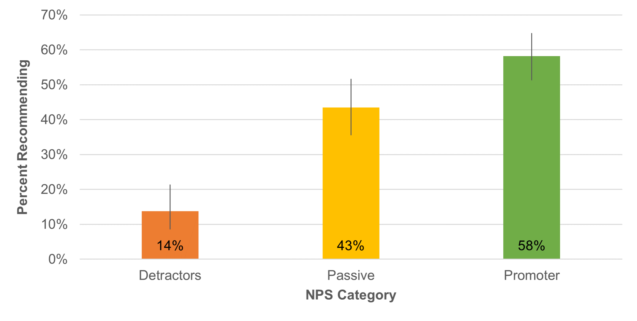
- Does the Net Promoter Score Predict Recommendations? Not perfectly, but they did. With the data collected in our longitudinal study of online grocery shopping, we found NPS was predictive of future recommendations (Figure 4).
UX Methods
This year, our UX methods focus was on the Think Aloud (TA) method in usability testing (five articles) and defining taxonomies (two articles).
- The Many Ways of Thinking Aloud. TA is often thought of as a single method, but there are substantial variations in its implementation (e.g., concurrent, retrospective from video, retrospective from memory, unmoderated remote).
- Does Thinking Aloud Increase Study Dropout Rates? It doubles dropout! In the context of unmoderated remote usability studies, the short answer to this question is “yes.” Across four online studies with 314 participants, we found that asking participants to think aloud roughly doubled the dropout rate.
- What Percentage of Participants Think Aloud? As little as 9%! Analysis across multiple datasets and over 1,000 participants indicated about 18% of people invited to participate in a remote unmoderated TA study actually thought aloud when they could do so immediately after the invitation. When the invitation was delayed, completed TA submissions dropped to 9% (Figure 5).

- Effect of Thinking Aloud on UX Metrics: A Review of The Evidence. A literature review of five relevant TA research papers that compared TA with non-TA completion times revealed inconsistent findings.
- Does Thinking Aloud Increase Task Time? Yes, by about 20%. Based on ten studies with 423 participants, TA does appear to increase total and successful task completion time, at least for remote unmoderated usability studies.
- A Taxonomy of Common UX Research Methods. We developed a taxonomy of common UX research methods that starts with a division between empirical (things people do and things people say) and analytic (inspection methods and task analysis).
- Four Ways to Pick the Right UX Method. We described strategies for picking UX methods based on our taxonomy of common UX research methods while also considering the development phase, analytical focus (qual vs. quant), data collection type, and resources (time and money).
Statistical Topics
Our six articles on statistical topics included two based on the work of Robert Abelson (statistical rhetoric and the “laws” of statistics), two related to the distribution of UX data and the role of nonparametric statistics in UX research, a new approach to modeling the discovery of usability problems, and a description of the N-1 Two-Proportion Test.
- Five Styles of Statistical Rhetoric. Abelson (1995) describes four styles of statistical rhetoric—brash, stuffy, liberal, and conservative. Considering stylistic practices that include (1) consistency within related studies but a willingness to be liberal or conservative depending on the research context and (2) a focus on practical rather than just statistical significance, we’ve described a fifth style between liberal and conservative—the pragmatic style (Figure 6).

- Eight Laws of Statistics. In addition to his rhetorical styles, Abelson (1995) describes eight laws, which are witty and useful constructs for researchers who use statistical analysis to guide their research narratives (e.g., “Chance is lumpy,” “You can’t see the dust if you don’t move the couch”).
- Is UX Data Normally Distributed? Usually, no. Most UX data is not normally distributed. This is usually not a problem when conducting a statistical analysis (e.g., central limit theorem), but we noted it can be an issue when estimating the center of a population.
- Should You Use Nonparametric Methods to Analyze UX Data? Sometimes. The answer to this question is “yes, when it’s appropriate.” But it isn’t always the best choice.
- A New Statistical Approach for Predicting Usability Problems. Following up on an observation by Bernard Rummel, we developed regression equations based on the cube root of the sample size for 15 problem discovery datasets, using the first five participants in each study to establish a discovery baseline. On average, the method is accurate but highly variable.
- How to Compare Two Proportions with the N-1 Two-Proportion Test. We briefly described different methods for comparing two independent proportions and why our preferred method is the N-1 Two-Proportion test.
Rating Scales and Selection Methods
We published seven articles on various rating scales, including selection formats, sliders vs. numeric scales, tech savviness, product experience, an update on the UX-Lite Usefulness item, product-market fit (PMF), and the effect of varying the number of response options in a series of rating scales.
- Comparing Select-All-That-Apply with Two Yes/No Item Formats. We conducted two surveys to compare different selection formats—select-all-that-apply (SATA) and two yes/no formats (in a SATA-like grid or as a series of yes/no questions). We recommended SATA for UX research because selection rates were similar for all three formats, but respondents strongly preferred SATA.
- Completion Times and Preference for Sliders vs. Numeric Scales. A comparison of sliders and numeric radio button scales over 212 responses found no significant differences in ratings due to item format, but users had a strong preference for clicking radio buttons over manipulating a slider.
- Measuring Tech Savviness. We described the construct of tech savviness and three ways to measure it—what someone knows, what someone does (or reports doing), and what someone feels (attitudes, especially self-assessments).
- How to Report Product Experience Data. We described three ways to report product experience data—tenure (how long people have been using an interface), frequency (how often they use it), and depth (how many features/functions they use).
- UX-Lite Usefulness Update. We reported four new studies of alternates for the UX-Lite Usefulness item. We found that “{Product} is useful” and “{Product} meets my needs” are not good candidates because, relative to the original wording and our preferred alternate (“{Product}’s features meet my needs”), it’s too easy to agree that a product is useful and too difficult to agree that a product meets one’s needs.
- What Is the Product-Market Fit (PMF) Item? It’s a metric related to loyalty. We described the PMF metric, which is the percentage of respondents who indicate they would be very disappointed if they would no longer be able to use a product.
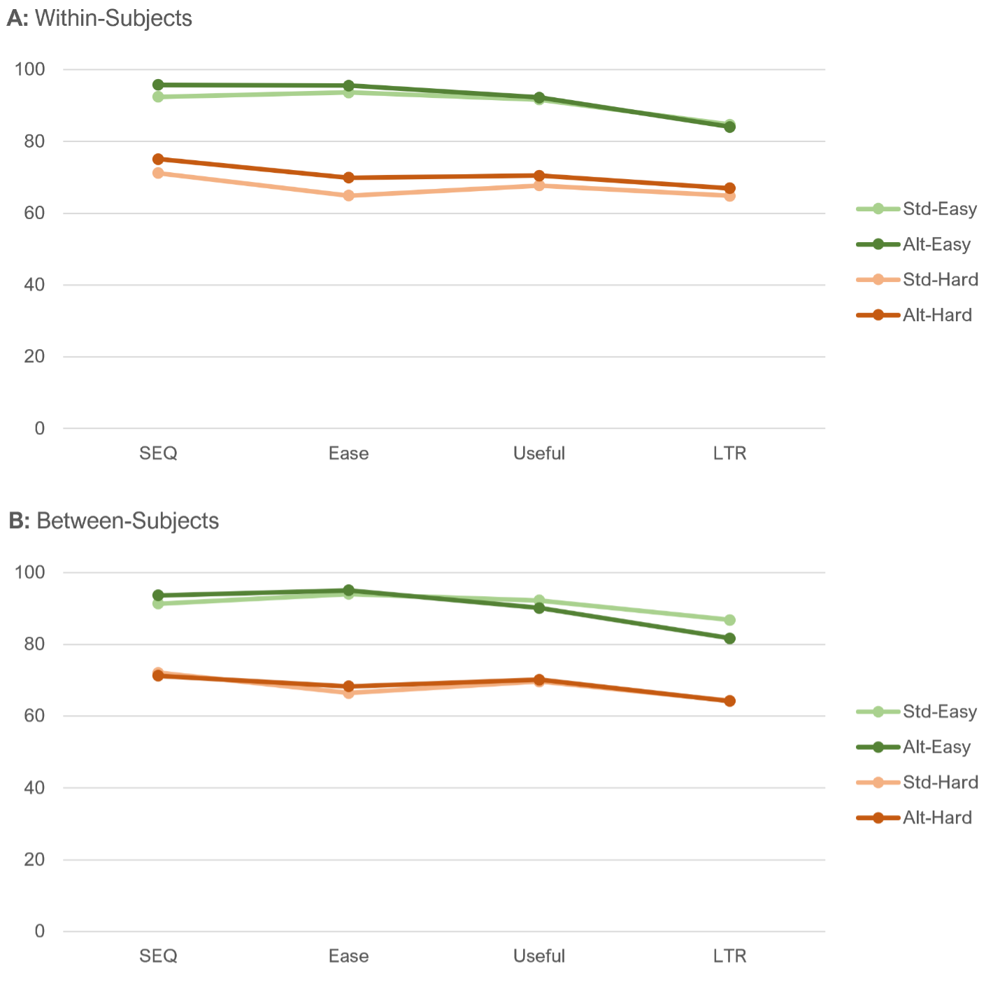
- Does Changing the Number of Response Options Affect Rating Behavior? No, it doesn’t. In a Greco-Latin experiment, we compared data in which the number of response options varied for standardized scales (five for UX-Lite Ease/Useful, seven for SEQ, and 11 for LTR) and data in which all scales had five response options. We found no difference in response patterns for means or top-box scores (Figure 7), and 80% of respondents who experienced both conditions didn’t notice the difference.
UX Industry Reports
In addition to the mixed-methods benchmark studies we conducted using the SUPR-Q and Net Promoter Scores, we also published our biennial SUS surveys of consumer and business software. Thanks to all of you who have purchased our reports. The proceeds from these sales fund the original research we post on MeasuringU.
SUPR-Q Benchmark Studies
In 2022 we published the results of nine UX and Net Promoter benchmark studies; SUPR-Q scores are included in a SUPR-Q license.
- Seller Marketplace Websites. Our survey (n = 307) of six seller marketplace websites (e.g., eBay, Etsy, Facebook Marketplace) found that trust in craigslist and Facebook Marketplace was very low. The ease of finding desired items was a primary driver of SUPR-Q and the NPS [full report].
- Grocery Websites. For online grocery stores, 390 shoppers rated their experience with one of eight grocery websites. Smooth checkout experiences drove SUPR-Q and the NPS, and respondents reported frustrations with out-of-stock items [full report].
- News Websites. In our survey of 14 news websites (n = 675), the key UX drivers were “The website provides unbiased news” and “The articles available on the website are impactful” [full report].
- Real Estate Websites. Our survey (n = 269) of five real estate websites found that seven variables accounted for 52% of variation in SUPR-Q ratings (e.g., “The website shows quality images of the homes”) [full report].
- Airline Websites. Six hundred users of 12 airline websites in the U.S. and international markets found some common UX issues across websites, including difficulty finding information (e.g., pricing), understanding processes (flight selections), and dealing with design issues [full report].
- Travel Aggregator Websites. For our survey (n = 457) of nine travel aggregator websites, we found that the ease of filtering was the top key driver for SUPR-Q and the NPS [full report].
- Business Information Websites. Our survey (n = 183) of three business information websites (Google Reviews, Tripadvisor, and Yelp) found that users were concerned with outdated business information and the trustworthiness of reviews [full report].
- Ticketing Websites. Ratings from 234 users on five ticketing websites found that SeatGeek leads and Vivid Seats lags in UX and NPS ratings [full report].
- Restaurant Reservation Websites. For our remote unmoderated usability study (n = 120) of three restaurant reservation websites, OpenTable was the leader in user experience, and the top key driver of SUPR-Q scores was the ease of checking reservation availability [full report].
SUS Benchmark Studies
Our 2022 SUS benchmark studies included reviews of business software and consumer software, plus a separate report on meeting software products used by both businesses and consumers.
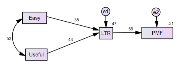
- Business Software. Our 2022 report on business software benchmarks covered 21 products with a mix of productivity and communications software. This is the first time our survey included the PMF item, enabling us to model how ease of use and usefulness drive likelihood-to-recommend and PMF (Figure 8) [full report].
- Consumer Software. Our biennial update of consumer software benchmarks examined 41 products, including popular productivity, storage, and security software. Our data continue to show a strong relationship between perceived usability (SUS) and loyalty (NPS), and UX-Lite drivers of LTR and PMF were similar to our results for business software [full report].
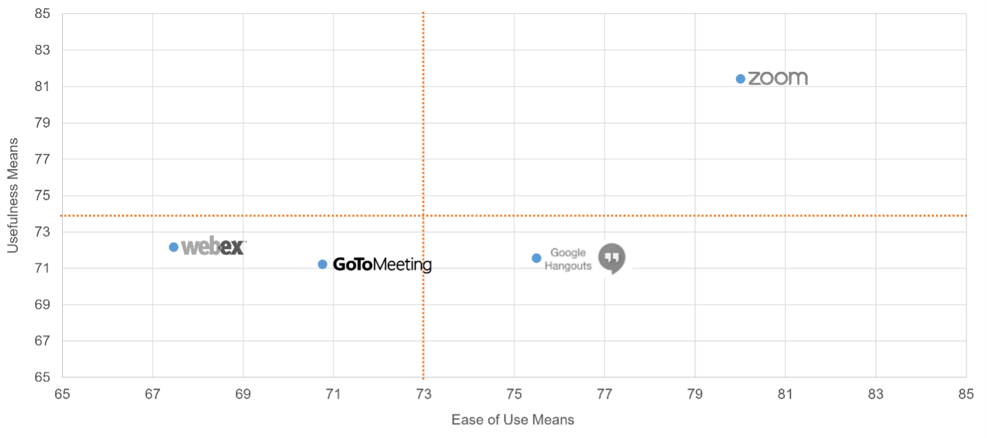
- Meeting Software. Following up on our 2020 article on meeting software, we reported on four meeting software products (n = 227). As shown in Figure 9, Zoom was the UX leader of this group of products in key areas such as perceived ease-of-use, perceived usefulness, and the NPS [full report].
UX Profession (UXPA Survey)
Every few years we assist our friends at the UXPA in helping the UX community understand the compensation, skills, and composition of the UX profession. The UXPA salary survey didn’t go out in 2020 because of the impacts of the pandemic, but we’re happy to have a new set of data from 2022 from which we have published three articles so far.
- User Experience Salaries & Calculator (2022). Using data collected from an international sample of UX professionals (n = 625), we found a median salary of $109K, with variation in salary primarily driven by country/region, years of experience, job level, and company size. The article also contains a salary calculator based on the key driver analysis.
- The Methods UX Professionals Use (2022). The results of the 2022 UXPA salary survey revealed that core UX methods remain popular today, including usability testing, expert reviews, personas, card sorting, and prototyping. Some methods, such as focus groups and eye-tracking, have continuously lost popularity over the last eleven years, while accessibility reviews have slightly increased in usage.
- How Satisfied Are UX Professionals with Their Jobs? They’re pretty satisfied. Most working in UX report high job satisfaction, and that hasn’t changed much since 2014. The average satisfaction in the profession is near the top of other high-satisfaction jobs. In the 2022 UXPA survey, out of multiple analyses of job satisfaction, the only statistically significant driver was job salary.
Coming Up in 2023
For 2023, stay tuned for a year’s worth of new articles, industry reports, webinars, new MeasuringUniversity offerings, and a new book on surveys for UX research.